Baltimore Ravens Logo
Baltimore Ravens is a team that plays as part of the National Football League. The team’s main achievement is winning the Super Bowl not once but twice. The history of the team begins in 1996, when Art Modell, moved the team to its current homebase. After moving to Baltimore, it became an entirely new team known by its fans as the “Baltimore Ravens”.
Meaning and History
The team’s history starts in 1996. As the name suggests, it is from Baltimore, Maryland. The “Ravens” part in the team’s name has an interesting story. It is actually the name of a poem written by Edgar Allan Poe. He was also connected to Baltimore as he spent a significant part of his life there and was even buried in Baltimore.
What is Baltimore Ravens?
The Baltimore Ravens is an American team of football players based in Baltimore, Maryland. In 1996, the Baltimore Sun newspaper made a poll to help the team decide on the name that is going to stay with them for a year. The football players had their best season in 2000 when they defeated the New York Giants.
1996 – 1998
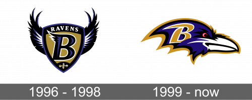
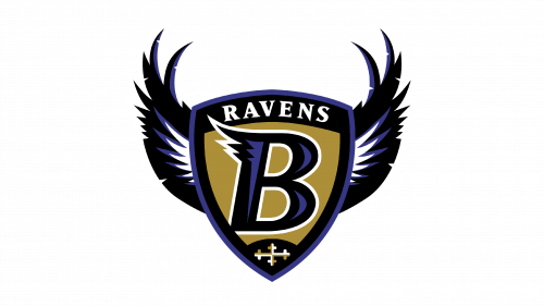
The first logo presented to the football lovers was a shield with crow’s wings on two sides. The shield was golden in the center with a purple letter “B” that had a thick black outline followed by white. It stands for their home city. The letter had three spikes of different lengths on the left at the top. At the top of the shield, they had the word “Ravens” written in white capital letters and at the base, the shield had a golden cross bottony. The shield had a black and purple border, which were the team’s colors. The wings were black, purple, and white in the center.
1999 – Today
Due to a legal controversy about the rights to the original emblem, Ravens had to come up with something new or pay the rights-holder (Frederick Bouchat) every time the logo was used during the games. It chose to redesign its logo completely. It still reflected its mascot, but instead of crow’s wings, the logo was in the form of a crow’s head that was facing right. The head had a black and gold outline with the center being purple and the beak colored white. The crow’s eye had a red rim. To the left of the head, they placed the letter “B” with a white outline, symbolizing the city just like what the previous emblem had.
