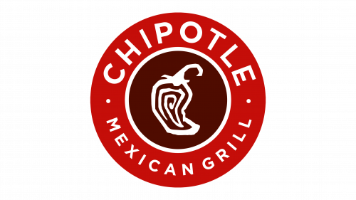
Chipotle Logo
Chipotle is a corporation that operates fast-food style restaurants under the brand name Chipotle Mexican Grill. One can find them in the USA, Canada, and some European countries. The main menu of the company includes burritos, burrito starters, tacos, and salads. There are not very many ready-made dishes in the establishment, but they offer a huge selection of ingredients that allow you to create your ideal meal. In addition, Chipotle prioritizes the development of technological and other innovations, such as digital ordering platforms, digital ordering lanes, delivery, and catering, which allow customers to order and receive food in a convenient way.
Meaning and History
Steve Ells, the future founder and owner of Chipotle Mexican Grill, began his career in the restaurant business as a simple chef at the Stars restaurant. In 1993, with the support of his father, he opened the first location of the now-famous restaurant in Colorado. A Mexican spice known as chipotle is a red smoked jalapeno pepper. Chipotle has pioneered the way to fast-casual places to eat outside home, offering high-quality food with the speed and convenience of fast food.
What is Chipotle?
Chipotle not only refers to a hot pepper but also a chain of well-known restaurants. The main menu items are burritos and tacos, but the customers will find many alternatives and add-ons that make a meal exciting. The company tries to use as many organic products as possible in dishes.
1993 – 2009
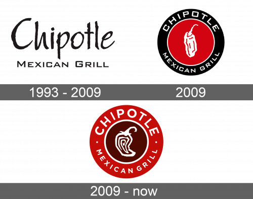
The first logo to represent a new restaurant was very minimal, yet looked very professional. It was simply the name of the company with “Chipotle” written in a larger font that is similar to Papyrus and “Mexican Grill” being done in a smaller and simpler font right underneath. The wordmark was black and typically seen on white background.
2009
When the company was already well-established, it decided to change its logo. This time, it was a round medallion with a black outer circle and a red inner circle that had a very thin white border. The name was typed in white capital letters and used the font previously seen on the original logo in the “Mexican Grill” part. A drawing of a pepper done in white popped on the red background and create a memorable brand image.
2009 – Today
It was not long before the new emblem underwent some design changes. The outer circle along with the thin white outline were significantly wider, which allowed writing the name of the company in a larger font. In fact, it almost filled the whole circle and only two white dots separated the words. There was still a white pepper in the center, although it had changed its shape and was drawn on a dark brown background. Along with the round emblem, there was also a rectangular logo that used the drawing of pepper from the round emblem and presented it in a square with rounded corners next to the wordmark “Chipotle” done in white against a red background.
