Cisco Logo
Cisco is an American multinational technology company that specializes in networking and communications technology. The company designs, manufactures, and sells networking equipment, routers, switches, and other products. Cisco’s products and services are used by businesses of all sizes, governments, and individuals globally. In addition to its hardware offerings, Cisco also provides software and cloud-based solutions, cybersecurity services, and other technology-related services.
Meaning and history
The corporation’s graphical identity pays homage to its birthplace and reflects its founders’ deep-seated respect for its origins and cultural legacy. The company’s name was derived from the colloquial moniker of its hometown, San Francisco, which served as the inspiration for its premier brand mark back in the mid-80s.
The brainchild behind the renowned brand mark was John Morgridge, Cisco’s founder and inaugural boss, who drew his inspiration from the well-known Golden Gate Bridge that spans across San Francisco Bay.
What is Cisco?
Cisco is a global IT company that provides networking and communication equipment and services. They offer routers, switches, and software solutions to businesses, governments, and individuals worldwide. Their services include cybersecurity and cloud-based solutions in addition to technology-related services.
1985 – 1990
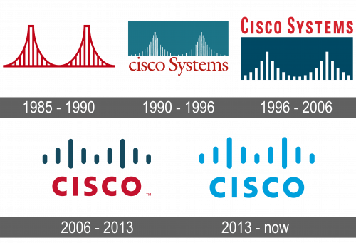
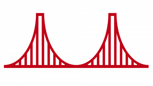
In its foremost iteration of 1985, the Cisco logo featured a red depiction of the bridge, drawn with slim lines. The design accurately reminisced the form and color code of the landmark, serving as a sign of the company’s pride in its origins. Then, the wordmark was only displayed in lowercase letters on official documents, and the initial logo did not feature any lettering at all. Despite its minimalistic composition, the insignia became synonymous with the emerging tech industry, and Cisco’s early success assisted to establish it as a major player in the field.
1990 – 1996
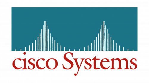
In 1990, the Cisco logo underwent a redesign, which included a fresh appearance. The updated emblem showcased a more abstract representation of the Golden Gate Bridge, consisting solely of white vertical lines of varying heights that followed the silhouette of the legendary structure. This white picture was then positioned on a rectangular sea-blue background, with a red “ciscoSystems” caption located directly below it.
The sea-blue, white, and red shades of the renewed sign embodied the strength and the firm’s pursuit to result. The sea-blue shade also conveyed a feeling of security and fidelity, which aligned with the company’s focus on providing technology solutions.
1996 – 2006
2006 – 2013
In 2006, Cisco introduced a new variation of its logo with a more modern and technical feel. The vertical bars of the Golden Gate Bridge in the insignia got bolder, and the lower edge was curved.
The colors stayed unchanged, while the name caption was shortened and situated under the picture again. The capital red “Cisco” cutline features a bold script with no serifs. It depicts airless lines and highlighted edges, similar to the Ricardo Extra Bold font.
2013 – today
In 2013, Cisco made a minor change to its logo, altering the color palette to a light blue hue, which was seated on a white backdrop. The sans-serif lettering of the red “Cisco” wording is balanced with the simple, abstract look of the white lines.
Color
The iconic symbol of Cisco is a colorful representation of the company’s core vision and mission. The striking red shade embodies the marque’s commitment and unwavering dedication to excellence. On the other hand, the blue hue signifies the company’s feeling of tranquility, reliability, and innovation, while also expressing the advancement and positiveness that the corporation strives to provide to its clients.
Font
The ongoing Cisco wordmark features an all-caps, sans-serif font with bold letters and distinguished corners of the characters. The script looks similar to the Ricardo Extra Bold font. It has a stylish, bold, and sleek appearance with good legibility and balance between the letters. The gaps in between are also well-proportioned.
