Citigroup Logo
Citigroup stands as a global financial services powerhouse. John Reed and Sandy Weill orchestrated its birth. Its creation took place in New York City, envisioned as a financial services conglomerate. It was designed to provide a comprehensive suite of financial solutions, from banking to investment services. This formation intended to cater to a diverse clientele, ranging from individual savers to major corporations, aiming for global financial dominance through innovative services and extensive market reach.
Meaning and history
The historical journey of Citigroup began in 1998, marking its establishment as a global financial behemoth. This inception was a result of the merger between Citicorp and Travelers Group, aimed at creating a one-stop financial services institution. Significant milestones include its early adoption of internet banking in the 2000s, positioning it as a pioneer in digital financial services. In the late 2000s, Citigroup faced substantial challenges during the financial crisis, leading to a significant government bailout. Despite these obstacles, Citigroup has emerged as a resilient entity, continuously evolving to meet the demands of a dynamic global economy.
What is Citigroup?
Citigroup operates as a global finance titan, offering an array of services across banking, securities, and investment management. It caters to a wide audience, from individuals to multinational corporations. Through its vast network and innovative solutions, Citigroup aims to facilitate seamless financial transactions worldwide, fostering economic growth and financial stability.
1976 – 1980
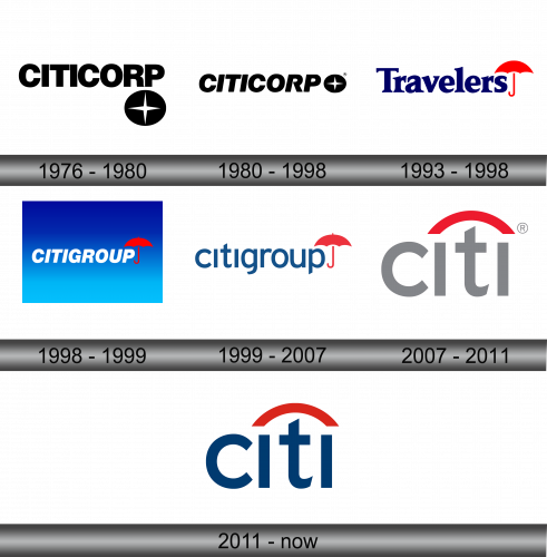
The logo presents a stark, bold design, featuring the word “CITICORP” in uppercase. Each letter shows a hefty, sans-serif typeface with ample spacing, delivering a sense of solidity and straightforwardness. To its right, a circle encloses a simplistic star-like symbol, its points touching the perimeter. This emblem, evocative of a compass, suggests direction, navigation, and global reach. The entire logo is rendered in a monochromatic tone, emphasizing a classic and timeless feel. The logo’s minimalism and absence of additional embellishments convey a professional, no-nonsense corporate identity.
1980 – 1998
The updated logo retains the bold, all-caps “CITICORP” text, but now includes a registered trademark symbol, asserting its proprietary status. The font and spacing appear unchanged, preserving the logo’s commanding presence. The accompanying graphic, a star within a circle, remains a consistent emblem of direction and global outreach. The stark black and white contrast continues to convey a sense of clarity and strength. This iteration subtly yet firmly trademarks the brand’s identity in the corporate realm.
1993 – 1998
The Travelers logo features vibrant colors and a new symbol. The name “Travelers” is in a serif font, deep blue, conveying reliability. Above the “s”, a red umbrella unfurls, iconic and protective. The red and blue palette suggests assurance and trustworthiness. This logo signals comprehensive coverage, embracing the spirit of travel and safety. It stands distinct from Citicorp’s monochrome and corporate aesthetic, leaning towards approachability and personal care.
1998 – 1999
This logo fuses elements from previous Citicorp and Travelers identities, symbolizing their historic merger. “CITIGROUP” appears in white, bold sans-serif letters against a gradient blue background, suggesting a modern, expansive horizon. This synthesis marries corporate strength with personal security, embodying a comprehensive financial services brand.
1999 – 2007
The logo simplifies further, discarding the previous blue gradient for a clean, white background. “citigroup” now shows in lowercase, in a softer, more accessible font, conveying openness. The iconic red umbrella remains, its placement above the “p” symbolizing protection and assurance. The change to lowercase suggests a more approachable and customer-friendly brand, aligning with a modern, user-centric business philosophy. The simplicity of this design reflects a contemporary ethos, embracing minimalism and clarity.
2007 – 2011
The logo evolves to a more abstract design with “citi” in grey, underlined by a red arc, reminiscent of the previous umbrella. This streamlined look uses a modern sans-serif font, leaning towards minimalism. The arc symbolizes shelter and continuity. The registered trademark symbol is now more prominent, signaling brand maturity. This design encapsulates Citigroup’s essence: modern, sleek, and focused on progress and protection.
2011 – Today
The logo maintains its composition while introducing a rich blue hue to “citi” and a brighter red for the arc. This version balances tradition with vibrancy, signaling stability and energy. The arc now rests atop, suggesting optimism. The color shift enhances visibility and reinforces the brand’s legacy in the modern era. It’s a nod to Citigroup’s heritage with a contemporary twist.


