Clemson University Logo
In addition, it is one of the most influential research institutions in the US and around the world. It is a public university divided into various colleges, including Business and Behavioral Sciences, Education and Development, Agriculture, Forestry and Life Sciences, Architecture, and so on. All Bachelor’s, Master’s, Ph.D. programs are accredited by the Commission on Colleges of the Southern Association of Colleges and Schools.
Meaning and History
Clemson University was founded in 1889 as an agricultural college and received university status in 1964. The university has about 200 programs in various fields. Sports and orange are an important part of Clemson and the Clemson Tigers compete in the NCAA Division. Actually, the university football team won the national championship for the second time in 2016. Greek life is also popular and over 25% of students are members of a community or fraternity. With over 17,000 acres, Clemson is one of the greenest universities in the country.
What is Clemson University?
Clemson University is a public institution in the United States. It uses a semester-based academic calendar. Clemson University is ranked as one of the best educational institutions.
1928 – 1934
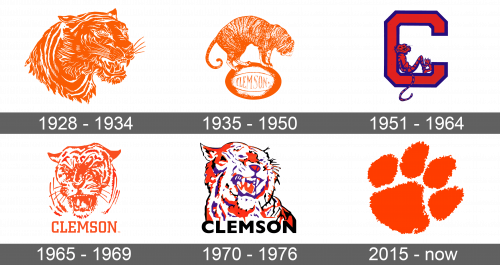
A very realistic depiction of a tiger was the first primary logo of the institution. It was a side view of its head. It was done in a very bold orange color with white used for highlights, which combined with an open mouth and visible fangs, gave a very impressive and strong-willed feel.
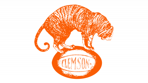
1935 – 1950
An updated version of the emblem now featured the whole animal instead of just the head. It was standing on a football with the “Clemson” written across it. The wild cat was done in the same color palette and a similar drawing style. It did not look as striking anymore, but the logo was quite appropriate for the representation of an athletic team of the university.
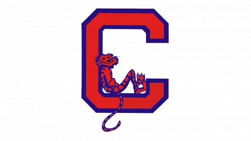
1951 – 1964
The university kept the orange color and tiger theme. However, this time a bright orange letter “C”, which stood for the name of the institution, was the center of the logo. It had a purple border and corners that were cut at an angle. An interesting element was added in the form of a small tiger figure sitting inside the letter. It was orange with blue lines and an outline. Its long tail was hanging down from the letter. The animal had a relaxed position and a friendly grin.
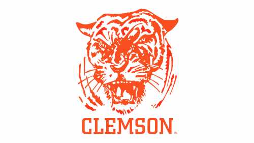
1965 – 1969
The next logo had a very similar feel and style to the original one. The animal was facing forward and had a very scary and determined look. There was more white with orange being used for drawing the details. Under the head, it stated the name of the university in uppercase letters using a classic font. The writing was also done in the same color as the animal.
1970 – 1976
The tiger was redrawn again. Although it still had its mouth open and visible fangs, it did not look as terrifying. In fact, it might even seem like the tiger is laughing. Moreover, new colors were added. These included black and purple. The letters were also done in black instead of purple.
2015 – Today
A more modern and simple logo was introduced by the institution in 2015. It was a purple tiger’s footprint. The edges were rough, while bright and bold orange color contrasted well against a white background. The paw was drawn at an angle. This was very unique and at the same time was a good representation of a well-known university.


