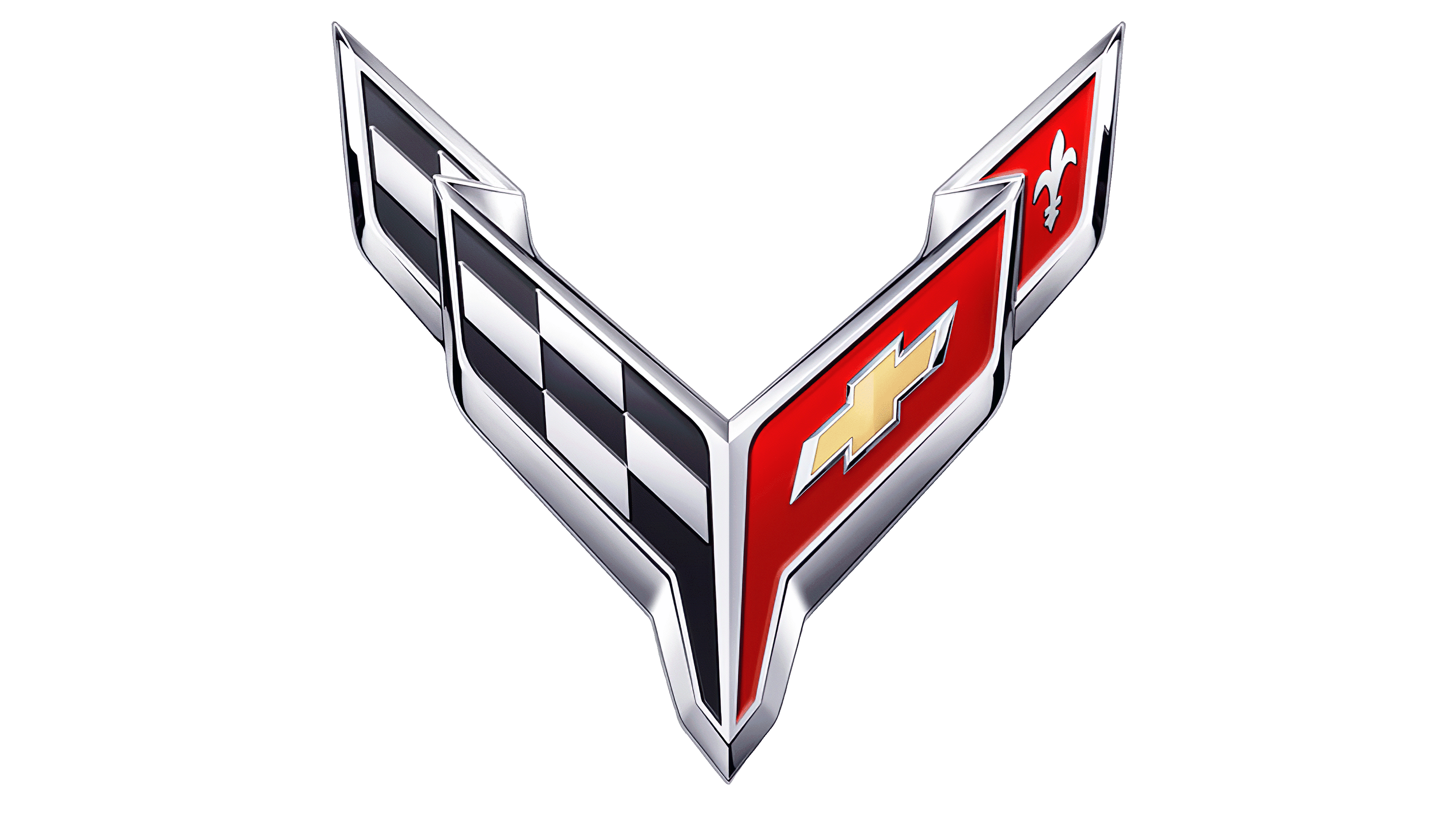
Corvette Logo
Corvette, a name synonymous with American sports car excellence, is a brand under Chevrolet, which is a division of General Motors (GM). Currently, Corvette focuses on producing high-performance sports cars, with its latest model being the C8 Stingray. This groundbreaking model showcases a mid-engine layout, a departure from the brand’s traditional front-engine design. The U.S. remains Corvette’s primary market, though its presence is felt globally. Owned by GM, Corvette continues to embody American automotive passion, blending heritage with cutting-edge technology to appeal to car enthusiasts worldwide.
Meaning and history
Corvette, an emblematic American sports car, debuted in 1953 as a concept vehicle at the GM Motorama in New York. Born under the Chevrolet umbrella, a division of General Motors (GM), it quickly gained popularity and transitioned from a concept to production. Initially, it featured a fiberglass body, a pioneering choice at the time, driven by material shortages after WWII.
In 1963, the Corvette Sting Ray made waves with its split rear window and independent rear suspension. The car evolved through seven generations, each introducing technological advancements and design tweaks. The C2 generation (1963-1967) solidified the Corvette’s iconic status with its aggressive, muscular design. The subsequent C3 (1968-1982) introduced the T-top, while the C4 (1984-1996) boasted improved aerodynamics and digital instrumentation. The C5 (1997-2004) brought forth structural enhancements and a transaxle assembly. With the C6 (2005-2013), the exposed headlights, absent since 1962, made a return. The C7 (2014-2019) provided a revitalized design, reasserting Corvette’s dominance in the sports car arena.
The most transformative change occurred with the C8 in 2019, moving from a front-engine to a mid-engine layout, revolutionizing the Corvette’s traditional design DNA.
Throughout its journey, Corvette remained a Chevrolet treasure, its ownership steadfast under GM. Production shifted from Flint, Michigan, to St. Louis, Missouri, and ultimately to Bowling Green, Kentucky, where it continues today. Corvette’s evolution narrates a tale of innovation, design prowess, and a relentless pursuit of performance, ensuring its enduring legacy in the automotive world.
1953 – 1955
When General Motors was gearing up to unveil its premier sports car, they commissioned interior artist Robert Bartholomew for the emblem’s design. He envisioned two intersecting flags: to the left, the iconic American flag with its stripes and stars, while the right showcased the checkered pattern typical of racing flags. Chevrolet’s name graced the top, while the term “Corvette” was faintly scripted at the base.
However, a last-minute realization revealed potential legal issues with this design. With a mere four days to rectify, Bartholomew sought inspiration from the Chevrolet legacy, contemplating the racer Louis Chevrolet’s family crest, but pertinent historical resources remained elusive.
Ultimately, the team settled on the time-honored French symbol, the fleur-de-lis, accompanied by three linear stripes and a cross-emblazoned shield. Both the flags and textual elements were encircled in a white band framed by a black border. This original design still holds a place of honor at the Kentucky-based Corvette Museum.
1955 – 1962
The font style underwent a transformation. Visual components adopted a more three-dimensional appearance, deviating from their initial design. Positioned in the forefront, just beneath the flags, emerged the letter “V”, mirroring the hands of a clock. This symbol was an homage to the V-8 engines, a standard feature in the sports cars of that era. This revamped design not only showcased the brand’s evolution but also highlighted its commitment to innovation and power, ensuring that Corvette’s legacy as a pioneer in the automotive world was unmistakably clear.
1963 – 1967
In 1963, Corvette introduced its subsequent model named StingRay. The moniker was prominently displayed at the emblem’s base, nestled within a dark-toned rectangular space beneath the “Corvette” inscription. The explicit ‘Chevrolet’ branding was omitted, considering the sports car enthusiasts were well-acquainted with the iconic marque. The lustrous ‘V’ was no longer present. The flags underwent subtle alterations in their dimensions, contours, and hues, reflecting the brand’s ongoing evolution and its commitment to staying contemporary in the ever-evolving automotive landscape.
1968 – 1982
Following the unveiling of Corvette’s third-generation sports vehicles, the emblem underwent a transformation. The circular backdrop was notably absent, and the flags were reimagined. Artists presented them at a refreshed orientation, aiming to convey a heightened sense of steadiness and equilibrium. This alteration was a reflection of the brand’s continuous pursuit of innovation, capturing the essence of its forward momentum while staying rooted in its heritage. The redesigned badge served not only as a testament to the car’s evolution but also as a symbol of the relentless drive and dynamism inherent to the Corvette identity.
1982 – 1996
The emblem for the fourth iteration of Corvette underwent a radical transformation. The once-familiar flags swapped positions and took on a revamped rectangular form, ditching their previous flagpole attachments. A familiar black circle made its comeback, framing the new design elements. The classic fleur-de-lis was notably absent, making way for Chevrolet’s distinctive golden cross, which took center stage. This redesigned symbol reflected both the evolution of the brand and its commitment to pushing boundaries while staying anchored to its iconic roots. It epitomized the fusion of tradition and innovation that Corvette had come to embody over the years.
1997 – 2005
During the evolution into the C5 generation, the emblem underwent a revamp. The creative team chose to retain the flags’ original orientation while reintroducing their timeless design, inclusive of the iconic fleur-de-lis emblem. The intersecting flagpoles, a signature element, were once again prominently displayed, albeit with half of them extending beyond the emblem’s circular boundary. This deliberate design choice was both a nod to the brand’s rich heritage and a modern twist, seamlessly blending the past and the present, capturing the essence of Corvette’s continuous journey of innovation while paying homage to its storied legacy.
2005 – 2014
The firm underwent a significant emblem transformation, discarding the prominent black ring. In its stead, they introduced extended creases along the inner contours of the flags, offering a more streamlined appearance. Positioned below, the name “CORVETTE” was integrated using a distinctive font, characterized by its dynamic slant towards the right. This revision not only modernized the logo but also provided a sense of momentum and forward motion, embodying the brand’s essence of speed and innovation, while still preserving its iconic heritage. The fresh design truly encapsulated Corvette’s evolution while paying homage to its foundational identity.
2014 – 2019
For the unveiling of their seventh-generation vehicles, a revamped emblem was essential. Thus, the creative team repositioned the flags, adopting a pronounced V-formation, emblematic of dynamism and evolution. While the typographic element retained its foundational design, the lettering underwent a transition, now gleaming in a lustrous silver hue. Additionally, the graphic component was enriched with a metallic contour, accentuated by subtle gradations, lending depth and a contemporary touch. This revamped visual representation was crafted to mirror the advanced and cutting-edge nature of the latest generation while preserving the brand’s iconic legacy. The overall design radiates modernity while nodding to its storied past.
2019 – Today
The emblem for the Chevrolet Corvette C8 showcases an amplified “V” formation compared to its predecessor. Designers eliminated the V-notch at the base, bringing the flags into closer proximity. They’ve spaced out the characters in the brand’s title, enhancing its legibility for viewers. The color palette employed is of a more subdued hue, and the emblem’s top edges now possess a pronounced angularity. Dubbed as the “butterfly” design, early glimpses of this version emerged in February 2019 before being solidified in official visual representations. This refreshed symbol encapsulates both the evolution and timeless essence of the Corvette lineage.


