Cutty Sark Logo
Cutty Sark is a brand of Scottish whisky that was designed initially for the sale in North America, where it boomed after the prohibition ended in 1933. It’s appreciated as the classic Scots whisky, although it’s nowadays overshadowed by some of the more accessible whisky brands.
Meaning and History
The whisky was designed in 1923 in Scotland by the English company called Buckingham Company. The name originates from the name of one of the last sail ships built in Britain. So, it’s somewhat of a nod to the age gone-by, although also a good marketing ploy, because Sark was even then a popular symbol.
What is Cutty Sark?
Cutty Sark is a famous British brand of blended Scotch whisky. It was established in 1923 and has since become known for its distinctive taste and iconic packaging. Cutty Sark offers a range of whiskies, including their flagship blend, as well as limited edition releases, appealing to whisky enthusiasts around the world.
1923 – today
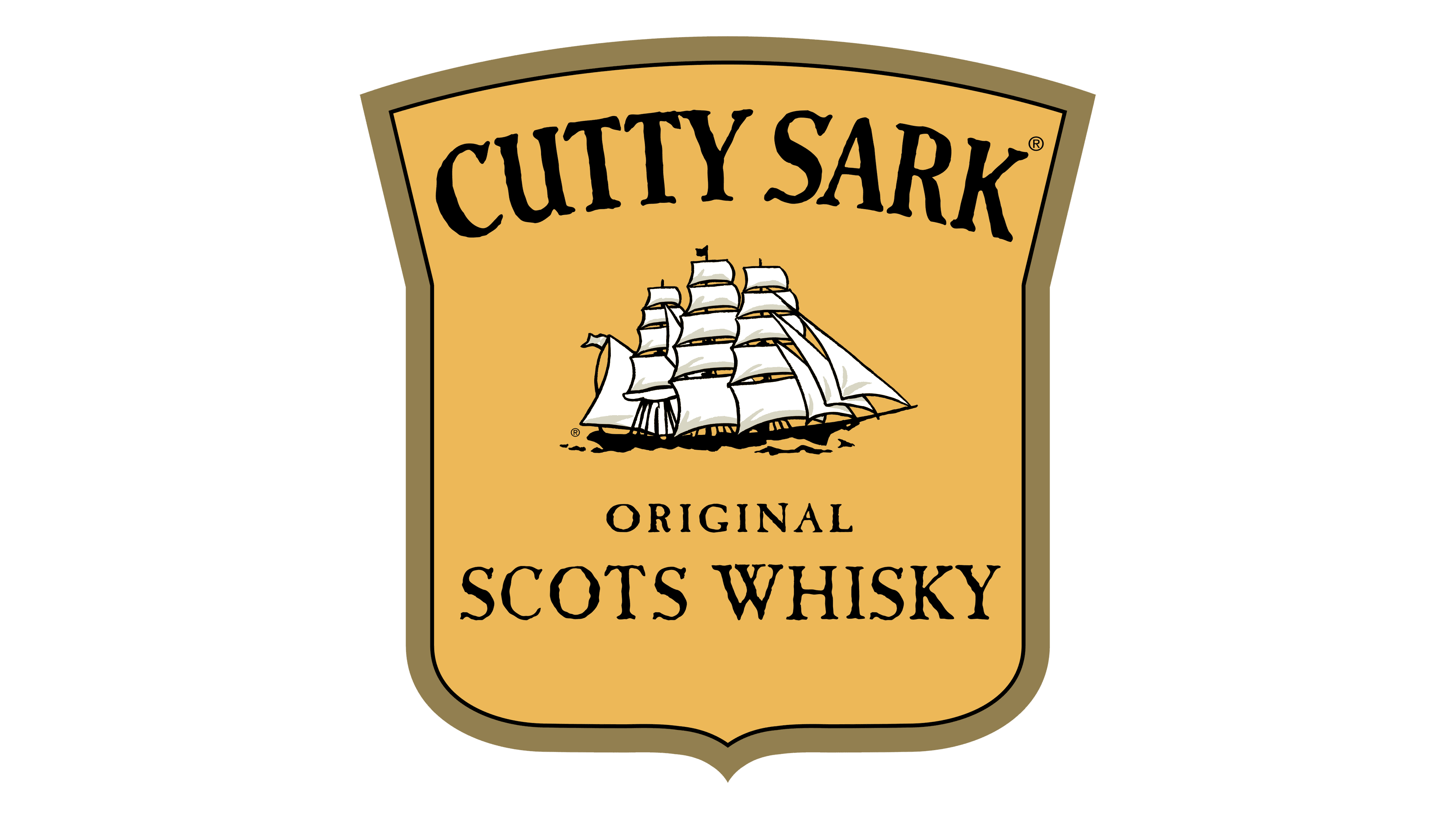
The logo introduced in 1923 depicts a large yellow shield with a brown frame. In its top, it shows the brand name itself – ‘Cutty Sark’ – in black serif letters. The center is occupied by the picture of a classic later-age sailing ship, colored in black and white. Below, they’ve written the words ‘Original Scots Whisky’ in much the same style the name.
Emblem and Symbol
There are many variations of the emblem – particularly in relation to how they are used on the bottles. On the bottles, there’s usually a lot more space (at least nowadays). In addition to everything listed above, they manage to fit entire descriptions of where, how and why the drink was brewed in full detail


