Detroit Lions Logo
The Lions won four NFL championships, but the last one was back in 1957. In 1958, Lyons let Bobby Lane go and received another player in exchange (Earl Morrall) and two draft picks in the future. There’s a legend that says the former player has claimed that the Lions will not see another championship without him for half a century. Afterward, the Lions truly did not achieve a championship in any of their games, which many call “The Curse of Bobby Lane”. Actually, the year 2008 marked a new record in the league’s history because it was the first time a team lost all 16 regular season games since this type of schedule was introduced.
Meaning and History
The roots of this well-known team start in 1928. Originally, football players were known as the Portsmouth Spartans, a team that was based in the state of Ohio. Their first game was played in 1930, and the players were a fairly successful team. Due to the Great Depression, which put the team in a bad financial position, the team was bought in 1934 by a group of businessmen. The football players now called Detroit their home, changed their name to Lions, and haven’t changed their homebase or name since. The name Lions was given to the team in respect to the Tigers baseball team based in Detroit as it was also a “cat” name.
What is Detroit Lions?
The Detroit Lions, a professional team of football players formed in the US in 1930, are one of those prominent NFL legends that have been hugely successful in the beginning. Nonetheless, the Lions are the only team that has never participated in the Super Bowl.
1929 – 1933
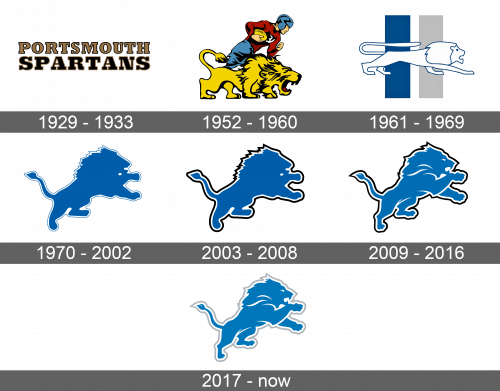
Since the original name of the team had nothing to do with the lions, the logo said “Portsmouth Spartans” in uppercase letters. The first letters were done in light brown color with a black outline. The word “Spartans” was done in black with a brown outline. The length of both words was the same, which made “Spartans” being done in a much larger and bolder font. Other than the outline, the logo did not have any fancy elements.
1952 – 1960
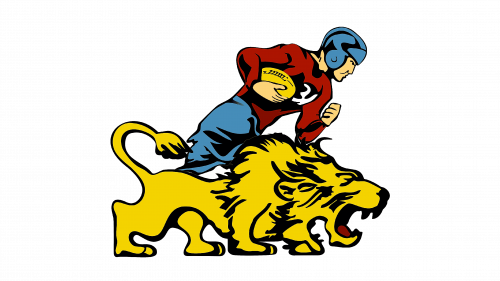
The next logo featured a very detailed and colorful cartoon drawing of a lion and football player. It was dynamic and courageous. The dynamic part came from the fact that the player was pictured running with a football done in yellow in his right hand. His shirt was done in crimson while the helmet and pants had a blue color. The black color was used for outlines and details. In front of the player, there was an aggressive, and at the same time, a magnificent and powerful lion. It was mainly yellow with the black outline of the body, mane, and other details. It had an open mouth with visible teeth and a crimson tongue.
1961 – 1969
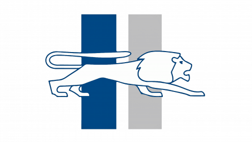
There was a drastic change in the way the logo was done. Although the color palette included blue, gray, and white, the emblem did not look as colorful when compared to what the team had before. It featured a very minimalistic drawing of a white lion with a very thin blue outline. The animal was on the move. It was set with two vertical rectangles in the background, with one being done in blue and the other in light grey.
1970 – 2002
The team continued with a minimalistic design of the logo. This time, it was a solid drawing of a lion who was jumping up. The lion itself was blue and had a white outline which was followed by a thin blue outline. Its mane was done in a zigzag line, which, combined with its pose, showed the movement and greatness of the whole emblem.
2003 – 2008
In 2003, the team decided to give its logo a little update. Although the change was very minimal, it gave it a much more dramatic and powerful look. The only difference was the change from a thin blue outline to a slightly thicker (matching the thickness of the white outline) black line. Otherwise, the lion stayed unchanged and there were no other elements or words added to the logo.
2009 – 2016
Yet another redesign was done several years later. It brought more changes to the logo as the lion now acquired more details, which continued the white outline. It was no longer a solid image of the animal. It looked like the lion acquired more character and determination. Moreover, the emblem was set on a blue background that had the same color as the animal itself.
