Philadelphia Eagles Logo
Football fans are well aware of great players known as Philadelphia Eagles. During its existence, the club has won several NFL championships. It has also been to three Super Bowl games but unfortunately the games back in 1980 when it played against Oakland Raiders and during the game in 2014 against the New England Patriots did not bring the team a victory. However, in the 2018 Finals, the Eagles were able to show the England Patriots that they know how to play football.
Information
Philadelphia Eagles is an American football team that competes in the East Division of NFC, as well as in NFL. It’s an old club that dates back to 1933, although it wasn’t particularly successful at first. The first significant wins came in late 40s, when they won NFL cups of ’48 and ’49.
This sudden leap came as a result of the leadership of Earle Neale, as well as the admittance of new strong players. Soon after, they were outshone by other teams, such as Cleveland Browns, Detroit Lions and others. The next successful win came in ’60 against Green Bay Packers.
In the next few decades, the team had a largely uneventful history. In the first 50 years of NFL, they scored 3 cups and became a one-time runner-up in ’47. This period of their existence is still viewed favorably – they were overall the 6th most successful team of that era.
The Eagles didn’t see any major action all the way until 2000s, when they were finally revitalized. In the Super Bowl era, they won in ’17 and became a runner-up three times. They are considered one of the moderately successful teams, with dedicated fan community in Philly and elsewhere.
Meaning and History
![]()
In 1933, the club emerged as a replacement for the Frankford Yellow Jackets when a group of businessmen with Bert Bell as the head won the right to own an NFL football team in Philadelphia. Bell and Ray came up with the Philadelphia Eagles with Bell serving as the president of the club and Ray as head coach.
What is Philadelphia Eagles?
This is a well-known American football team. It is not hard to guess from the name where it comes from. The team’s fan base fiercely stands behind the NFL players and is one of the most loyal in all sports.
1933 – 1935
![]()
The team did not go all out when they came up with the original logo. It was an eagle who spread its wings as if flying up. It was holding a football ball in its claws. The emblem was drawn with great details and looked more like a photo that was printed in blue and light gray shades. Given that victory and leadership are often associated with the eagle, the emblem is surely meant to show the world that this team is determined to win every game.
1936 – 1941
![]()
Shortly after the team’s formation, the logo was changed. It had a different color palette with different shades of green and gray as the only colors being used. The logo’s idea has not changed. The difference was in the eagle’s shape. Its wings were still spread but the ends were not going up but backward. It seemed that the bird has just landed on the football. The ball itself has lost the details and was more of a spherical oval figure.
1943
![]()
As the team has merged with another football team, the logo has changed as well. It still had an eagle, but it was diving and holding a helmet with both of its feet. A small straight line at the bottom represented the earth. The color scheme was replaced by a predominantly black to represent the gloomy times the world was going through during this period. Overall, the emblem was drawn with minimum details and was more of a solid image.
1944 – 1947
![]()
The black eagle was used only for a year. The team decided to bring back the green color, although it was a different and more natural shade. Otherwise, the shape of the bird has not changed much, but this time it was diving and clenching a football with all its might. It also had a closed beak, which made it look less aggressive.
1948 – 1968
![]()
The eagle has spread its wings anew and was soaring with a football in one of its claws. It was still almost a solid slightly darker green color, but there was more white contouring, which made the bird look more realistic. The feet and the ball were predominantly white with green outlines. The logo acquired a more modern look.
1969 – 1972
![]()
Philadelphia Eagles have stayed loyal to the idea and the meaning behind its logo and have made adjustments only to the bird’s shape. The wings and the tail of the bird acquired more rectangular shapes and had straight lines. The right wing, head and feet were white with green outlines while the rest of the eagle was green with white outlines.
1973 – 1986
![]()
The redesigned logo did not look anything like the logos used for over 40 years of the team’s history. However, the Philadelphia Eagles preserved the green color and an eagles wing made the logo recognizable. It featured a side view of a solid image of a helmet in the same green. A gray wing with pointy ends and a thick white outline was going from the forehead towards the back. The strap was white contrasted by a green outline.
1987 – 1995
![]()
The helmet logo was used by the team for over 10 years, but the year 1987 brought about an updated version of the team’s image. Not surprisingly, it was an eagle. It looked very similar to the one presented in 1948. The key differences were the direction the eagle was facing as well as the addition of new colors. The new eagle featured a golden beak and claws. The football was drawn in brown. The white contouring on the eagle was thicker and more detailed. The whole image had a black outline to make it stand out even more against the white background.
1996 – Today
![]()
The logo had just the eagle’s head. The bird looked determined and ready to attack, which gave the logo an energetic and assertive feel. The colors were substituted for white, light gray, black, and dark blue, with the white being in the center and the remaining colors going outwards sequentially. The eye is black with a dark blue and white outline. An attentive eye will see that the feathers are drawn in such a way that they form the letter “E”, which stands for the team’s name.
Helmet
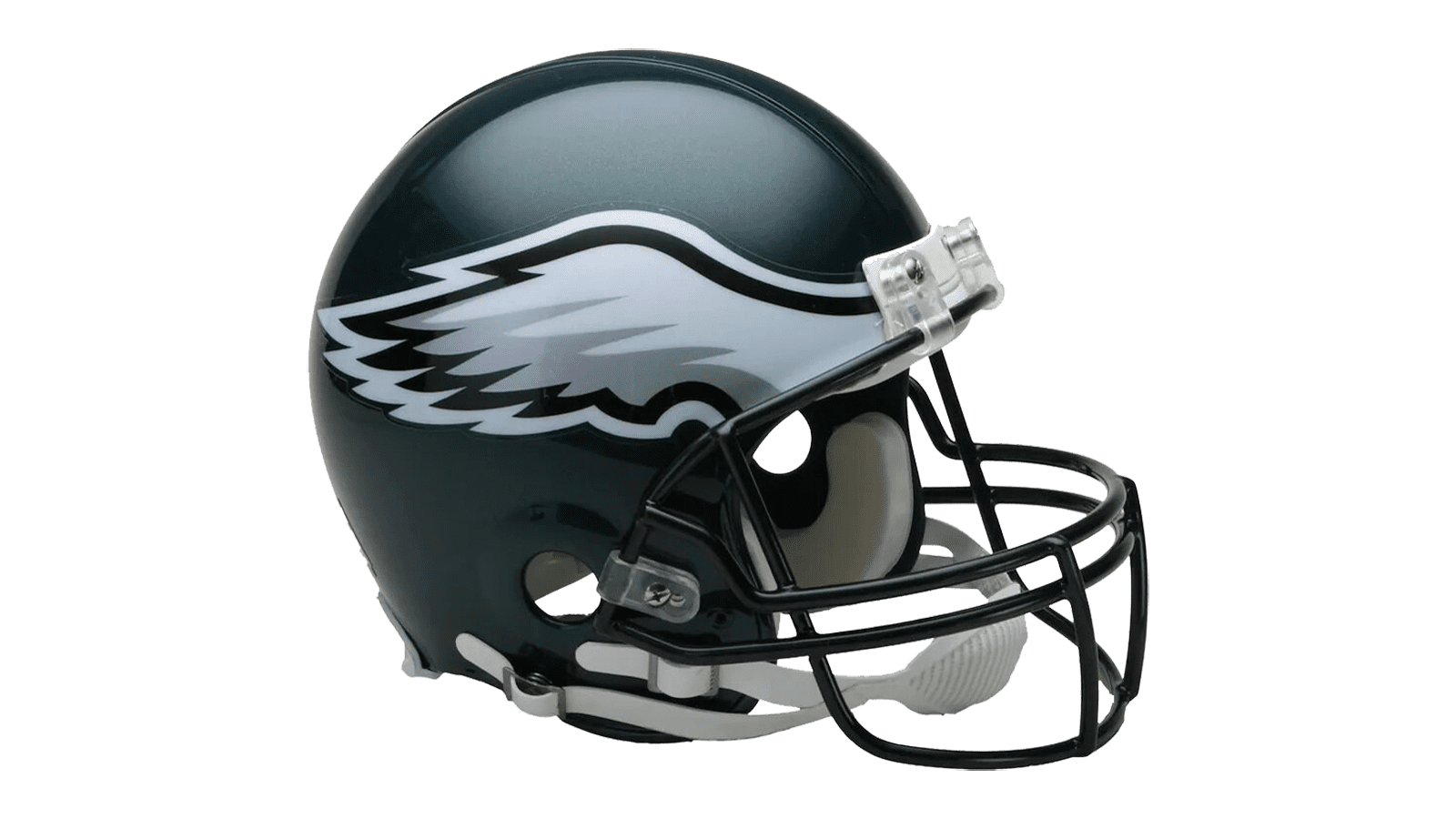
The helmets of Eagles mostly use their iconic bluish-green color. It covers almost the entirety of their headwear, besides the faceguards and the insignia on the sides. These are commonly black. These helmets also have eagle wings emblazoned on their sides – stretching from frontal forehead area to the back of the end on both sides.
These are mainly painted silver – the other common Eagles color. The texture of feathers is underlined by the darker shades of grey, while the outline of the wings themselves is executed in full black. The other layer of outline around the black framing is made in white. This layer grows thicker near the ends of the wings.
Uniform
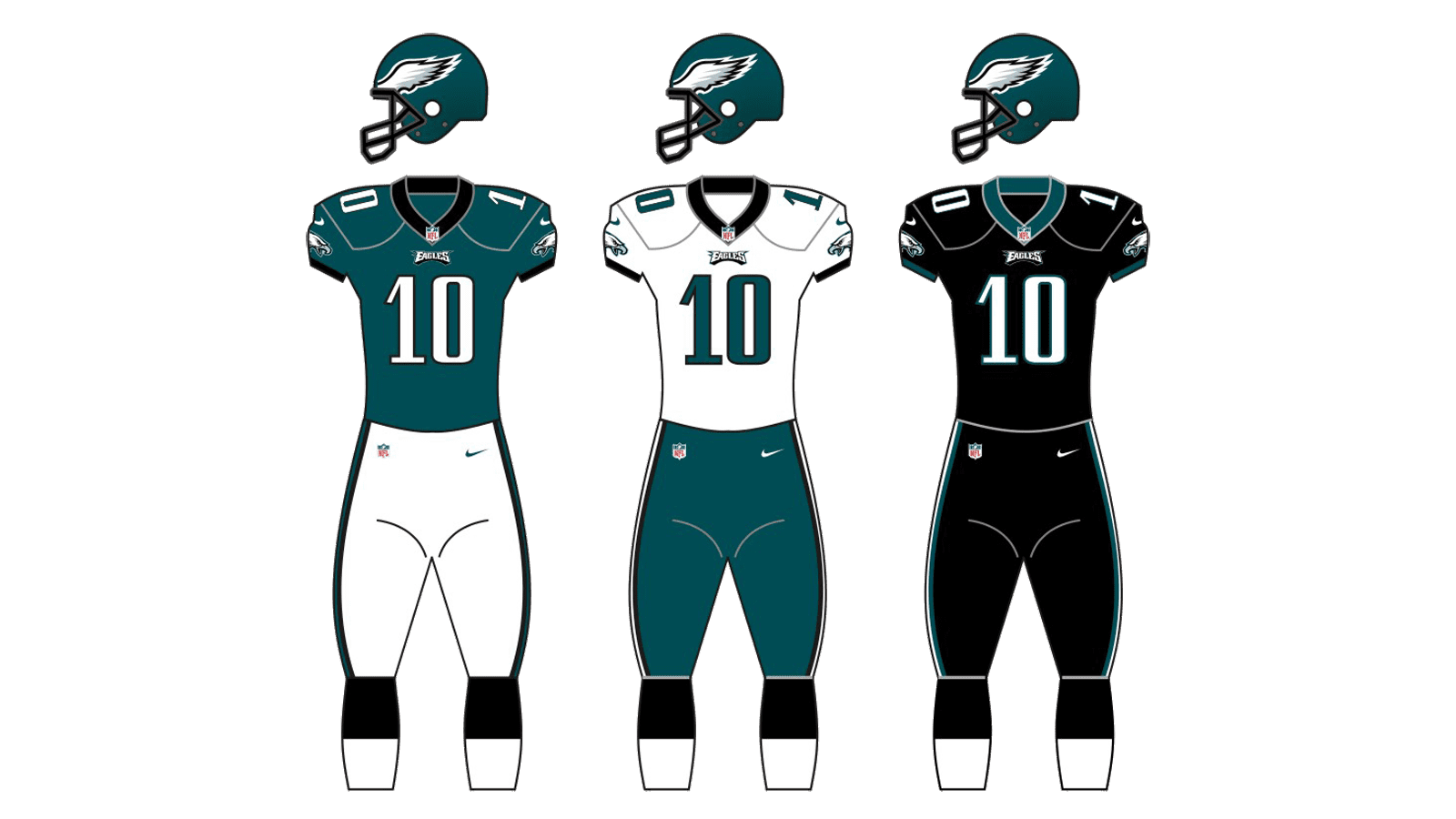
The three main versions of Eagle uniforms follow the same palette of blueish-green, black and white. The main one is a green jersey with white pants, the latter lined on the sides with green & black stripes. The numbers throughout are painted white, while the collar is in black.
The other version is a largely mirrored one – white jersey and green pants with white stripes on the flanks. The numbers are green in this variety. The lesser used variety is an almost fully black sort with white numbers and a green collar.


