Deutsche Bank Logo
Deutsche Bank, headquartered in Frankfurt, Germany, is a prominent international banking and financial services company. It provides a wide range of services, including investment banking, retail banking, and asset management. The bank operates in major markets worldwide, with a strong presence in Europe, the Americas, and Asia. Key stakeholders include institutional and private investors, with no single entity holding a majority stake.
Meaning and history
Deutsche Bank was founded in 1870 in Berlin with the goal of promoting and facilitating German foreign trade. Over the next few decades, the bank expanded its network both within Germany and internationally, opening branches in London, Shanghai, and other major cities.
During the early 20th century, Deutsche Bank underwent significant changes, including mergers with other banks and the acquisition of several regional banks in Germany. This helped the bank to further solidify its position as one of the leading financial institutions in the country.
The post-World War II period saw Deutsche Bank play a key role in the reconstruction of Germany’s economy. The bank was involved in providing loans and financial support to various industries and companies, contributing to the country’s economic recovery.
In the 1980s and 1990s, Deutsche Bank expanded its global presence through a series of acquisitions, including the purchase of the British merchant bank Morgan Grenfell in 1990 and the American investment bank Bankers Trust in 1999.
The 2000s were marked by further expansion, but also by legal troubles and financial crises. The bank was involved in various controversies, including the rigging of interest rates and the sale of toxic mortgage-backed securities.
Despite these challenges, Deutsche Bank has remained a significant player in the global financial industry. Today, the bank provides a wide range of services, including retail banking, asset management, and investment banking, and has a presence in more than 70 countries worldwide.
1870 – 1918
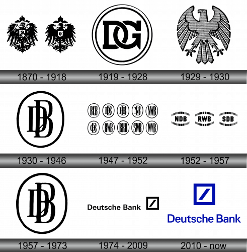
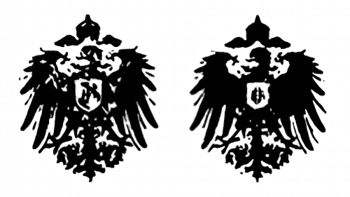
Established in 1870, Deutsche Bank emerged as the brainchild of a collective of politicians and bankers. The logo of the bank mirrored the emblem of the Deutsches Reich, a historic German state that spanned from 1871 to 1918. This emblem featured a regal eagle, its wings unfurled and its head turned to the left in a majestic pose. There were two primary variations of the emblem; the first showcased the eagle adorned with white intricate details, while the second depicted the eagle in a stark black silhouette, contrasted only by the light emblem gracing the chest of the bird.
As the years progressed, the bank evolved and expanded, solidifying its position as a key player in the financial world. It became synonymous with innovation, reliability, and a steadfast commitment to facilitating global trade. Today, Deutsche Bank stands as a testament to the vision and determination of its founders, continuously striving to uphold the principles that have guided it since its inception. The eagle, a symbol of strength and majesty, continues to be an integral part of the bank’s identity, representing its unwavering commitment to excellence and its pivotal role in shaping the financial landscape.
1919 – 1928
The institution known as Disconto-Gesellschaft, founded in 1851, is a historic component of what is now the contemporary Deutsche Bank, with the two financial giants amalgamating in 1929. Prior to their union, Disconto-Gesellschaft stood as one of the most prominent banking entities within the German landscape. It was recognizable by its distinctive logo, featuring the initials “DG” elegantly encased within a circular ring.
The merger marked a pivotal moment in the history of Deutsche Bank, significantly enhancing its capabilities, reach, and influence within the financial sector. The amalgamation brought together a wealth of expertise, resources, and heritage from both entities, creating a powerhouse that has since played a crucial role in shaping the trajectory of Germany’s economic development. Today, Deutsche Bank, with its rich history and a strong foundation built on the legacy of its predecessors, including Disconto-Gesellschaft, continues to be a vital player in the world of finance, contributing significantly to the global economic landscape. This historical merge serves as a testament to the bank’s adaptability, resilience, and commitment to growth and innovation, solidifying its position as a leader in the industry.
1929 – 1930
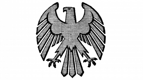
In the momentous occasion that marked the fusion of Deutsche Bank and Disconto-Gesellschaft, the emblematic eagle underwent a transformative redesign. The artists opted for a pristine white palette, significantly altered the bird’s silhouette, and chose to eliminate the coat of arms. This significant change also ushered in a new era for the company, encapsulating its dual heritage with the nomenclature “Deutsche Bank und DiscontoGesellschaft.”
This amalgamation was more than just a union of names; it symbolized the convergence of two financial powerhouses, each bringing its unique strengths, values, and history to create a unified entity poised to take on the challenges of the modern financial landscape. This new identity was not just a visual representation but also a testament to the bank’s commitment to innovation, excellence, and a shared vision for the future. Today, the legacy of this historic merger continues to resonate, with Deutsche Bank standing tall as a testament to the enduring power of collaboration, adaptation, and strategic evolution in the ever-evolving world of finance.
1930 – 1946
During the 1930s, a significant shift in branding occurred when the bank decided to refresh its logo, moving away from the eagle imagery and introducing a new design featuring the monogram “DB” encased within an oval shape. This alteration bore a resemblance to the vintage brand identity of Disconto-Gesellschaft, effectively intertwining the past with the present.
This transformation was not merely a visual change; it was a symbol of the bank’s evolution and its commitment to staying relevant in the ever-changing financial landscape. The new logo encapsulated the essence of both Deutsche Bank and Disconto-Gesellschaft, serving as a reminder of their rich history and shared values. As the years progressed, the bank continued to expand and diversify its services, solidifying its place as a leading global financial institution. The “DB” emblem became synonymous with innovation, excellence, and a steadfast dedication to serving its clients’ needs. It represents a bridge between the bank’s storied past and its dynamic future, embodying the bank’s mission to drive economic growth and foster financial stability worldwide.
1947 – 1952
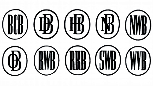
Post-World War II, the financial firm found itself teetering on the brink of collapse. This precarious situation, compounded by political pressures, necessitated the segmentation of the institution into ten distinct entities. Every independent unit was endowed with its unique emblem, meticulously crafted to echo the aesthetic essence of the Deutsche Bank logo. This gave rise to a harmonious collection of monograms, each encased within an oval frame. The initials for these emblems were derived from the names of the regional organizations they represented, such as BCB, NWB, NB, HB, and DB.
This segmentation, while a product of necessity, illustrated the bank’s resilience and adaptability in the face of adversity. It also highlighted the importance of regional identity and the need to maintain a sense of unity, even in times of division. These emblems, while distinct, were bound together by their common design elements, serving as a visual testament to the bank’s enduring legacy and its commitment to overcoming challenges. Today, Deutsche Bank stands as a testament to the power of resilience, adaptability, and the unwavering pursuit of excellence, with its history serving as a rich tapestry that tells the story of its journey through time.
1952 – 1957
The Deutschland Bank logo, unveiled in 2010, elegantly builds upon its predecessor, boasting a more succinct and vibrant design. It features a square emblem delineated by a thick blue border, bisected by a diagonal line in a matching shade of blue. This emblem has transcended its graphical form to become an iconic symbol, so potent in its brand association that it renders lettering obsolete. It serves as a visual testament to the bank’s foundational pillars of strength, stability, and financial acumen.
The amalgamation of blue and white in the logo’s color scheme is not merely an aesthetic choice. Rather, it is a deliberate representation of the bank’s core values, with blue symbolizing trustworthiness and wisdom, and white embodying purity and precision. This color palette is a nod to the bank’s steadfast commitment to its clientele, reflecting the bank’s promise to uphold the highest standards of integrity, excellence, and loyalty in all its financial dealings. The emblem, in its essence, encapsulates the bank’s rich history and its forward-looking approach, standing as a beacon of the bank’s prestigious position in the global financial landscape.
1957 – 1973
The year 1957 marked a significant chapter in the bank’s history as the three successor entities amalgamated, heralding the renaissance of the classic Deutsche Bank. With this merger, the iconic symbol from the 1930s – a monogram “DB” ensconced within a white oval encircled by a black outline – was also revived.
This emblem is more than just a logo; it is a testament to the bank’s rich heritage and its unyielding resilience through myriad challenges. It stands as a beacon of the bank’s commitment to its roots while also symbolizing its ongoing evolution and adaptation in the dynamic financial landscape. The return of this old symbol marked a full-circle moment for Deutsche Bank, solidifying its identity and underlining its commitment to uphold the values and principles that have guided it since its inception. Today, as Deutsche Bank continues to navigate the complex world of finance, this symbol remains an integral part of its identity, representing a blend of tradition and innovation that is the hallmark of its success.
1974 – 2009
In a strategic move to underscore its global reach, the bank’s executives spearheaded an initiative to revamp its visual identity. This culminated in a logo design competition in 1972, with a reward of 3,000 German marks awaiting the participants. The competition drew in eight graphic artists, including the likes of Coordt von Mannstein, Armin Hofmann, and Anton Stankowski. On February 6, 1973, a jury led by esteemed designer Jupp Ernst crowned Anton Stankowski as the victor, awarding him a handsome 100 thousand marks for his innovative square diagonal line design.
Before being unveiled to the public, the new brand name was first introduced to the bank’s employees via its in-house magazine, Deutsche Bank. Its public debut followed at the annual press conference in April 1974, where the world got its first glimpse of what would become an iconic symbol synonymous with Germany’s financial sector.
Despite its eventual success, the simplistic design initially received mixed reviews. Some media outlets criticized Stankowski, stating that he had “earned 100,000 marks with five strokes.” This was, however, a misrepresentation as his studio had submitted a total of nine projects, including several iterations featuring the letters “DB.” The truth was that Stankowski’s work was a result of thoughtful consideration and artistic innovation, reflecting the bank’s commitment to modernity and global prominence.
2010 – Today
Following a subtle yet impactful design evolution, the text “DEUTSCHE BANK” was omitted, and the square along with the forward slash adopted a rich blue hue. This refreshed emblem, while distinct in its modernity, conceptually resonates with its predecessor, firmly retaining its place as one of the most recognizable and iconic symbols in the realm of finance.
The blue color introduces a contemporary and dynamic element to the logo, symbolizing trust, depth, and stability—qualities that are synonymous with Deutsche Bank’s values and ethos. This transition is not merely a visual update; it is a testament to the bank’s commitment to evolving and adapting in tandem with the changing times, while also paying homage to its rich heritage and legacy. The new logo stands as a beacon of the bank’s resilience, innovation, and unwavering dedication to excellence, serving as a powerful representation of its prestigious position in the global financial landscape.
