Disney Channel Logo
The Disney Channel is a channel for kids as well as teenagers, with the richest collection of full-length cartoons, modern animated series, and movies, programs for viewers of all ages about fashion, lifestyle, and family shows. The audience of Disney Channel likes the content so much that they are ready to watch Disney Channel all night and all day. After all, the kids can see all the delights of the life of Disney characters on this channel.
Meaning and History
Owned by The Walt Disney Company, Disney Channel is a cable television channel specializing in children’s television programs based on original series and movies. The audience of the channel is mainly children, but in recent years the channel has also become popular among teenagers and young families. The original Disney channel is available primarily on cable and satellite television. In addition, there is a DisneyChannel.com website, which has been broadcasting in high definition since March 19, 2008.
What is Disney Channel?
Disney Channel is an entertainment channel for the whole family. It broadcasts popular animated and feature series for children and families, classic Disney animation, Disney Channel original movies. This entertainment channel for the whole family is now available in many countries.
1981 – 1982
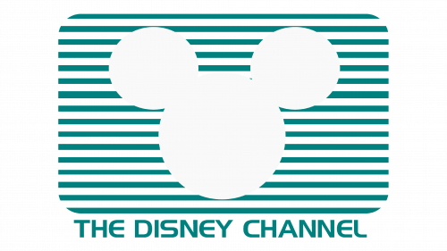
The logo, used by the Disney Channel at the beginning of the 1980s featured a blue and white composition, with the laconic white silhouette of the Mickey Mouse head drawn on a striped horizontally oriented rectangle with rounded corners. The circular ears of the famous animated character were slightly detached from the rounded head. The graphical emblem was underlined by the full name of the channel, written in the capitals of a medium-weight sans-serif typeface.
1982 – 1986
A white filled icon of a Mickey Mouse head represented the Disney Channel during the first years of its existence. It was set against stripes of blue and white color. The stripes formed a rectangle with rounded corners, which looked like a TV screen. Under this rectangle, there was the channel’s name, which was printed in all uppercase letters using the same blue. The design was simple and clearly showed who is the main audience of the channel.
1986 – 1997
Several years later, the logo was rebranded. Now, it had a black and white color scheme. The basic idea was the same though. The striped TV screen had wider black strips and thin white strips. A new font was used to write the name of the channel with the first letter being capitalized. The word “Disney” was written using an interesting typeface that Disney Channel has used since then.
1997 – 2000
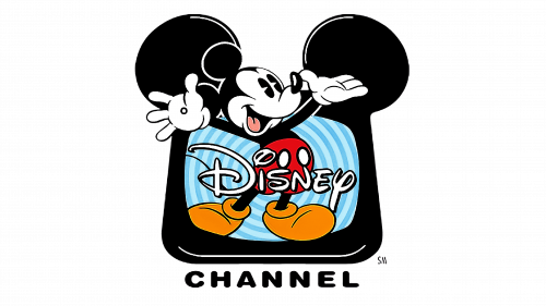
Disney went all out when it was designing this logo. It still featured a TV, but this time, it had large black ears that reminded of Mickey Mouse and a thick black border. The main element, though, was a happy Mickey Mouse that was walking out of the blue TV screen with its hand raised in awe. It had bright yellow shoes and red shorts. The word “Disney” was written across the TV screen over the mouse in white, while the “Channel” was added under the screen and had capital simple black letters.
1999 – 2002
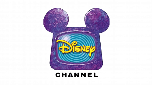
The TV with ears was painted different shades of purple and bits of blue in metallic colors, while the word “Disney” was written in bright yellow. There was no more Mickey Mouse. Otherwise, this version reminded of the logo created in 1997.
2002 – 2010
This Disney logo featured its wordmark written inside of Mickey Mouse’s head. The head was a white icon with sky blue contouring of various thickness.
2010 – 2014
The channel gave the logo a slightly different spin. The icon of a well-known Disney character was now peaking from an almost square TV screen, which had a relatively thin blue border and white screen. It was exactly the same Mickey Mouse with the name of the channel written across its forehead that the fans saw in the previous emblem, only now it was not fully visible.
2014 – 2017
The emblem was updated over again. It was just the name of the channel written in white and set against a blue gradient background. The “Disney” was using its now trademark font, but two round ears were added to the dot above “i” to make it look like a Mickey Mouse. The word “Channel” was still written in all uppercase letters but used a funkier font.
2017 – 2019
The gradient and shadows were removed from the logo to make it look more modern and cleaner.
2019 – 2024
It was not long before the color was brought back. It filled about two-thirds of the word “Disney” going from the bottom and gradually fading into white. The background was also changed to a deep blue for more contrast. Such adjustment was more than appropriate considering that the main audience of this channel is children and teenagers who typically love the color.
2024 – Today
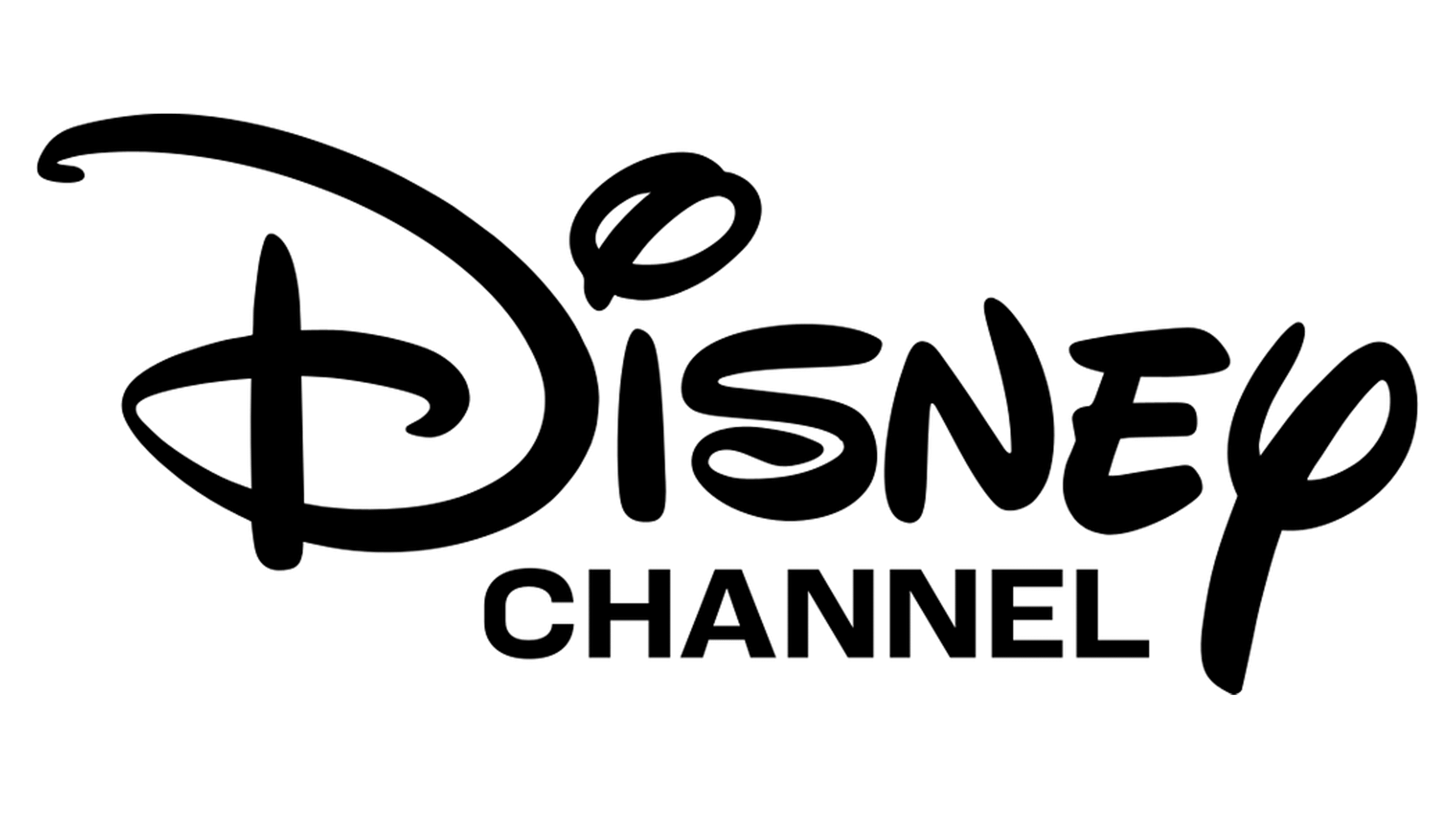
In 2024 the Disney Channel logo was redrawn according to the modern trends of minimalism and simplicity. The idea remained the same, however, the color palette was changed to plain black-and-white, and the outlines were erased from the the concept. The new logo features a bold Disney logotype, written against a clean white background and accompanied by a modest uppercase “Channel” in a modern geometric sans-serif font.
