Dollar General Logo
Dollar General sells all kinds of merchandise, from toys and light bulbs to clothes and shampoos, much like Walmart. The key difference is the extremely low prices. Dollar General operates smaller stores than competitors such as Walmart and typically focuses on low-income areas where there is little competition from large retail and grocery stores. Such a strategy allows it to occupy a niche that is of little interest to large format players. Due to little competition in this niche, the profitability of the business is higher and it is easier to expand, which this chain has been successfully achieving.
Meaning and History
![]()
Dollar General Corporation was founded in 1939 by James Luther Turner and his son Cal Turner and was known as JL Turner and Son. In 1955, the name changed to Dollar General Corporation, and in 1968 the company went public on the NYSE. As of 2020, Dollar General Corporation operated almost 20 thousand stores in most US states. Dollar General first introduced the pOpshelf concept at the end of 2020. The new retail store offers the vast majority of its merchandise for $5 or less to make the shopping experience fun and affordable.
What is Dollar General?
Dollar General Corporation, a retail chain, provides a variety of products at an affordable prices. The company is ranked 15th on the PG 100, Progressive Grocer list of the top food and merchandise retailers in North America as of 2021.
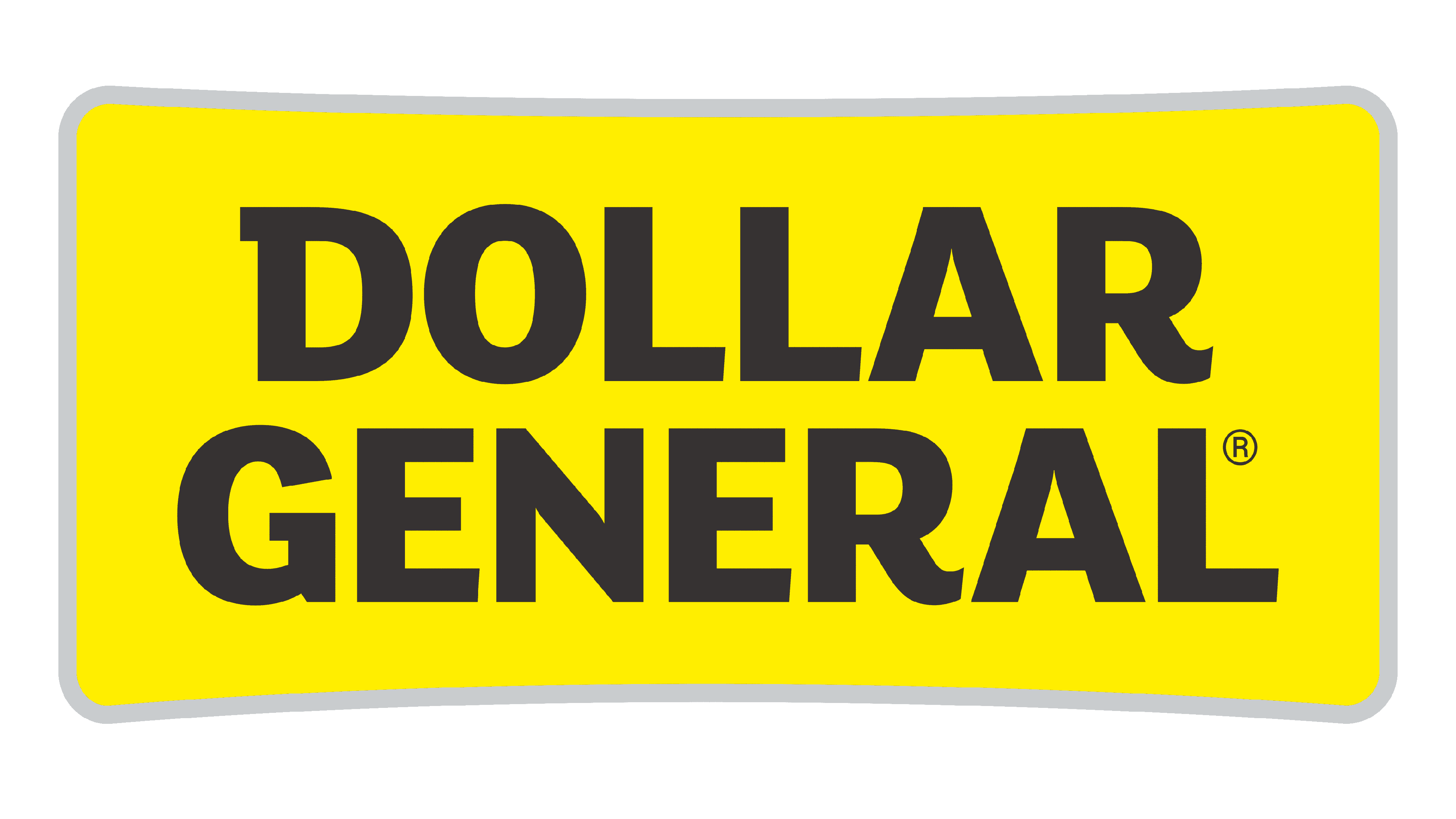
1955 – 1972
![]()
To go with the name, the company used coins and a banknote as a base for the logo. The coins were aligned in a straight line at the top and each held a letter of the word “Dollar”. The $1 banknote was tacked under the coins and had “General Stores” written across. The inscription was done using bold, sans-serif, all-uppercase lettering. To fit the second line on the banknote, the letters were made smaller compared to the first line. The emblem was black and white.
1966
![]()
A simpler version was introduced in 1966 and served as an inspiration for all the other logos. A thin black border framed the company name, which was now placed in one line. The lettering was black and featured a sans-serif font that slightly differed from the original. Although all the letters looked uppercase, the first one in each word was made larger.
1966 – 1967
![]()
Similarly to the previous version, the name was placed in one line. This time, the colors were flipped. In addition, all the letters were now the same size, so the emblem became one long, thin rectangle.
1967 – 1972
![]()
The main change to the previous logo was the way the name was done. It was a light gray color and the new font featured more vertically elongated lettering. The letters were also spaced closer, which created a more balanced overall appearance of the logo.
1972 – 1984
![]()
The original idea was brought back with some modifications. First of all, the designers removed the background. The font was also updated and the letters now appeared to have a more rectangular form with rounded corners. Letters “D” and “R” also acquired small strokes at the top, which added some uniqueness and interest.
1984 – 1995
![]()
A yellow color was introduced into the brand image. It was used for a rectangle with rounded corners that held the name of the company. The designers used the same font as previously but placed the second line next to the first, stacking the two words. To complete the picture, the emblem had a thin black border.
1995 – 2009
![]()
The logo now featured only “Dollar General”. Since the name was shortened, there was no need to have two lines. The frame was also gone and the corners of the yellow rectangle were straight.
2009 – Today
![]()
A modified logo did not look drastically different from the previous version. Yet, there were some notable differences. First of all, it was the shape of the emblem, which now not only had rounded corners but also looked curved towards the inscription in the center. The font has also been changed bringing back rounder letters while preserving the serif element in the letter “D”.
Font and Color
The yellow color used for the base since 1984 has served as a good contrasting color for the back lettering and instantly attracted attention. Before that, the company used a black-and-white color palette, which looked professional, but not as welcoming. The font has also been kept quite simple, but the bold lines and color choice made it look nice. The simplicity of the lettering made the brand seem more accessible and in line with its values.


