Dynamics 365 Logo
Dynamics 365 is a collection of intelligent business applications. This is a system that combines ERP and CRM in the cloud. It was created by Microsoft to provide maximum flexibility and the ability to expand. These are not just two separate systems, but both systems at once. It contains tools for managing sales, marketing, service, and business processes. It is possible to work with the system directly from Outlook.
Meaning and History
At the start of its development, Dynamics 365 products were developed by other companies that Microsoft systematically absorbed. The history of some products in Dynamics 365 begins in the early 80s (e.g. Navision, bought in 2002, was founded in 1983, Copenhagen). Until 2016, the product line was collectively known as Microsoft Dynamics CRM. The version was indicated by the year, for example, CRM 2013 or CRM 2016. The products later began to be called along the lines of “Microsoft Dynamics 365 for Finance and Operations”. Since 2021, it is known as simply Dynamics 365.
What is Dynamics 365?
Dynamics 365 is a family of Microsoft software products under the same name. The products themselves are internally divided into two categories: CRM (customer relationship management) and ERP (enterprise resource planning) applications.
2009 – 2012
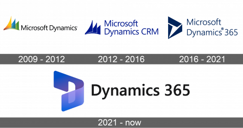
The first logo of this Microsoft product featured the name of the product along with a colorful emblem to the left of it. The latter consisted of three curved triangles slightly overlapping each other. The top one had a red and orange gradient, the second one was blue, and the last one featured a green color. The inscription was done in a sans-serif font of black color.
2012 – 2016
There was not much change in the logo as the designers wanted to preserve the original appearance while reflecting the new name of the product. The triangles were all a solid, deep blue color just like the name. The product name was now written in two lines and featured the abbreviation “CRM” at the end.
2016 – 2021
A few years later there was a name change again. Although the company preserved the font, the letters were spaced more widely. “CRM” was replaced by “365”. There was no more three triangle illustration. Instead, the designers added a geometric shape made up of two triangles and a trapezoid shape.
2021 – Today
The next logo looked more modern and futuristic. The name was once again written in one line and stated “Dynamics 365”. It was accompanied by an image that resembled a curved rectangular stripe of a blue color with a door.
Font and Color
The company used the same sans-serif font in all of the variations of its logo. It resembles the Segoe typeface. Although initially the logo was quite colorful, representing all the applications the product contains, later Microsoft stuck to a classic blue. It symbolizes stability, loyalty, and trust.
