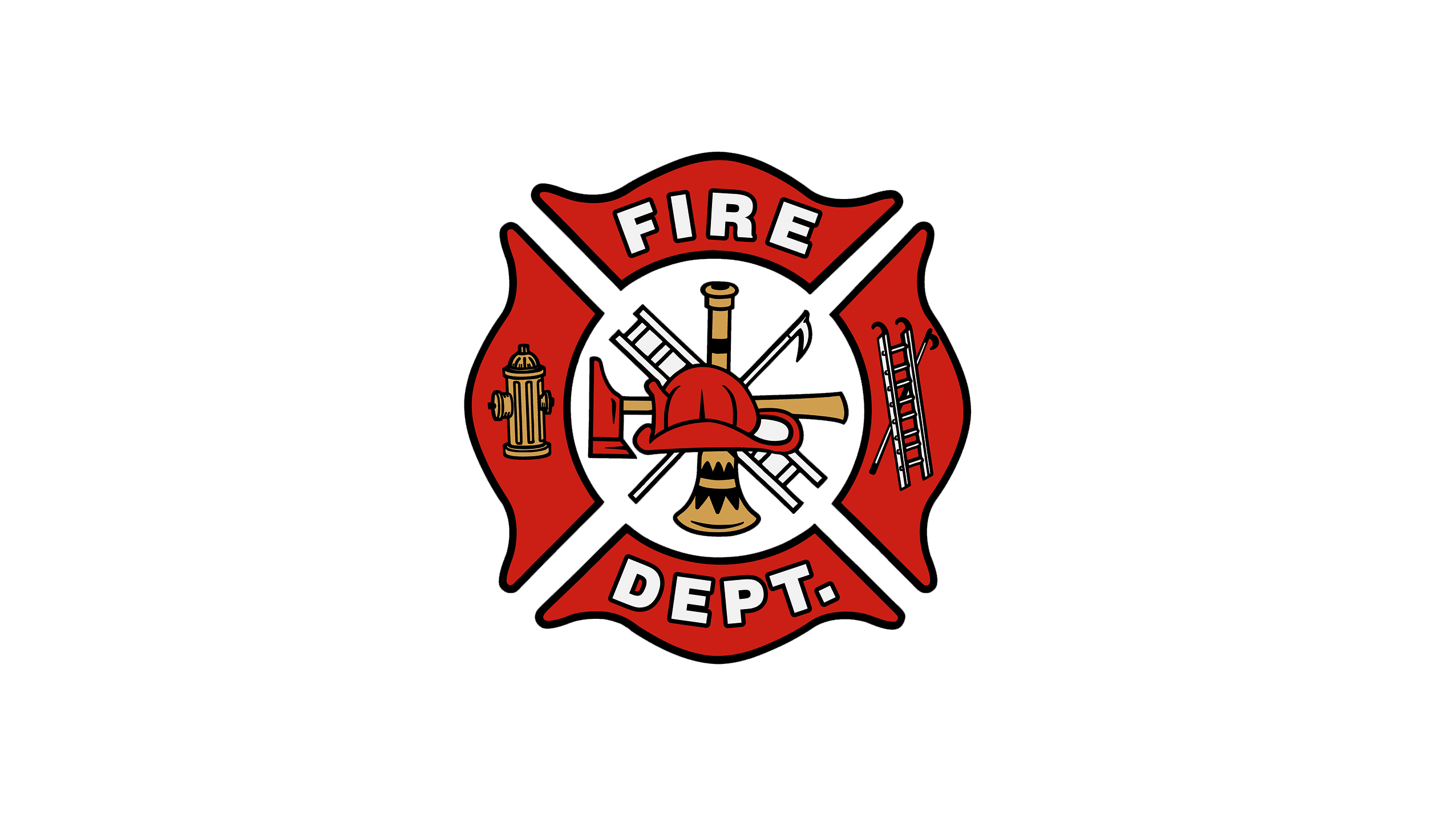
Fire Department Logo
The Maltese Cross, which serves as the Fire Department logo’s center element, symbolizes courage, bravery, and protection. Its significance dates back to the 11th century when a group of knights from all over Europe gathered in Jerusalem to create a hospital for pilgrims. These knights became known as the Order of St. John. They vowed to protect the sick and weak. Their emblem was a white cross on a black background. The Maltese Cross has also been adopted by firefighters and first responders as a symbol of their profession. It is a testament to the bravery and dedication of those who risked their lives to protect others.
Meaning and History
Before the fire department was established in the 17th century, communities handled fires on their own. Cities expanded and the extent of fire devastation increased. Self-propelled firefighting squads were made possible by advancements in mechanical engineering, while firefighting tools continued to improve and become more effective. Benjamin Franklin is largely credited for founding the nation’s first volunteer fire brigade, which would eventually grow to become the Union Fire Company. Fire clubs or cooperatives were established as early as 1736 to defend the volunteers’ own residences. Government-run fire services did not exist in the US until the American Civil War. The first full-time professions in fire department were established at the beginning of 1853, in Cincinnati, Ohio.
What is a Fire Department?
Founded as the Union Fire Company at the beginning of the 17th century, the Fire Department became responsible for preventing and fighting fires. Besides fighting fires, the firefighters help people during other emergencies, including floods.
Today
The Fire Department logo is based on a Maltese Cross, which has been used since the 11th century as a symbol of bravery and commitment to helping people. It is done in red, and the pointed ends remind of fire flames. A fire hydrant is placed on the left, while a ladder is added on the right side. A bold, sans-serif font of a white color with a black outline is used to print “Fire Dept.”, split between the top and bottom. The center had a white circle with multiple firefighting tools, including an ax, ladder, and a helmet. The logo had a lot of symbolism and every element is intentional and instantly associated with the firefighting.
Font and Color
The logo is done in red, white, golden, and black. The red color serves as the main color, which not only attracts attention but also makes an association with fire and creates caution. Red is the color of life, sun, and fire. This emblem is also presented in a black-and-white color palette.
When it comes to the font, the designers chose a simple font with clean and straight strokes to make the inscription easily readable. This purpose is supported by the bold lines and absence of serifs.


