Ford Bronco Logo
Ford developed the Bronco, an iconic vehicle. This creation emerged in the United States. Aimed at adventure enthusiasts, it offers robust performance. The Ford team crafted it with versatility in mind.
Meaning and History
Ford Bronco, an iconic SUV, debuted in 1966, catering to off-road enthusiasts. Initially, it introduced a new niche in the automotive market, embodying ruggedness and adventure. Through its production years, it saw multiple design transformations, evolving from a compact SUV to a larger family-friendly vehicle by the 1990s. Despite its popularity, Ford discontinued the Bronco in 1996, shifting focus to the more profitable Expedition. Ownership changes weren’t notable, however, Ford’s strategic decisions heavily influenced the Bronco’s journey. In 2020, after a long hiatus, Ford revived the Bronco, tapping into nostalgia while integrating modern technology and design. This comeback reflected Ford’s recognition of the enduring appeal of the Bronco and its significant place in American automotive culture. The Bronco’s legacy is marked by its adaptability and lasting impact on the SUV market.
What is Ford Bronco?
The Ford Bronco stands as a testament to rugged durability and adventurous spirit. It’s a vehicle designed for those who crave exploration and outdoor adventures. With its rich history and modern revival, the Bronco continues to captivate enthusiasts worldwide.
Before 2020
The emblem features a bold, black silhouette of a horse in mid-gallop, symbolizing power and freedom. “Bronco” stands out in a sweeping, stylized font. Golden outlines highlight the black letters, adding a touch of elegance. The dynamic posture of the horse conveys movement and strength, integral to the Bronco brand’s identity. This logo merges ruggedness with sophistication, embodying the essence of the adventurous vehicle it represents.
2020 – Today
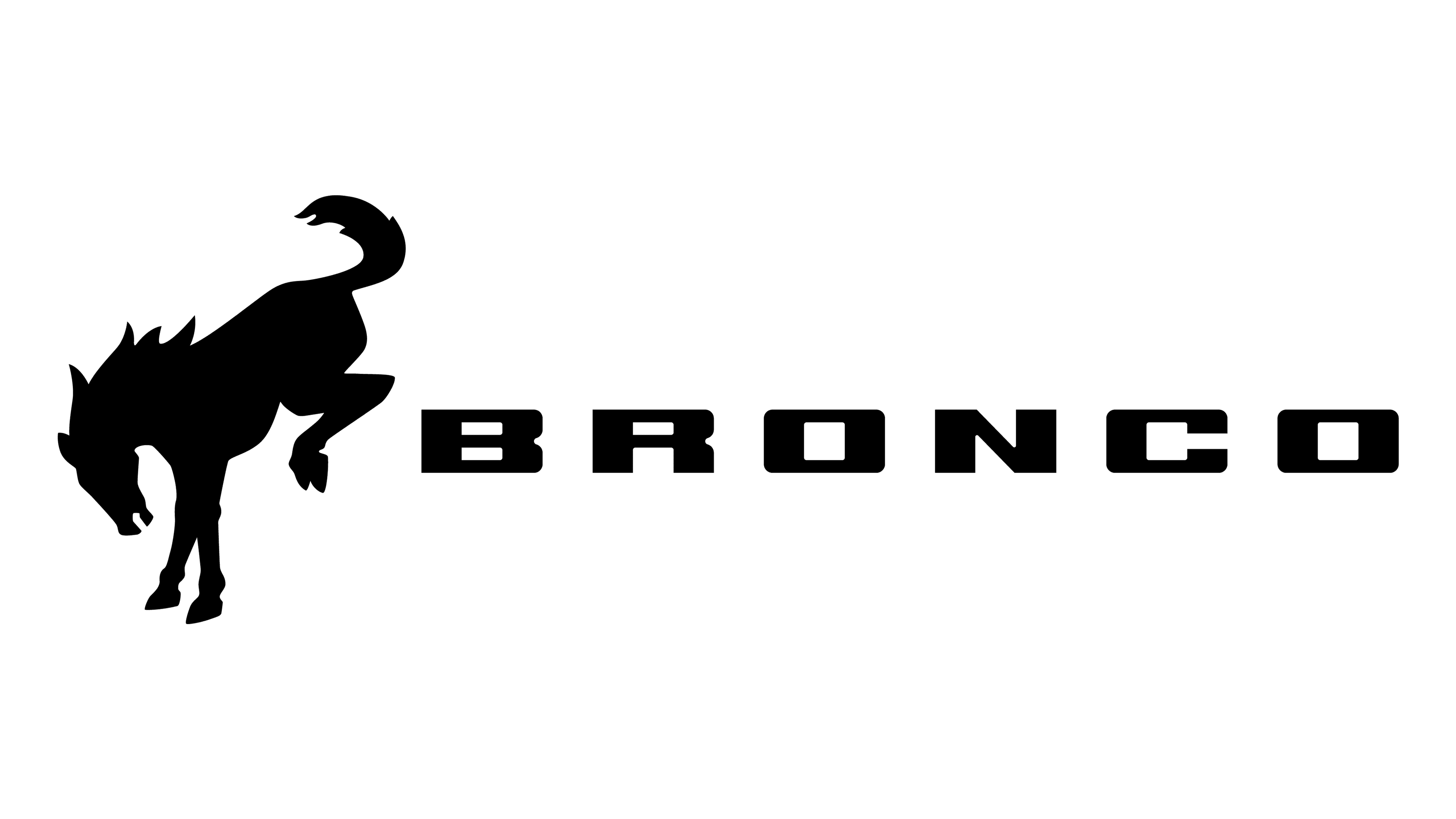
The logo captures a stark, black-and-white theme, forgoing the previous golden flair. It boasts a bolder, more simplified design. The horse’s silhouette stands alone, powerful and unrestrained, preceding the “BRONCO” text. The font is stark, with clean lines that suggest modernity and strength. This minimalist approach reflects a contemporary aesthetic, focusing on the essence of the Bronco brand’s rugged spirit.


