Kit Kat Logo
Crispy wafer bar Kit Kat is widely known and easily recognizable all over the world. This treat was created by the British at the beginning of the last century and still has not lost its popularity, being also a symbol of rest, a break from work. The Kit Kat brand offers not only original bard divided into two or four pieces. Some series were produced in limited quantities, while some lines were abandoned due to lack of popularity and profit.
Meaning and History
The first Kit Kat appeared in the UK in 1935 when the Rowntree company began to produce it. In 1989, the company was taken over by Nestle, which planned to sell Kit Kat worldwide. For a decade, it actively promoted bars in other countries and eventually achieved second place in recognition. Ten years later, a new large KitKat Chunky and later Double Cream appeared on the market, but the excitement has soon noticeably dropped and sales of the classic KitKat have also declined. Trying to get out of the crisis, the company resorted to expanding the range of flavors. By 2005, the company was facing a new crisis. After surveying the consumers, it left only classic caramel and tiramisu flavored bars, getting rid of all exotic ones.
What is Kit Kat?
Kit Kat is a series of chocolate bars sold in many countries. The rights to produce Kit Kat belong to two companies. Nestlé SA occupies the global confectionery market, while Hershey’s distributes chocolate bars only in the United States thanks to a license.
1935 – 1937
The logo of the Kit Kat brand, as it is known now, was part of the packaging. The brand’s name is done in white which beautifully popped against the saturated red color of the packaging. The word “Rowntree’s” arched at the top while “Chocolate Crisp” was written in larger letters in a straight line. The letters looked like they were stenciled and were positioned very close to each other.
1937 – 1942
The new logo reflected the name change. The company kept the “Chocolate Crisp” line unchanged. The “Rowntree’s” was changed to “Kit Kat”. The name was placed in a solid white oval. The letters were red like the wrap. Both “K’s” are not only taller than all the other letters, but they also extend below them.
1942 – 1945
During the war, the Kit Kat company was forced to use dark chocolate due to a lack of milk. Thus, it changed the packaging to dark blue. The centerline said “Kit Kat” in large capital letters using a classic font. Above it, the logo said “Rowntree’s”. It was done using delicate, italicized letters written in a straight line.
1945 – 1988
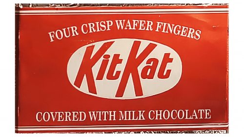
Once the war was over, the company returned to its well-recognized red packaging. It also brought back a logo it has used before. It was the white oval emblem with “Kit Kat” written inside of it. This element was enlarged and placed in the center of the packaging. Other than the specification of the product written above and below the logo, the packaging did not have anything on the front side of it.
1988 – 1995
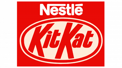
The logo was updated at the end of the 1980s when Nestle purchased the company. The brand added a white border around the oval shape that was placed at some distance, so the red packaging color created a look of a double border. Above the emblem, it stated “Nestle” in white printed letters with the first one being uppercase. The top of the “N” extended to the right all the way to the end with “T” and “L” crossing it.
1995 – 2004
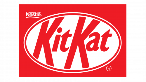
The logo underwent a redesign and the emblem was turned slightly diagonally. The red border popped thanks to highlights that gave it a 3D feel. The “Kit Kat” also looked different thanks to gradients that gave it some volume. The word “Nestle” looked much smaller and was placed in the upper left corner right above the oval shape. There was also a wavy line underneath it. The update made a familiar emblem look bolder and full of energy.
2004 – 2017
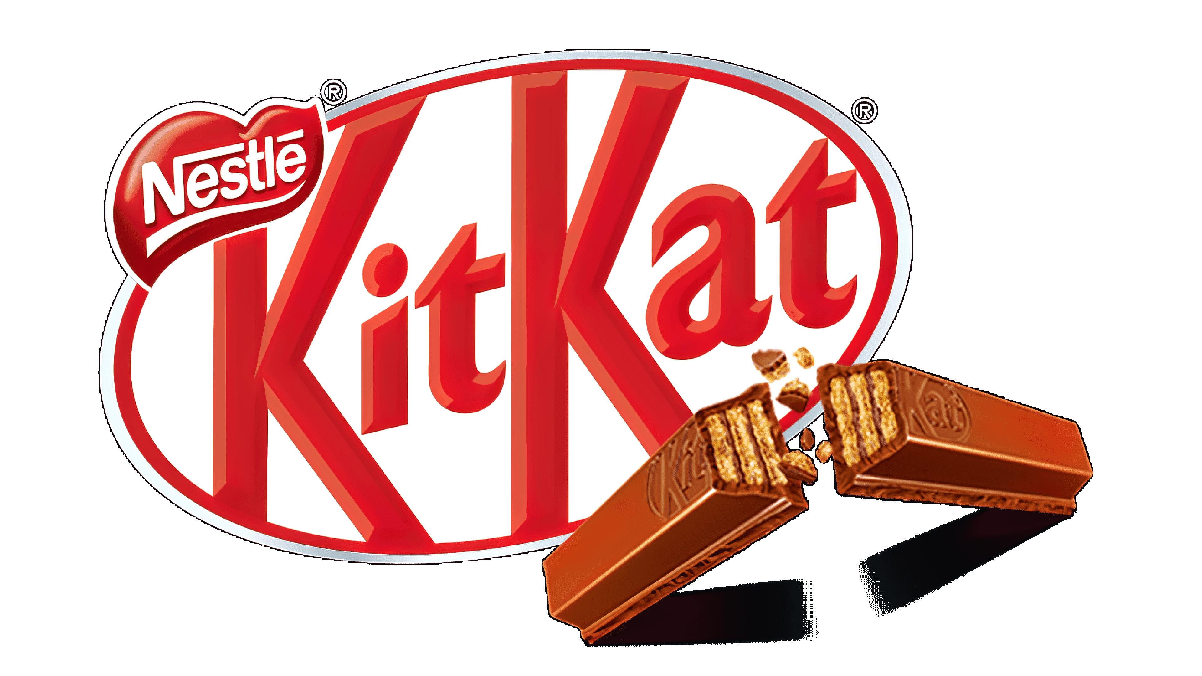
The company further improved its logo and added even more highlights to the wordmark. The word “Nestle” now looked more like it was part of the whole emblem. It was placed on a shape that resembled a heart, which slightly overlapped the oval border and the top of the first letter. The heart also had a gradient that gave it a 3D look. Moreover, the oval shape acquired a second red outline that looked darker and thicker and as if it was part of the heart.
2017 – Today
Although the “Kit Kat” still had a 3D feel, the white highlights were removed and only a darker border was left. There was only one red border that had even thickness and color. The heart shape with “Nestle” was kept the same.
