G20 Logo
While the G7 is made up of wealthy countries, the G20 features leaders from both developed and emerging market economies to represent a broader range of opinions. In addition, G20 meetings are usually attended by representatives of various international organizations. The G20 does not have a formal leader or a permanent secretariat. Instead, a chair country is responsible for organizational work and the agenda. The change of chairmanship takes place at the end of each year. Traditionally, representatives of different countries are invited to each summit. Only Spain has the status of a permanent guest.
Meaning and History
The idea of creating the G20 was first announced at a meeting of G7 finance ministers in 1999. It emerged the same year after the Asian financial crisis, as people came to the realization that the countries with emerging market economies were not adequately represented in the global economic discussions and decision-making of the G7. Until 2008, the group did not hold summits at the level of heads of state. Its main form of activity was annual meetings at the level of finance ministers, heads of central banks, trade representatives, and anti-corruption working groups. The name comes from the fact that the G20 consists of 19 states and one region – the European Union.
What is G20?
The Group of Twenty is a forum that brings together officials from countries with the most developed and developing economies. G20 member countries account for over 80% of world production and trade, as well as 65% of the world’s population.
2008
April 2009
The emblem for the second summit after G20 transitioned to a new level had a lot of meaning. For the background, they chose a realistic image of the Earth that blended into a darker background of the rectangle. A sun peaking from behind symbolized new possibilities for the whole planet. In the bottom half aligned to the left, there were several lines with text. The first two had a large, sans-serif font, and all capitalized letters. It stated the location and year of the summit. The next line specified the main goals – stability, growth, and jobs in a smaller font. The last line gave a link to the website.
September 2009
This logo is very minimalistic compared to the previous version. It uses a white background with the inscription, which says “The Pittsburgh Summit 2009”. The article is printed in small gray letters and placed along the vertical line of the “P”. The rest of the name is split in half and aligned in such a way that “2009” starts right under the letter “G”. The latter is done in gray, just like the “20” underneath. It was a nice way to say “G20” without printing it separately. The rest of the emblem is done in blue, a color of stability and trustworthiness. A link to the website with relevant information is printed in small font at the bottom.
June 2010
A logo for the year 2010 held in Canada had an abstract drawing of one of its main attractions in Toronto decorating the top of the emblem. At the bottom, it stated “G20 Toronto” in graying blue with G20 being bold and separated from the other word by a red maple leaf. Right underneath, the emblem specified the country and year in smaller font.
November 2010
That same year, another emblem was created for a summit in South Korea. It had a red and blue flag hanging from a light gray tree branch. A white line was separating the two color blocks and the sun was as if peeking through a crack. It reminded of the logo created in 2009. Summit details were printed on the right in four lines. It stated “G20 Seoul Summit 2010”. Like in previous versions, the designers used blue for the inscription.
2011
An iconic Eifel Tower leaves no doubt where the summit was held. If one still wonders, it says “G20 France 2011” in the upper right corner. It looks like there was an agreement to use blue for the inscriptions. Another feature that made a connection with other logos is a sun peaking behind the tower on the right. The Eifel tower was done in a gradient, going from blue at the bottom to red at the top.
2012
A summit in Mexico was marked by a square blue emblem. Two-thirds are taken up by a decorative diamond featuring a traditional Mexican pattern with a bright yellow center. At the bottom, it says G2012 with the G20 portion being done in white and the other in light blue. The next line stated the location in yellow, serif font using all capital letters.
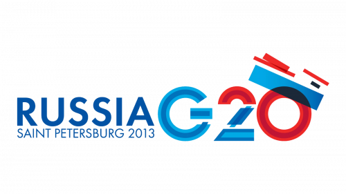
2013
A summit held in Russia was done in Russian flag colors. The “Russia G20” inscription was printed in two lines using two shades of blue and two shades of red. There was an image that resembled a boat in the upper right corner.
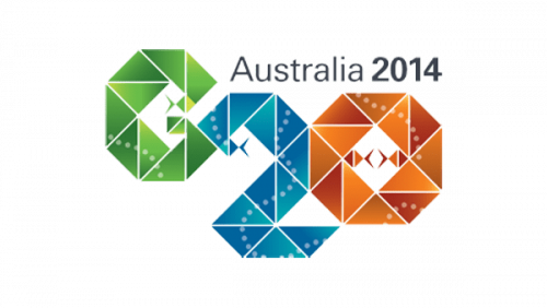
2014
The Australian emblem is geometric and sophisticated at the same time. Each letter is formed using triangles. The latter are colored using a gradient of the same color. G20 features green, blue, and copper colors. Right above, it states the location and year using a basic, black font.
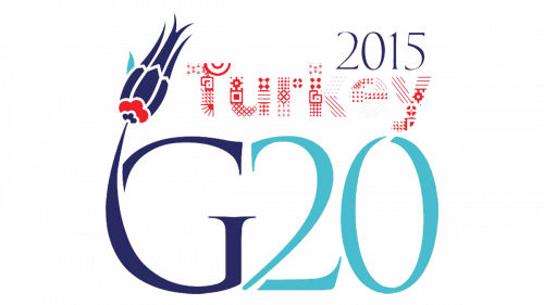
2015
Just like India, Turkey used its national flower, the tulip, as part of the logo. It was blossoming right from the letter “G”. Both were done in dark blue with a bit of red and turquoise in the flower. This flower stands for beauty, perfection, and elegance in the culture of this country. The turquoise was also used to write “20”. The country name was placed right above “G20” and featured a detailed Turkish pattern of red color. The summit year was at the very top.
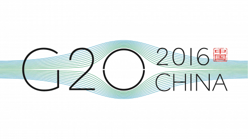
2016
China used a very basic, sans-serif font to present minimal information about the summit. “G20” was printed using a larger font, while the year and country name were placed on the right in two lines. Behind the inscription, the designers added smooth lines of light blue and green color. They gave a feeling of peace as both are associated with nature.
2017
The colorful lines are interconnected and create a shape resembling an infinity symbol but with open ends. They not only symbolize the different goals the countries set before themselves, many of which are connected to the environment and nature but also all the various efforts flowing in to make it happen. Under this symbol, it states the location and year of the event in blue color, which became typical for G20 logos.
2018
This logo is just as vibrant as the previous one. Zero in “G20” is stylized as a rainbow color wheel made up of circles of different sizes. All the other elements are done in light gray. Under G20, it specifies the location and year the summit is held.
2019
Japan’s national symbols are part of this emblem. One can see a pink cherry blossom in the bottom left corner and a red sun, which is also seen on its flag, peaking from behind Fuji mountain. These elements are integrated into a blue inscription “ G20 2019 Japan”. The latter used bold, sans serif letters and placed each word on a new line, creating a triangle shape with the mountain at the top.
2020
G20 takes a whole line and is written using a bold, sans-serif font of a green color, which is common in national symbols. Underneath, it states the location and the year just like many other logos of this group. A predominantly red in color twisted ribbon above features a pattern common to the Saudi Arabian culture.
2021
This logo has something in common with the emblem created by Mexico. It also uses a blue square as the base and has a bit of yellow, which is used to draw a large thin ring that starts at the bottom and goes beyond the square. Yellow is also used for two lines that state “Italia” and “2021”. The numbers are separated by small dots, so both lines are of the same length. Right above, “G20” is printed in a white, elegant serif font. Italy has not forgotten to add a little detail that would remind of the summit location. It added a line at the bottom of the square that was done in three colors of the Italian flag.
2022
Indonesia held the summit in 2022 and created another memorable logo. A deep blue inscription with typical information was decorated by a delicate, elegant flower pattern above it, called Gunungan. It wanted this cultural element to symbolize the unity of the countries and their recovery after the pandemic. The red and white colors seen in this emblem are also the colors of the Indonesian flag.
2023
The “G2” and the lotus flower to the right of it are colored using a gradient of saffron and green. The flower has a significant meaning in Indian culture. It is drawn with a blue and white planet behind it, which serves as a stylized zero and symbolizes the international reach of the summit.
Font and Color
Just like the countries they were representing, the colors used for the G20 logo created bright, meaningful, and beautiful color palettes. The same can be said about the fonts. In some cases, the countries went for more sophisticated, serif typefaces, while in other cases the logos featured rather basic, sans-serif inscriptions.
