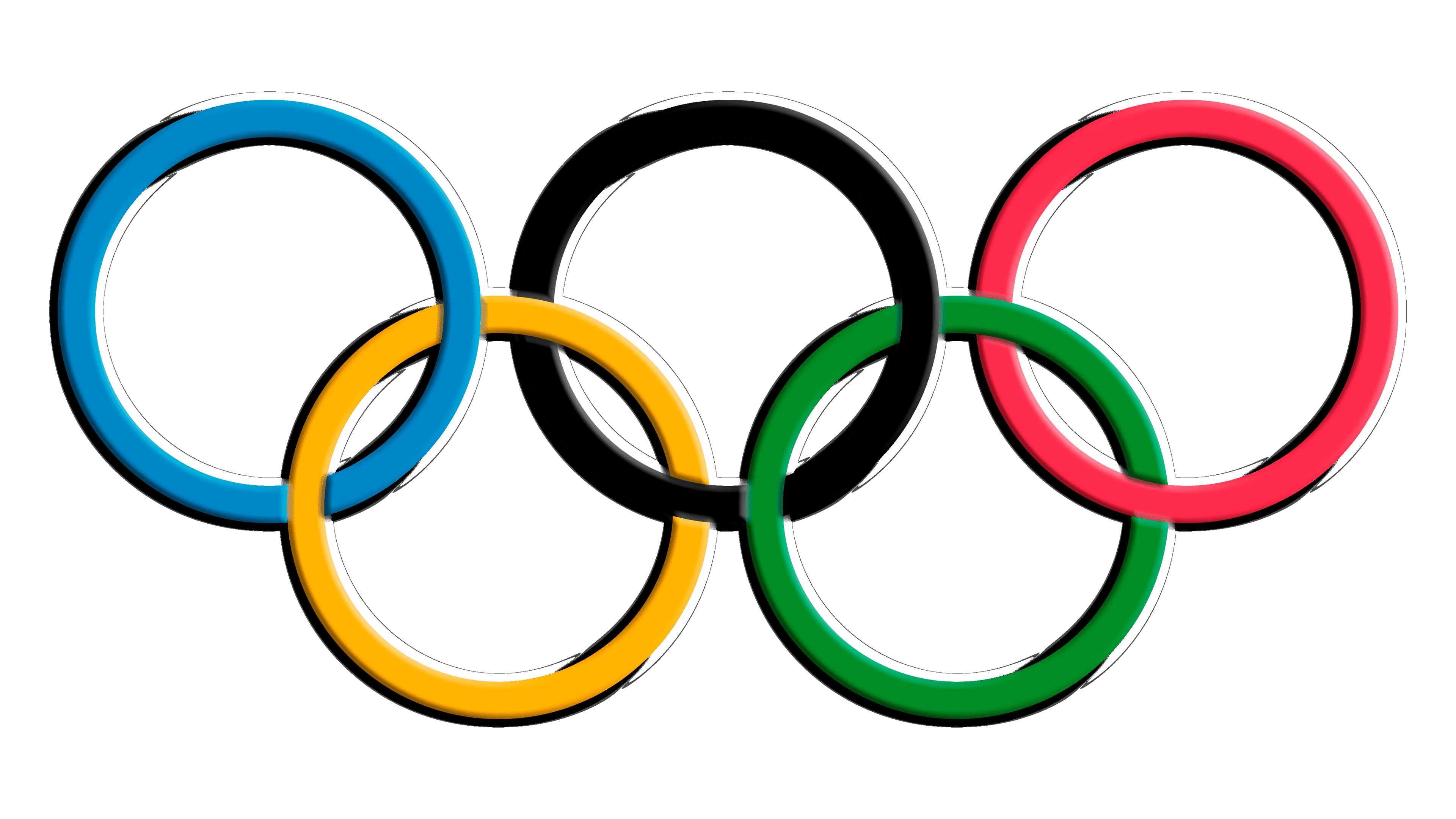
Olympics Logo
The Olympics, a global sports extravaganza, trace their roots to ancient Greece, specifically Olympia, around 776 BCE. Created to honor Zeus, these games fostered unity, showcasing athleticism and competitive spirit. Pierre de Coubertin revived them in 1896, modernizing the concept to promote peace and mutual understanding across nations. This event, occurring every four years, alternates between the Summer and Winter Games, uniting thousands of athletes in a celebration of excellence, friendship, and respect.
Meaning and history
The Olympics ist a global sports movement, governed by the International Olympic Committee (IOC). Founded in 1894 by Pierre de Coubertin, it aimed to promote peace through sports. The first modern Games were in Athens, 1896. Initially, the Olympics were summer-only events. The Winter Games debuted in 1924 in Chamonix, France, expanding the brand. Over the years, the Games have faced boycotts, political tensions, and scandals, yet they’ve grown in size and scope. The IOC, once European-dominated, now boasts a diverse, global membership. It’s adapted to changing times, embracing technology and sustainability, ensuring the Olympics’ relevance and continuity into the 21st century. The event remains a symbol of global unity and sporting excellence, transcending its ancient origins.
What is Olympics?
The Olympics stand as a testament to human potential, uniting the globe every four years through a spectacular festival of sports. Birthed in ancient Greece and reimagined in the modern era, they celebrate the relentless spirit of competition and the enduring pursuit of excellence across nations.
1913 – 1986
The emblem showcases five interlocking rings, each a different hue: blue, yellow, black, green, and red, on a white backdrop. They symbolize the world’s inhabited continents, united by the Olympic spirit. The rings’ interconnection reflects athletes from across the globe coming together in peaceful competition. This design, simplistic yet profound, conveys the values of unity, diversity, and the joy of sport. It’s an enduring symbol of the Olympic movement, recognized universally.
1986 – 2010
In this evolution of the emblem, the rings remain vibrant but now overlap in a different sequence, symbolizing interconnectedness. The blue, yellow, black, green, and red rings maintain their representation of the world’s continents, yet their new arrangement offers a fresh perspective on global unity. This design iteration reflects the dynamic nature of the Olympics, constantly moving forward while retaining its core values of diversity and international camaraderie. It’s a visual dialogue of continuity and change within the Olympic heritage.
2010 – Today
The emblem’s evolution introduces a 3D effect, giving depth to the iconic rings. The once-flat colors now have gradient shading, adding a touch of modernity. This design tweak suggests a dynamic, evolving spirit of the Games, mirroring the technological advancements of our time. The rings maintain their meaningful palette and interlinking, yet now they pop against the backdrop, ready to leap into the future. This refreshed emblem encapsulates a blend of tradition and innovation, resonating with a new generation.


