Linde Logo
Linde is a global industrial gases and engineering company founded by Carl von Linde in Germany. It specializes in producing and distributing various gases like oxygen, nitrogen, and argon, essential for industries such as healthcare, electronics, and manufacturing. The creation of Linde marked a pivotal moment in industrial chemistry, revolutionizing how gases were produced and used across multiple sectors. Its innovative solutions continue to support sustainable development and efficiency improvements worldwide.
Meaning and history
Founded in 1879 by Carl von Linde in Germany, Linde pioneered industrial gas production. It initially focused on refrigeration. By the 20th century, it expanded into gases like oxygen. Post-WWII, Linde diversified, entering engineering and healthcare. The 1990s saw global expansion, acquiring companies worldwide. In 2006, it merged with BOC Group, enhancing its global footprint. 2018 marked a significant merger with Praxair, forming a new Linde plc, headquartered in Ireland. This merger created a leading industrial gas company. Linde innovates in clean energy and efficiency, shaping industries globally.
What is Linde?
Linde operates at the forefront of the industrial gases sector, innovating in the production and supply of essential gases like oxygen, nitrogen, and helium. Born from the vision of Carl von Linde in 1879, this global entity now pioneers solutions across healthcare, electronics, and manufacturing, driving sustainability and efficiency.
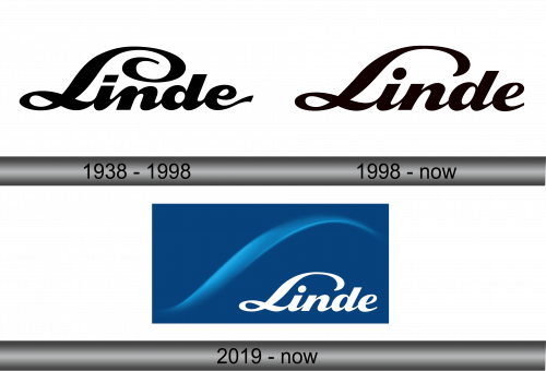
1938 – 1998
The logo in view presents a stylized script with fluid, cursive letters that spell out ‘Linde’. Its sweeping curves suggest dynamism and fluidity, embodying a sense of continuous movement and innovation. The capital ‘L’ stands out with an elegant swirl, anchoring the design and drawing the eye. This script is confident and clear, hinting at a heritage brand that values both tradition and forward-thinking. The overall simplicity of the black on white adds to its timeless quality.
1998 – Today
This logo retains the essence of fluidity but with a more substantial and bold presence. The letters are fuller, rounder, and have a pronounced weight to them, conveying a sense of solidity and reliability. The ‘L’ no longer flaunts an elongated tail but maintains its dominance with a strong, looping flourish. The color has shifted to a rich, deep brown, adding an element of organic warmth and stability. This logo iteration reflects a company that has matured, emphasizing strength and a robust foundation in its identity.
2019 – Today
The latest logo displays a dynamic shift with a rich blue backdrop, symbolizing depth and reliability. A sweeping arc above the word ‘Linde’ echoes the company’s focus on innovation and flow. The lettering returns to a lighter, more graceful script, contrasting against the previous logo’s heavier tones. This script lies flat, suggesting openness and accessibility, while the swoosh conveys motion and progress. Overall, this design conveys a harmonious blend of tradition and forward momentum.


