Logos with golden crowns
In the realm of branding, a logo is more than just an image; it’s a powerful symbol that communicates the essence of a brand, its values, and its heritage. Among the pantheon of symbols, the golden crown stands out as a beacon of regality, luxury, and excellence. A universal signifier of status, the use of a golden crown in a logo conveys a message of superiority and premium quality. This emblem is steeped in history, rooted in the ancient traditions of monarchies where the crown represented power, legitimacy, and sovereignty.
When a brand chooses to adorn its logo with a golden crown, it taps into a rich vein of associations with leadership and aristocratic prestige. This is not merely a decorative choice but a strategic branding decision. It reflects a commitment to excellence and often a storied legacy, suggesting that the brand is at the pinnacle of its field, much like a monarch is the apex of a royal hierarchy.
From luxury goods and fine champagnes to venerable institutions and sports clubs, the golden crown symbolizes a commitment to the highest standards. It’s a visual promise of a distinguished experience, whether that’s the opulence of a timepiece, the exclusivity of a service, or the grandeur of a sports team. The crown in these logos is a silent yet eloquent communicator of a brand’s aspiration to offer nothing less than the best.
In this article, we’ll explore the significance of the golden crown in logo design, looking at various organizations that have incorporated this majestic symbol into their branding. We will delve into the history, the psychology, and the aesthetics of crowned logos, understanding why they captivate the imagination and command respect in the competitive world of branding.
Bombay Sapphire
Bombay Sapphire, a high-end gin brand, is instantly recognizable by its iconic blue bottle. This gin is unique due to its innovative vapor infusion technique, which employs ten carefully selected botanicals, resulting in a refined and adaptable taste that has gained immense popularity in both bars and households across the globe. The image showcases the Bombay Sapphire logo, characterized by a striking serif font that prominently spells out “BOMBAY SAPPHIRE” in uppercase letters. At the center lies a complex emblem, showcasing an elegantly designed sapphire jewel nestled in a lavish gold and blue setting, topped with a crown. This jewel, with its multifaceted illustration, captures and reflects light, symbolizing the gin’s superior quality. The color theme of deep navy blue and gold emphasizes the brand’s luxurious and sophisticated identity, while the inclusion of sapphire and crown motifs highlights its majestic and refined brand image.
Burlington Royals
The Burlington Royals, a minor league baseball team from Burlington, North Carolina, was recognized for its contribution as a Rookie-level affiliate of the Kansas City Royals. This vital role in nurturing future major league talents continued until the team’s dissolution in 2020. The team’s logo is captured in the image, featuring a shield-like design with a dominant royal blue backdrop. Crowning the top is a majestic gold crown with four distinct points, representing both royalty and excellence. Central to the shield is a prominent, serif-styled letter “B,” denoting the team’s initial. The shield’s base displays the trademark symbol “TM,” asserting the logo’s registered status. The regal blue and gold color palette, alongside the crown design, reinforces the team’s “Royal” identity, exuding tradition and nobility.
Chambord
Chambord stands out as a distinguished French liqueur, famous for its spherical, kingly bottle and its rich, intricate flavor profile that includes black raspberries, vanilla from Madagascar, Moroccan citrus peel, honey, and cognac. This composition makes it a sumptuous ingredient in various cocktails. The Chambord logo in the image features two primary components: atop, a circular burgundy emblem highlights the phrases “BLACK RASPBERRY LIQUEUR” and “ROYALE DE FRANCE,” encircling a stylized crown illustration, indicative of the brand’s royal French roots. Below this, the brand name “CHAMBORD” is boldly displayed in large, serif characters, colored in a deep purple shade. This choice of color not only mirrors the rich hue of the liqueur but also underscores the brand’s luxurious and regal essence. The presence of the registered trademark symbol signifies the brand’s protected and esteemed status.
Clash Royale
Clash Royale is a widely played mobile strategy game created by Supercell, combining elements of collectible card games, tower defense, and multiplayer online battle arenas. It’s known for its captivating gameplay and its ability to stay fresh with frequent updates and new content additions. The game’s logo, as seen in the image, prominently displays the title “CLASH ROYALE” in a bold, 3D style with a metallic finish, making a strong visual statement. The word “CLASH” appears in silver with a stone-like texture, while “ROYALE” is presented in gold, exhibiting a shiny, reflective quality that conveys richness and prestige. Adjacent to the text is a shield emblem, featuring a blue core and a golden border, crowned by a simplified, stylized gold crown. This crown motif is a key element in the game, symbolizing the player’s rank and the overarching regal theme of the game. The inclusion of the shield and crown in the logo reflects the game’s fusion of medieval warfare and noble splendor.
Corona
Corona, a renowned Mexican beer brand, is famous for its clear bottle and the customary practice of adding a lime slice. It offers a light, crisp taste that has elevated it to one of the top-selling beers globally, particularly noted for its connection with beachside and leisure environments. The Corona logo depicted in the image features the brand name in a distinctive Gothic script, characterized by sharp serifs and graceful curves, which speaks to its heritage and craftsmanship. Rendered in navy blue, the lettering signifies reliability and professionalism. Above the brand name sits a golden crown, ornately detailed with a cross at its pinnacle, reflecting the brand’s name, which translates to “crown” in Spanish. The crown’s design, reminiscent of classic European heraldry, enhances the logo’s timeless and refined feel. This design embodies a blend of casual elegance and is commonly associated with relaxation and beach scenes. The presence of the registered trademark symbol underscores the logo’s protected status.
Deportivo La Coruna
Deportivo La Coruna, often referred to as ‘Depor’, is a professional football club based in La Coruna, Galicia, Spain. Noted historically as one of Spain’s premier teams, it boasts a rich legacy, including securing the La Liga title in the 1999-2000 season. The club’s logo, as shown in the image, features a complex emblem with a maritime motif, reflecting La Coruna’s coastal roots. At the center is a bold, golden circle resembling a belt, inscribed with the club’s full name in a serif font. This circle encompasses a white backdrop featuring a stylized football, over which a thick, diagonal purple band crosses, adorned with a smaller version of the crown positioned at the top of the logo. The band and football represent the club’s sporting focus. Crowning the emblem is a larger, elaborate crown, symbolizing the ‘Real’ (royal) endorsement. The color scheme of gold, purple, and white, coupled with the nautical and royal imagery, conjures a sense of regal distinction and maritime heritage.
Disney Princess
The Disney Princess franchise, crafted by The Walt Disney Company, is a celebrated collection of fictional female leads from various Disney movies. It has made a significant cultural mark and has spawned an extensive merchandise line including dolls, apparel, and a host of other products. The logo in the image is for Disney’s “Ultimate Princess Celebration,” a campaign celebrating the iconic Disney Princesses. Set against a deep black backdrop, the logo is framed within a diamond-like boundary with a delicate golden edge. Atop the diamond, a collection of golden stars or sparkles subtly forms a crown-like design, enhancing the royal theme. The word “Disney” is displayed in its signature, whimsical font, widely recognized and synonymous with the Disney brand. Below it, “ULTIMATE PRINCESS” appears in large, gold, serif capitals, and the term “CELEBRATION” follows in a smaller yet similarly styled and colored font. The black and gold color scheme radiates elegance and sophistication, fitting for the regal concept of princesses. The overall design is both classy and captivating, reflecting the magical allure of Disney’s princess tales.
Espanyol
RCD Espanyol de Barcelona, commonly referred to as Espanyol, is a prominent Spanish football club based in Barcelona. It’s known as one of La Liga’s founding teams and for its intense rivalry with FC Barcelona. The club’s logo, shown in the image, is circular with a striking red outer ring that contains the club’s full name “RCD ESPANYOL DE BARCELONA” in uppercase yellow letters. This ring encloses an inner circle adorned with blue and white diagonal stripes, reminiscent of the club’s traditional football jersey. Above this circular emblem is a yellow crown with red details and a cross on top, reflecting the ‘Real’ (royal) aspect of the club’s name and its noble patronage. The red, yellow, blue, and white color palette mirrors the vivid and historic Catalan identity.
Kansas City Royals
The Kansas City Royals, an American professional baseball team based in Kansas City, Missouri, are known for their two World Series championships in 1985 and 2015 and their devoted fan base. The team’s logo, as seen in the image, displays a shield crest with a deep royal blue background, a color often linked with depth and stability. Within the shield, the intertwined letters “KC,” representing Kansas City, are prominent in white with a golden border, offering a refined contrast. Atop the shield rests a golden crown with four distinct points, symbolizing the team’s name and the royal imagery it represents. Below the shield, the word “Royals” is inscribed in a fluid, cursive blue font, suggesting movement and athleticism. The logo also includes a trademark symbol, affirming its registered status. The design artfully merges royal symbolism with sports aesthetics.
Krusovice
Krusovice, a celebrated Czech brewery with a storied past, was established in 1581 and once had the distinction of being owned by Emperor Rudolf II. It is renowned for producing a variety of beers, including the acclaimed Krusovice Imperial, which enjoys international recognition. The Krusovice logo, as depicted in the image, is anchored by a striking red banner with gold edging. This forms the background for the prominently featured name “KRUSOVICE” in bold, gold-outlined white letters. A sophisticated crown, intricately detailed, adorns the top of the banner, symbolizing the brewery’s royal lineage. The founding year “1581” is prominently displayed, split by the crown, marking the brewery’s historic inception. Below the main banner, the phrase “KRÁLOVSKÝ PIVOVAR” (Czech for “royal brewery”) is inscribed, further underscoring the brewery’s noble heritage. Decorative medals bearing historical crests flank the banner on both sides, enhancing the logo’s royal and traditional appeal. The red and gold color scheme of the logo imparts a sense of luxury and high quality.
Mississippi RiverKings
The Mississippi RiverKings, a professional minor league ice hockey team based in Southaven, Mississippi, were active participants in the Southern Professional Hockey League from 2011 until their suspension in 2018. The team’s logo, as seen in the image, features a shield-shaped emblem set against a black backdrop. It is dominated by a bold, stylized white “M” that mirrors the winding path of a river, reflecting the team’s name. This “M” is outlined in gold, offering a striking contrast and suggesting an air of prestige. A golden crown is perched atop the “M,” echoing the “RiverKings” part of the team’s name and its regal motif. Below the “M,” the team name “RIVERKINGS” is written in a forceful font, with a hockey stick cleverly integrated into the “R,” signifying the sport they play. The entire logo is framed in gold, which stands out vividly against the black background, lending the design a dynamic and competitive edge.
Moet Chandon
Moët & Chandon, a prestigious French winery and a key part of the luxury goods conglomerate LVMH, is globally acclaimed for its Champagne, especially its flagship Moët Impérial. The company’s rich heritage dates back to 1743. In the image, the Moët & Chandon logo presents a clean, sophisticated design. The brand’s name “MOËT & CHANDON” is written in a large, bold serif font. Above the name sits an elegant crown adorned with crosses and fleur-de-lis motifs, signifying the brand’s illustrious history and connections to royalty. This crown is framed by the phrase “FONDÉ EN 1743” (meaning “Founded in 1743”), emphasizing the winery’s longstanding tradition. Below the brand name, the word “CHAMPAGNE” is displayed in a smaller, capitalized font, underscoring the product’s esteemed classification. A lone gold star appears beneath the text, possibly symbolizing the brand’s high quality or its standout status among champagnes. The logo’s color palette of black and gold on a white background radiates elegance and luxury.
Qarabag
Qarabağ FK, a professional football club from Agdam, Azerbaijan, is known for its remarkable resilience and success despite the displacement of its hometown due to the Nagorno-Karabakh conflict, earning it the nickname “The Horsemen.” The club’s logo, depicted in the image, features a shield-shaped crest with a robust navy blue border. At its core is a golden band that contains the name “QARABAĞ FK” and the establishment year “1987,” set against a white backdrop. On each side of this central band are two stylized, rampant black horses, emblematic of strength and nobility. A smaller golden crown with five points is placed at the top of the shield, reflecting the royal implications of the name “Qarabağ,” which is tied to an historically significant region in Azerbaijani culture. Below the crown and year, prominently positioned is a classic black and white football, underscoring the club’s sporting dedication. A solitary gold star above the shield may represent the club’s achievements or aspirations, adding a touch of distinction. The logo’s color palette of gold, navy blue, and black imparts a regal and prestigious appearance, apt for a team named “Qarabağ,” with its royal historical associations.
Real Betis
Real Betis Balompié, commonly known as Real Betis, is a significant Spanish football club based in Seville, celebrated for its fervent fan base and its La Liga victory in the 1934-1935 season. The club’s logo, as seen in the image, showcases a distinctive, inverted triangular emblem, outlined in green with a broad gold border, symbolic of prosperity and success. The triangle features green and white vertical stripes, mirroring the colors of the club’s home kit. At the triangle’s center is a white circle containing the intertwined initials “RB” in a Celtic-style green font, hinting at tradition and history. A regal crown with red and gold details, denoting the “Real” (royal) status granted by the Spanish monarchy, rests atop the triangle. The crown includes a cross at its peak, a common element in royal iconography. The emblem’s green, white, and gold color scheme, coupled with the crown, reflects the club’s proud identity and royal endorsement.
Real Madrid
Real Madrid CF, one of the world’s most renowned and successful football clubs, hails from Madrid, Spain. It boasts a record 13 UEFA Champions League titles and numerous domestic league and cup triumphs, with a vast global fanbase. The club’s logo, featured in the image, presents a circular crest with a blue outline. Inside, the intertwined initials “C” and “F” (for Club de Fútbol) appear in dark blue, forming a distinguished monogram set against a white background, resonating with the club’s nickname “Los Blancos” (The Whites). Around the monogram are two concentric darker blue circles, with the club’s full name inscribed in the outer ring. A golden royal crown, embellished with red and blue jewels, crowns the crest, symbolizing the “Real” (Royal) in the club’s name, a title granted by King Alfonso XIII in 1920. The crown’s top features a Christian cross, signifying the royal and religious heritage linked to the crown and the club. The inclusion of the crown on the logo embodies the club’s royal patronage and its illustrious history in both Spanish and European football.
Real Salt Lake
Real Salt Lake, a professional soccer team based in Sandy, Utah, has been competing in Major League Soccer (MLS) since 2005. They are celebrated for winning the MLS Cup in 2009 and are known for their enthusiastic fan base at the Rio Tinto Stadium. The team’s logo, as displayed in the image, is a shield – a symbol commonly used in soccer crests to represent protection and tradition. This shield is outlined in red and filled with a deep cobalt blue. The club’s initials “RSL” are interlaced in an elegant, flowing font, creating a striking contrast against the blue background. Above the initials sits a golden crown with red and gold details, echoing the ‘Real’ in the club’s name, a term traditionally bestowed by royal decree in Spain to denote patronage. A stylized soccer ball at the bottom of the shield ties the crest back to the sport. The color scheme of red, blue, and gold, often linked with royalty, enhances the club’s name and imparts a regal quality to the team’s branding.
Real Sociedad
Real Sociedad, a well-known Spanish football club based in San Sebastián, Basque Country, boasts a rich history including two La Liga titles and a commitment to nurturing young talent and Basque players. The club’s logo, shown in the image, features a dynamic design incorporating a football encircled by a blue and white striped flag, reflecting the team’s colors and home kit. These stripes are a hallmark of the club’s identity. Atop the football, a gold crown with red details and intricate embellishments signifies the ‘Real’ in the club’s name, which translates to ‘Royal’ and is a title conferred by the Spanish monarchy. The crown is topped with a Christian cross, a traditional element in royal insignia. The initials “SS,” representing San Sebastián, are prominently placed on the flag, linking the club to its home city. The logo’s use of royal blue, gold, and white conveys a blend of regal elegance and a deep-rooted sporting tradition.
Rolex
Rolex, a Swiss luxury watchmaker established in 1905, is globally renowned for its performance, reliability, and iconic models like the Submariner and Daytona. The brand is also recognized for its history of innovation, including the development of the first waterproof wristwatch. The Rolex logo, as seen in the image, comprises the brand name “ROLEX” in bold, capital, serif letters that exude durability and classic elegance. The lettering is presented in a luxurious, deep green, a color often associated with prestige and wealth. Above the brand name is a stylized golden crown, symbolizing excellence and leadership in the watchmaking industry, consistent with Rolex’s reputation for high-quality, luxurious timepieces. This combination of a golden crown and green text illustrates the brand’s dedication to supreme craftsmanship and its esteemed status in the luxury goods market.
Royal Jordanian
Royal Jordanian Airlines, established in 1963, serves as the flag carrier airline of Jordan, recognized for its broad network connecting Amman with key global cities and its dedication to hospitality and service excellence. The airline’s logo, as seen in the image, showcases its name in both Arabic and English scripts, executed in a refined, serif font that exudes formality and professionalism. The Arabic calligraphy, gracefully flowing above the English text, reflects the airline’s rich cultural heritage. Both the Arabic and English names are presented in a luxurious golden hue, signifying the high standards and luxury associated with the airline’s services. The logo is accented on the right with a stylized crown, elaborately designed with golden spikes and orbs, emphasizing the ‘Royal’ element of the airline’s name. The choice of gold on a white background enhances the logo’s regal and sophisticated look, aligning with the airline’s esteemed status.
Royal Mail
Royal Mail, established in 1516, is a major postal service and courier company in the United Kingdom, celebrated for its extensive history of service, commitment to universal postal provision, and its iconic red postboxes and mail vehicles. The company’s logo, depicted in the image, displays the words “Royal Mail” in bold, golden-yellow serif letters set against a red rectangular backdrop. Centered above the text in a white area is a detailed crown graphic, ornately adorned with orbs and crosses, symbolizing the British monarchy. The crown is rendered in gold, red, and silver, adding a royal flair and representing the ‘Royal’ prefix in the company’s name. The logo’s design, with its crown motif and the red, white, and gold color scheme, pays tribute to Royal Mail’s long-standing service and its role as a government agency. The red and gold colors, traditionally linked with the UK’s royal insignia and mailboxes, further reinforce the company’s identity and legacy.
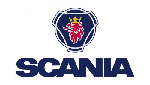
Scania
Globally recognized for their innovative transportation solutions, Scania stands at the forefront of the industry, specializing in the manufacture of robust vehicles like heavy-duty trucks and buses engineered for rigorous transport duties. Their service spectrum is comprehensive, encompassing a variety of product-supportive services. At the heart of their visual identity, Scania showcases a commanding griffin emblem—this legendary beast combines the regal majesty of a lion with the sovereign gaze of an eagle, depicted in a vibrant scarlet hue, crowned gloriously in gold. This emblematic figure is embossed upon a shield of rich sapphire, edged by a prominent alabaster border that boasts a sophisticated array of geometric designs. Positioned below this emblem is the Scania designation, typeset in expansive, uppercase letters of a sleek sans-serif font, exuding a contemporary and slick aesthetic. The chosen palette of deep maritime blue, intense crimson, and pristine white is intentionally selected to evoke feelings of reliability, authoritative strength, and a respect for heritage. These elements together not only define Scania’s brand identity but also reflect their commitment to excellence, safety, and enduring legacy in the logistics and transportation sector.
