Hallmark Logo
Hallmark has come a long way from a man with empty pockets, postcards in a shoebox, and a dream. The range of goods increased, so it was possible to buy souvenirs, soft toys, jewelry, dishes, bedding, calendars, notepads, and much more with the Hallmark logo. Later, millions looked forward to new movies and series. At the same time, Hallmark did not forget that the roots of the brand are warm words that they give to millions. Hallmark still believes that if a person starts a business with the sole purpose of making money, they have little chance of getting rich. However, if they put the desire to serve people and provide high-quality goods or services in the first place, then success will follow.
Meaning and History
Joyce Hall showed ingenuity not only in product development but also in marketing. He really liked the word hallmark, which was used by jewelers as a sign of quality in 14th century London, and also included his last name. In 1954, the name of his greeting cards company officially changed to Hallmark Cards. In the early 1990s, Hallmark began to lose its market share, so the brand changed its focus to television. The company bought small TV channels until the brand got its own Hallmark channel in 1992. In 1994, Hallmark acquired RHI Entertainment Inc, a leader in family entertainment. After the purchase, it was known as Hallmark Entertainment. It should be said that it traces its history back not only to greeting cards but also to two cable channels: the American Christian Television System (1984) and the Vision Interfaith Satellite Network (1988), later renamed the Odyssey Network. Hallmark bought a significant stake in Odyssey in late 1998.
What is Hallmark?
Hallmark is a film company and television channel that is loved in the US and beyond its border. It specializes in the production and broadcasting of classic series and films for families. Hallmark is still a family business, led by the brand’s founder’s grandson Donald Junior Hall.
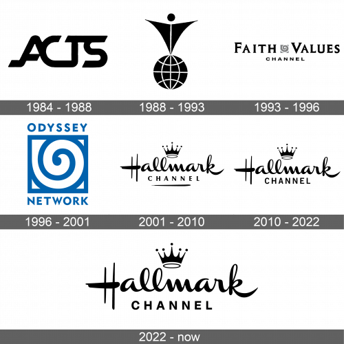
1984 – 1988
The logo of the TV channel simply consisted of the initials. They all were joined in one way or another, creating an interesting smooth design. Sharp, diagonal cuts beautifully contrast against the curves of all the lines. There were no other elements.
1988 – 1993
With the launch of a new network, the logo had to be redesigned. It was still black and white but featured a globe with an abstract human on top of it. The glove had thin white lines for meridians and parallels. The icon on top of it consisted of a shape that resembled a triangle pointing down with a small circle on top for the head. There was a white line going down the triangle, which created an illusion of legs at the bottom, while the hands were outstretched horizontally. The logo represented all the people on Earth and their interconnection.
1993 – 1996
A new logo was created after the channel got a new name. The latter was the main element of the emblem with Faith Values being printed using capitalized bracketed serif letters with the first letters being larger. The words were separated by a gray square with a white swirl inside, which added some dynamics. The second line had “Channel” written using a smaller font and sans-serif letters. The logo looked sophisticated with a traditional touch.
1996 – 2001
The only element that remained from the previous logo was a square with a swirl inside. However, it was made the center of the emblem with “Odyssey” printed above it and “Network” underneath. Unlike the previous black and white versions, this logo was done in deep blue.
2001 – 2010
The iconic Hallmark brand image appeared only in 2001. It featured a calligraphic style of writing for the name and a grotesque typeface for the second line that said “Channel” in all capitalized letters. The most memorable part of this logo was a five-point crown above the inscription. It reflected the utmost excellence of the Hallmark Channel. It was inspired by logos created by Andrew Szoeke, a Hungarian emigrant. Jim Sturdivan and Audrey Wilkinson were the creators of the actual logo for the channel.
2010 – 2022
There was a minor update to the logo in 2010. The designers chose to change the font for the second line and made it a bit larger. In addition, they removed a line that was painted under the previous logo.
2022 – Today
The network asked Superestudio to work on rebranding. As with the previous case, it was decided to keep the crown and the “Hallmark” inscription unchanged, as these were the most recognizable elements of the logo. They did, however, introduce a different font for the “Channel” inscription. It was also sans-serif but noticeably bolder with shorter letters.
Font and Color
Since 2001, the logo features the Channel Left Slanted Font for the “Hallmark” inscription. It used the Albra Grotesk font for the “Channel” inscription in 2001, which was replaced by a simpler sans-serif font in 2010.
