Cartoon Network Logo
Cartoon Network Studios is an animations studio that made a lot of iconic shows for teens and younger adults. Most of their works are broadcasted on their own channel, Cartoon Network that ultimately became one of two choices for the kids from the 90s, alongside Nickelodeon.
Meaning and History
Cartoon Network is both a spiritual and a physical successor of Hanna-Barbera – a celebrated 20th century animations studio known for hits such as Scooby Doo, the Flintstones, Smurfs and others. In 1994, that studio was transformed into Cartoon Network who also created a bunch of iconic shows in their time.
1994 – 1996
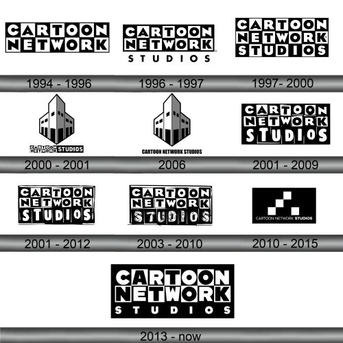
This first logo became a bulk of many of the future attempts. It’s the name of the studio – Cartoon Network – written in big uppercase letters, styled to look cartoonish. The words were written on two levels, and each letter was put in its own square. These squares were identical save for the coloring.
They were checkered – the black and white squares alternated, and so did the letters inside them, although those were obviously inverted.
1996 – 1997
In 1996, they added the word ‘studios’ written in uppercase below the main logo. The letters were spaced out to fit those above them, and the emblem was otherwise unchanged.
1997 – 2000
A year later, they put the ‘studios’ word in the same checkered squares and styled them accordingly for aesthetic continuity.
2000 – 2001 (alternative)
For the 2000 design, they put the CN part and the ‘studios’ part beside each other. At the same time, the proportions of both parts were unchanged. The way they were depicted was changed however – they outlined the ‘Cartoon Network’ checkers with an orange hue, while the ‘studios’ part was now a simple text with a black background.
Above these was an image of a classic movie theater colored in white and black, as well as outlined by black and slightly by the orange color from before.
2006 (alternative)
The theater in the 2006 design stayed the same, except they got rid of the orange tint. This also happened with the text, although this part suffered more. It was simplified to a plainer black writing without special details.
2001 – 2009
This logo was used alongside the previous two, although it’s more of a continuation of the 1997 design. They basically took that one, slightly remodeled the letters in the ‘studios’ part, colored the background completely black and gave the entire logo a slight black outline.
2001 – 2012
For the 2001 – 2012 variant, they, for some reason, made the letters look as if painted on. In addition, there was now a white rectangle in the background, as if they put the logo onto a whiteboard of sorts.
2003 – 2010
The 2003 – 2010 attempt was just two panels from the original logo – the ‘C’ and ‘N’, styled exactly as on the original emblem. Here, however, they are tilted and shifted a bit, as well as given a slight orange tint behind them.
2010 – 2015
The 2010 design was slightly off, compared to the others. It was a black rectangle with four white squares in the middle. Beneath them was the writing ‘Cartoon Network Studios’ in white uppercase letters (with the last word being bolder than the others).
2013 – today
In 2013, the emblem came full circle. It depicted the 1996 design almost exactly as it was, except for a few changes. The entire thing was put against a black rectangular background, which made the black letters beneath the main logo turn white. There were also minor changes in the letters positioning, but it’s barely noticeable.
Emblem and Symbol
The brand commonly uses just the first panel from each word of ‘Cartoon Network’ as a main emblem. That’s what they use mostly to identify their channel, and that’s what the brand as a whole uses on a daily basis. That being said, even that is not just one certain design – given how much they like to animate their emblems.
