Haribo Logo
Haribo, a renowned confectionery company, specializes in gummy and jelly sweets. Founded in Germany in 1920, it remains family-owned, symbolizing a tradition in sweet treats. Globally recognized, Haribo’s primary markets include Europe, North America, and parts of Asia. Its iconic product, the “Goldbears” gummy bears, epitomizes the brand’s commitment to quality and innovation. Haribo continues to expand its reach, constantly adapting to new markets while maintaining its beloved classic flavors.
Meaning and history
Haribo, an emblematic name in the candy industry, started its journey in Bonn, Germany, in 1920. Hans Riegel Sr., an enterprising confectioner, founded the company, fashioning its name from his own (Hans Riegel) and his hometown (Bonn). With humble beginnings involving a kettle, a stove, and sugar, Riegel created the “Dancing Bear,” a gummy candy that laid the groundwork for the iconic Goldbears.
The 1930s saw Haribo’s footprint expand within Germany and across its borders. The post-war era was challenging, and following Hans Riegel Sr.’s death in 1945, his son, Hans Riegel Jr., took the helm. Under his stewardship, the company revived and thrived, introducing a diverse range of confectioneries.
Haribo’s venture into television marketing in the 1960s marked a significant upswing in its popularity. The brand’s memorable jingle resonated across generations, embedding Haribo in the public consciousness.
The 1980s were a period of strategic expansion for Haribo. It wasn’t just about increasing production facilities across Europe; this era also saw the birth of the Goldbears, which became synonymous with the Haribo brand on a global scale.
As the 21st century unfolded, Haribo’s global presence became more pronounced. The acquisition of companies like the UK’s Dunhills and the American Jelly Belly broadened its product range and international reach.
Despite its growth and expansion, Haribo’s ownership stayed within the Riegel family. The passing of Hans Riegel Jr. in 2013 marked a new chapter in leadership but the family’s influence remained.
Presently, Haribo stands as a multinational entity, with production sites worldwide. It continues to enchant with its diverse candy selection, balancing innovation with a deep respect for its rich history and Hans Riegel Sr.’s original vision.
What is Haribo?
Haribo, a globally recognized confectionery brand, is renowned for its gummy candies, particularly the iconic Goldbears. Originating from Germany in 1920, the company has grown into a symbol of sweet, playful treats enjoyed across generations and continents.
1922 – 1979
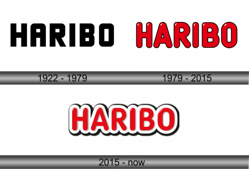
The logo is a stark, minimalist design featuring the brand name “HARIBO” in bold, uppercase letters. Its typography is simple yet impactful, with solid, geometric characters that communicate stability and presence. The absence of serifs and the uniform thickness of the lines convey a modern, no-frills attitude, reflecting the brand’s straightforward approach to delivering delight. The black on a white background asserts a classic, timeless feel, suggesting that the brand, much like its logo, is enduring and unchanging in its commitment to quality.
1979 – 2015
This rendition of the HARIBO logo radiates vibrancy with its bold, red coloring, reminiscent of the brand’s sweet delights. The letters, set in a rounded, sans-serif typeface, exude a friendly and approachable vibe. Each character is outlined in black, creating a striking contrast that enhances legibility and visual appeal. The glossy finish on the letters suggests the chewy texture of gummy candies. This logo diverges from its predecessor by infusing color and a three-dimensional effect, which adds depth and modernity. It embodies the joyful and playful spirit of the brand, signaling a commitment to fun and flavor that HARIBO is known for.
2015 – Today
The HARIBO logo here is dynamic, with the red letters popping against a shadowed 3D effect, creating an illusion of depth. Each character is embraced by a glossy white border, emphasizing the text and granting it a candy-like appearance that’s hard to miss. The rounded sans-serif font is playful, evoking the joy and fun associated with the brand’s gummy products. Compared to the previous iteration, this logo adds a shadow that gives a floating effect, suggesting lightness and whimsy. The red is a shade brighter, enhancing its visual impact, and the addition of the white border introduces a fresh, contemporary edge to the design, reflecting an evolution while staying true to the brand’s lively essence.
