Hero MotoCorp Logo
Hero is an Indian company specializing in the production of motorcycles and scooters. The production is based in New Delhi. Hero is the largest manufacturer of two-wheeled vehicles both in India (market share — 46%!) and worldwide.
“What is a curious fact about Hero?
Hero’s impressive commercial success figures in recent years are based on the growth of India’s domestic market over the past five years. However, while other Indian motorcycle manufacturers, for example, Bajaj or TVS, have developed and implemented an effective international strategy, Hero is still only at the beginning of this path, having a small number of distributors and insignificant sales volumes abroad. And although the company reports that Hero motorcycles are sold in more than 40 countries around the world (mainly in Africa and Latin America), most of the sales abroad are in Bangladesh, Sri Lanka and Nepal, where the brand competes with other Indian manufacturers of motorcycles.”
Meaning and history
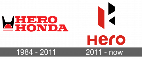
1984 – 2011
The first Hero logo was worked-out in 1984, when the company was called Hero Honda. It consisted of a verbal sign built on two levels and an emblem to the left of it. The inscription, written in capital letters, was created in a classic serif font and thick confident lines that looked massive and powerful in the brand’s bright red color. The Hero Honda logo consisted of a stylized Honda symbol “H” located on a red sun with three parallel horizontal lines below it.
2011 – today
In 2011, Honda decided to leave the brand. Consequently, there was a need for a new corporate identity. The famous design bureau Wolff Olins redesigned the Hero logo in 2011. The agency created a new modern and stylish image for the brand.
The new Hero logo consists of a verbal sign and an emblem located above it. The phrase has lowercase letters with the first capital letter “H”, but is equal in size to other letters. The font of the sans-serif nameplate is clear and neat. It is similar to the Harabara font. Bold smooth lines with a rounded letter “r” make the nameplate elegant and modern.
The new logo of the Hero is geometric and clear. It consists of the letter “H”, which is rotated by one-third and looks voluminous thanks to the use of three colors: red, white and black. Made in the closing technique, it is an excellent graphic symbol, the sharp corners of which give the logo a more energetic and dynamic look.
Font and Color
The classic color combination was taken by the brand from its original visual identity design. The red-black-and-white color palette is the strongest possible three-color combination that shows confidence, progress and strength.
The main color of the logo is red. This is one of the most intense colors. Its powerful energy has a very strong influence on the psycho-emotional state of a person.
The love of red is no exception among the world’s automakers, including Hero. The red color of the logo allows you to convey the feeling of the power of the motorcycles and scooters and the coolness of its owner. Such logos attract attention, stimulate buying, arouse the desire to own a car, show passion and strength.

