Jagermeister Logo
Jägermeister is a popular German dessert drink. It’s an old herbal recipe that supposedly helps with digestion, which is why some advice to drink it after the meal. It’s rather similar to Becherovka and several other European herb liquors – both in terms of formula, design and flavor.
Meaning and History
The recipe was devised in 1934 by the members of Curt family. The son, in particular, was an avid hunter. Paired with a rather ‘natural’ formula of the drink, the name ‘Jägermeister’ was a good call. In German, this word means ‘Master Hunter’, although it was also a job of a gamekeeper back in the day.
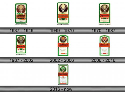
1937 – 1949
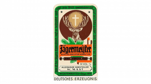
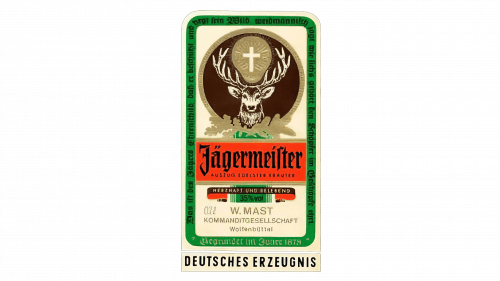
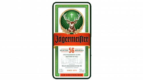
Like most old liquor brands, this one primarily used its own label as a full-time logo. It shows a white vertical rectangle with a bright green rim. Most of the space in the upper section is occupied by brown circle with a deer in it, and a glowing cross. Beneath was a wide orange section that held the drink’s name written in a jagged Gothic style, surrounded by the green pine branches.
There were many more writings all over the label, including ‘the German product’ below, the ’35 vol. %’ alcohol content and lots of others.
1949 – 1970
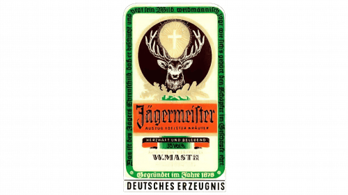
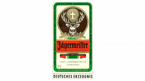
In 1949, the logo generally became thinner and rounder. The rim in particular halved in size. The idea behind the logo as a whole was to reduce nuance. They made the deer less realistic, the colors became more basic, and smaller stuff, such as branches and extra text here and there disappeared.
Some things were added. For instance, the circle was given a new golden outline with some golden foliage in its base.
1970 – 1987
In 1970, they doubled down on the previous design and basically aligned everything better. It’s become significantly more streamlined – the colors were given more contrast and saturation, while the elements were outlined better. In short, it got more pleasing.
1987 – 2002
Most of the logo was bleached, but something was also added. For instance, the golden leaves became more pronounced and now positively looked like something made from gold.
2002 – 2006
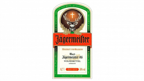
More polish followed in 2002, which meant they rearranged something. The top line became an arch, the glow emanating from the cross was amplified, the orange ribbon now swerved around the green rims. They also scaled down the text content, which only contained the necessary information now.
2006 – 2016
In the previous attempt, they forgot to add texture to the golden leaves, while it was there before. In 2006, they fixed it, and the leaves once more resembled actual gold.
2016 – today
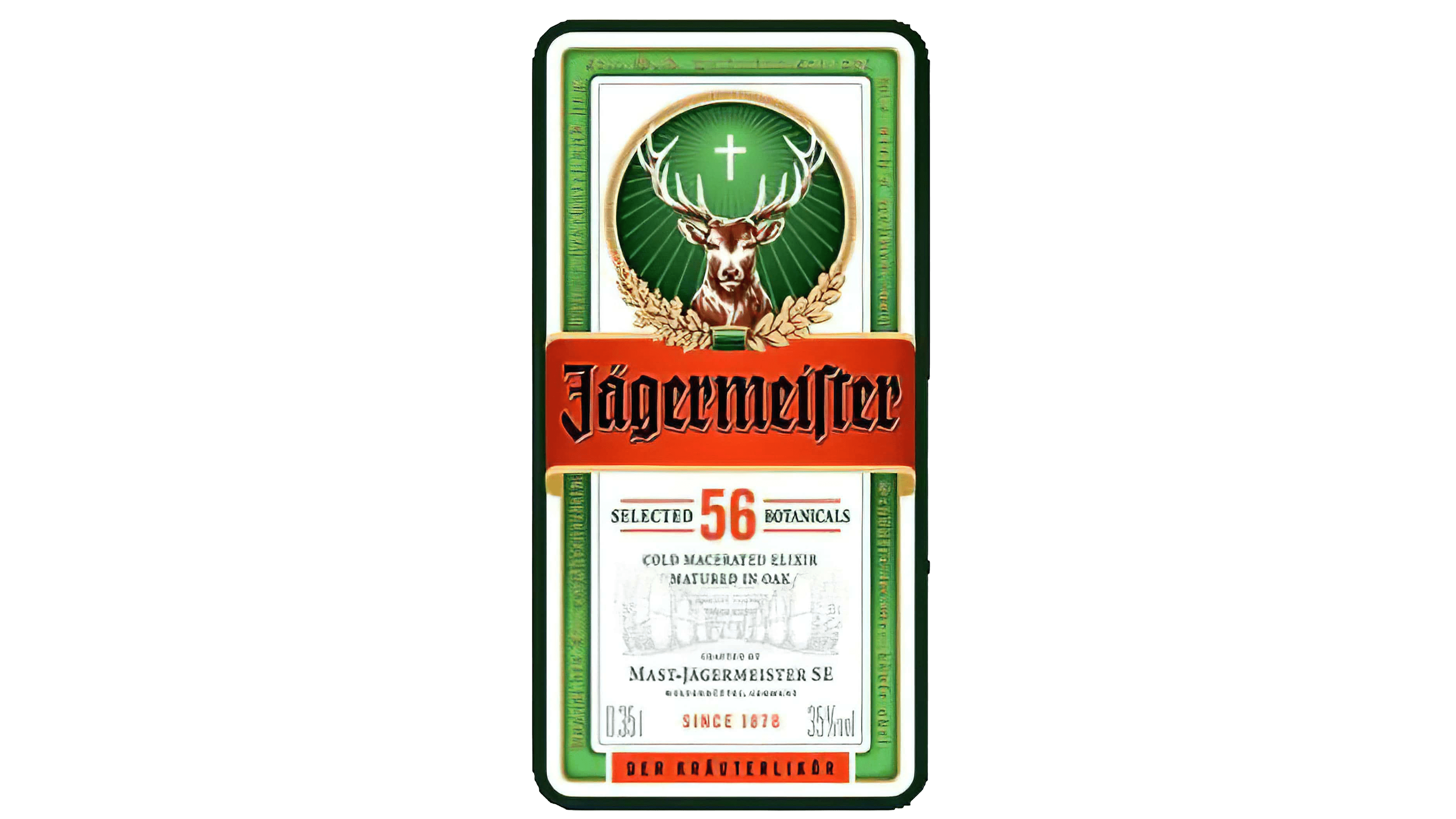
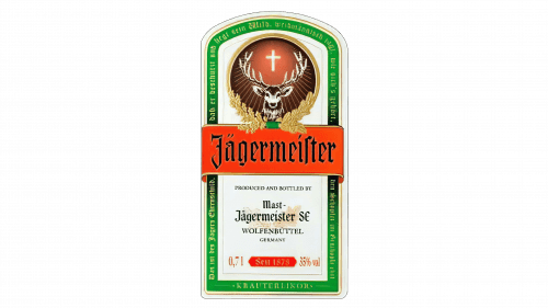
Most on the logo stayed the same, except for the color of the circle, which shifted from brown to green, and also some new text details, such as the ‘selected 56 botanicals’ in the middle, referring to the number of herbs, and others.
Emblem and Symbol
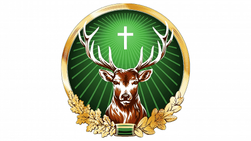
The circle part of the logo is an interesting composition sometimes used independent of the rest of the logotype – primarily by the Jägermeister Company, where it’s simplified and outlined with orange. The logo is based on the story of two saint patrons of hunt who converted to Christianity and witnessed a stag with a cross between the antlers.
