Jaguar Logo
Jaguar brand is a story of the transformation of a sidecar assembly company, founded by two enthusiasts, into a world leader in the production of premium cars. Its automobiles have won many awards. They are owned by monarchs and prime ministers. Cooperation with the well-known manufacturer Daimler provided the car with a more luxurious design and an improved level of comfort.
Meaning and History
![]()
The company was born in 1922 as Swallow Sidecar Company and produced sidecars for motorcycles. The first car was presented in London in 1931. In 1940, the Jaguar SS100 received the title of the best classic sports model. After the Second World War, the name of the company changed to Jaguar as an abbreviation that caused negative associations. It was nationalized in 1975, then acquired by the auto giant Ford in 1990. In 2008, the Jaguar brand was sold for £1.7 billion to India’s Tata Motors.
What is Jaguar?
Jaguar, a premium car brand, is currently owned by the Indian concern Tata Motors. Three Jaguar Land Rover plants are located in the UK, and one is in Pune, India.
1922 – 1935
![]()
The logo has changed several times throughout the history of the Jaguar automobile brand. For the first 30 years, it was a “winged” logo. A blue circle with a red ring held the name of the brand. It was done using stylish cursive writing of a golden color. The wings were also golden with blue details. As a final touch, the whole emblem was outlined by a light yellow shadow.
1935 – 1945
![]()
This logo preserved the wings and now looks more like a bird thanks to a tail at the bottom. The circle was replaced by a hexagon, which now held only the initials. Underneath, it said “Jaguar” in smaller sans-serif font of black color. The whole emblem was done in brown, beige, and black color palette. It resembled wood tones and looked very rich.
1945 – 1951
![]()
This logo reflects a new brand name. It is very similar in shape to the previous version, which allowed it to preserve the brand image. In fact, it looks almost like a black-and-white version of it. The center, though, is done differently and bears the new name. The hexagon shape is elongated horizontally to make space for all the letters. The inscription features a bold sans-serif font. All the letters are uppercase with the letters in the middle being bigger to repeat the shape of the border around.
1951 – 1957
![]()
This is probably the most minimalistic, yet very sophisticated logo of the brand. It features the brand name in a bold, black, serif font. All the letters were uppercase, which enhanced a powerful look. There are no other details, but the name says it all.
1957 – 1982
![]()
An emblem in the form of an orange medallion with a thick black frame and golden accents served as the brand image for quite some years. It featured a gold head of the animal facing forward, which gave made it look grand. Across the top of the black border, it stated “Jaguar” using a font similar to the one seen in the previous logo. At the bottom, there was an inscription “2.4 Litre” done in the same style.
1982 – 2001
![]()
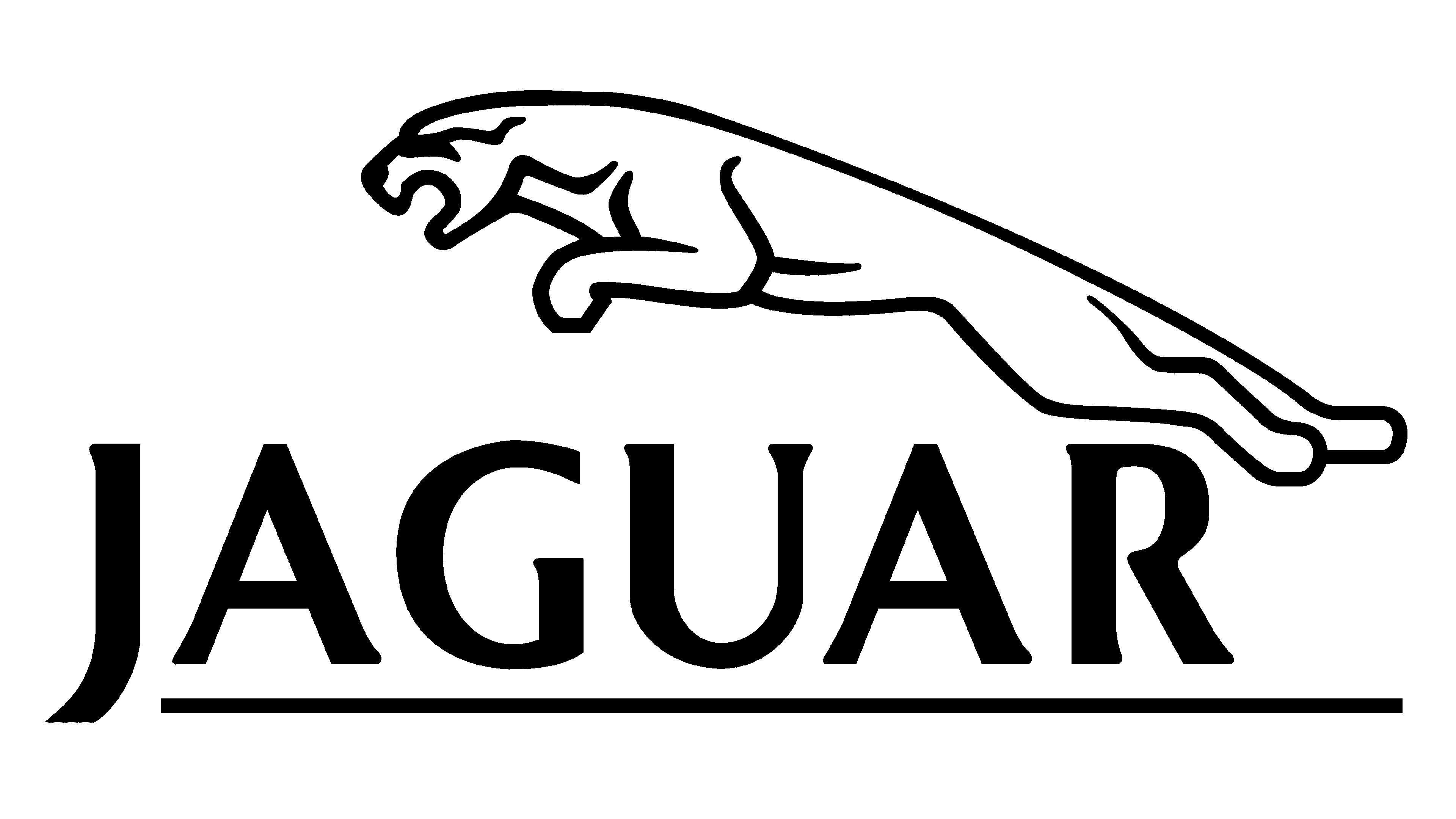
The new brand image embodies the key values of the company: elegance, sophistication, power, and speed. It is an outline of the animal the brand was called after. The wild cat is jumping from right to left over the name. The latter is printed using all uppercase, serif letters of a dark green color.
2001 – 2012
![]()
An updated version looks very similar to the previous one with a few exceptions. First of all, the animal jumped a little further and was centered above the name. There is also a lot more space between the letters, which are now black.
2012 – 2021
![]()
After restyling in 2012, the brand image became more stylish and elegant. The 3D figurine has been given metallic and silver tones to enhance its sophistication. The spacing between the letters was made smaller again and the whole inscription did not look as tall anymore.
2021 – Today
![]()
A more minimalistic and modern image was brought back. It is simply black and white again. The shape of the animal and the inscription were preserved.
2023 – now ( JLR Logo )
![]()
A refined, new identity of the Jaguar and Land Rover brands is presented in one single emblem. It features just the “JLR” initials, which are done in classic black color that gives the logo a formal and stylish appearance. The new logo uses a font similar to the Dugguen font by Creative Fabrica with the exception of the “R” that has its vertical stroke removed. The letters have no serifs and are written using smooth, medium-thickness strokes. The straight and in some places diagonal cuts add a touch of perfection and sophistication.
Font and Color
Although there were some relatively colorful logo versions, the majority of them featured a black-and-white color palette. Yellow/golden and orange were prominent in some of them. When it comes to fonts, the company typically went for bold, sans-serif options and used all uppercase letters to print its name. All the inscriptions looked powerful and luxurious.


