Kia Logo
Kia is a South Korean vehicle-producing corporation that was established in 1944. They produce sports cars, passenger cars, and commercial cars. Their products are widely recognized for speed, safety and controllability not only among simple drivers, but also racers and sports drivers. Although today Kia is one of the leading carmakers in Asia, which sells its vehicles across the whole globe, at the very start Kia didn’t produce cars, at least it wasn’t their main direction. They were the first company to produce a Korean bicycle in 1951.
Meaning and History
The Kyungsung Precision Industry was launched in the middle of the 20th century. It was a small factory in Seoul that specialized in designing and producing of bicycles. In the 1950s, the business went so well that it had to rebrand and explore new directions. The company was renamed to Kia. This word can be roughly translated into English as ‘Arise from Asia’. At the end of 1960s, they became to produce cars and spread their production across the whole world.
What is Kia?
Kia is an international marquee of high-class quality automobiles, which was founded in South Korea, in 1944. They manufacture sedans, crossovers, and coupe cars for the needs of ordinary drivers from cities, sports competitors, racers, and other types of audience. Among other vehicles produced by the company are motorcycles, bicycles, and scooters. This is one of the largest South Korean companies, whose products are sold across the globe.
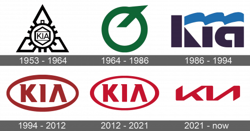
1953 – 1964
Their first logotype depicted a gear with a hexagon inside. In the hex, they put a rectangular frame with the sans serif name of the brand having typical uppercase font. From three sectors of the gear’s perimeter, there were three rhombs coming out and forming a figure supposed to remind a triangle.
1964 – 1986
The following logotype depicted a green circle with a sharp diagonal line coming out of its center. The whole symbol reminded a letter ‘Q’ turned upside down.
1986 – 1994
The 1964 variant of the logotype design brought us the first ‘KIA’ watermark. The first ‘K’ character was split into three parts: the rectangle, which was a vertical bar of the letter, the triangle standing as a lower tail of the letter, and a bright blue curved line which was replacing the upper bar of the letter as well as covering the rest of the word. The following ‘i’ letter was looking like a rectangle, similar to the vertical bar of the ‘K’ symbol. The ‘a’ letter was also a fat rectangle with something like a horseshoe.
1994 – 2012
The next logotype was a bold oval badge and an inscription with the name of the brand inside it. The name itself had a somewhat bold type with fewer gaps between uppercase letters. There were two features in that logotype: first, there were little serifs in the upper left corners of each letter; second, the ‘A’ character didn’t have any horizontal bar. The whole logotype had a dark red coloring.
2012 – 2021
In 2012, they enlarged the whole logotype and lightened it. The coloring became rather pink.
2021 – today
The 2020 logotype depicts a modern version of the brand name. It’s a depiction of three letters, merged in the upper and lowest corners into one large symbol. The ‘I’ character served as a central bar of the whole symbol. The whole inscription looks like two Cyrillic letters – ‘КИ’.
Font
The Kia logo designers always added special elements in the corporate nameplate, as well as made unusual styles for logotypes. For example, the 1986 Kia wordmark looks rather like a set of geometrical shapes together combining a company name. The 2020 logo looks like two Cyrillic letters, written in a sharp capitalized font – ‘K’ and ‘И’. They’re drawn as quite simple and linear letters, joined with each other.
Color
As for the coloring, for the last 3 logotypes, the brand has been using a red palette only, brightening and darkening it from time to time.

