Kohl’s Logo
Kohl’s is a chain of supermarkets created in America in 1946. Over time, they went from selling food to offering various categories of goods, including appliances, clothing and more. It’s considered the biggest retail store brand in America, and one of the most successful brands in this country.
Meaning and History
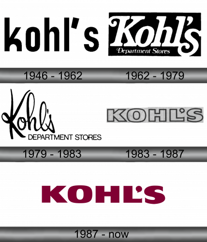
1946 – 1962
Before 1962, Kohl’s mostly sold food. It was only in the 60s that they took on their current multi-department nature. During their gastronomical phase, they used a simple black emblem that only featured their name in lowercase. The font they used was a soft, tall sans-serif with annoyingly unstable boldness.
1962 – 1979
In 1962, they were renamed to ‘Kohl’s Department Stores’. The logo also changed: they added a black rectangle as background and picked a new style. The big ‘Kohl’s’ writing became white, started using a more elegant serif font, upgraded the ‘K’ to uppercase and also added a smaller cursive writing saying ‘Department Stores’ beneath.
1979 – 1983
The 1979 logo had a similar idea. They got rid of the black rectangle, returned the letter coloring to black and also changed the fonts again. ‘Kohl’s’ received a new cursive style and move to the left a bit. The rest of the writing was enlarged and given a usual sans-serif font – in all uppercase.
1983 – 1987
This emblem is in many ways identical to the one they used since 1987. The only difference is that the letters are fully white with black contours.
1987 – Today
By 1985, they decided to scrap everything except the big word ‘Kohl’s’. It was this time purple and written with all capital letters. These are also much wider, although the typeface itself is a very mundane typographic style.


