Land Rover Logo
The history of Land Rover is a journey filled with adventure, engineering, innovation, risk, and thousands of loyal owners. The British car manufacturer Land Rover has never produced anything other than SUVs. The characteristics of the automobile immediately appealed to agricultural workers, restoration and rescue services, as well as the military. Now, the Land Rover concern continues to work on the creation of more advanced models that will cover the needs and preferences of modern drivers.
Meaning and History
Land Rover became one of the first manufacturers to produce high-quality SUVs. The first SUV was released in 1948 in England and gained instant popularity. By 1960, demand for all-wheel drive models began to grow rapidly. Throughout the 70s and 80s, the evolution of SUVs continued. In 1994, the company was bought by BMW. After a series of sales, the brand was eventually acquired by Tata Motors in 2008. The Land Rover name was first used by Rover only for a model produced in 1948. Over time, it developed into a trademark.
What is Land Rover?
Land Rover is a brand of the British car manufacturer Jaguar Land Rover, which specializes in the production of a wide range of models of all-wheel drive vehicles. Originally, luxury and convenience were not as important as technical characteristics. Over time, this changed and it even earned a prestigious status.
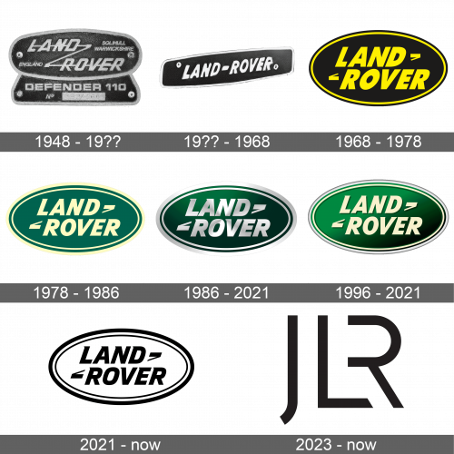
1948 – 19??
The original logo of the brand looked like a combination of dark gray leather for the background and lighter-colored metal. The latter was used for all the inscriptions as well as the border around an elongated oval shape. The brand name, obviously, took the center position. It was done in two lines with the second line being significantly indented to the right. It was done using an italicized, sans-serif font. all the letters were connected by a zigzag line that looked like a “Z” and went through both words. In the upper right corner, it stated “Solihull Warwickshire”, while at the bottom left, it stated “England” using the same font.
19?? – 1968
After the first redesign of the Land Rover visual identity Cits logo got a cleaner and simpler shape — now it was the horizontally-stretched banner with the sides slightly arched from the center. The uppercase “Land-Rover” lettering was set in silver, executed in a slightly narrowed bold and slanted sans-serif font, placed against a black background and enclosed into a thick silver frame.
1968 – 1978
The new logo became the base of all the new emblems the world has seen since. It featured a more perfect oval shape of black color. The only inscription “Land Rover” was done in a very similar style as in the original but with a few modifications. First of all, the brand introduced a bright yellow, which was also used as a thin border that was indented inside. Combined with the bold letters, it made the brand look very confident. In addition, the words were almost stacked one over the other, while the zigzag line was transformed into two “tick marks” as only the corners of the line were kept.
1978 – 1986
Besides a new color palette, there were not many changes. The black was replaced by a grassy green while the yellow was much lighter, muted, and looked more like a beige color. The oval has been stretched out horizontally just a bit to give more space for the inscription, which featured slight modifications to the font. In addition, a light yellow border was added around the outer edge of the emblem, which made it look as if it was illuminated.
1986 – 2021
This new version looks more sophisticated and luxurious thanks to the new shades of green. The background now featured a gradient that had darker shades in the right half and lighter in the left. The gradient was done on a diagonal to go with the imaginary “Z” line and give the logo even more dynamics. To make the outer light border stand out, it was underlined by a thin light gray line, which created a beautiful frame for the whole emblem. The name was kept unchanged, except for a thin shadow behind the letters that made them stand out.
1996 – 2021
A deeper green background was introduced in 1996. To make the logo look even more luxurious and modern, the designers used silver metallic color for the lettering and border, which was now much thicker. all the elements appeared to have some volume thanks to highlights and shadows.
2021 – now

The updated logo closely resembles the earlier versions. It still has an oval-shaped border, which now has two black lines separated by a white one and the brand name in the center. The name is printed using the same font as in the earlier version only now it is printed in black and without the shadow. This new version looks modern and more minimalistic. The clean lines, delicate serifs, and monochrome color palette give it a sophisticated appearance.
2023 – now ( JLR Logo )
The new identity of the Jaguar Land Rover company is bold and stylish. The initials of the company now serve as the main and only element of the logo, which is now used by both brands. They feature straight, clean lines and combine diagonal and straight cuts. A unique feature of this emblem is the letter “R” which uses the vertical line of the “L” as its illusional vertical line.
Font and Color
Although the original color palette featured different shades of gray, the company soon introduced a brighter version of its logo. The black and yellow color palette was full of energy. In 1978, the company made green its main color, with beige and later silver being used for inscriptions and borders. This color palette was more in line with nature, where one would often see these cars. The font used by the brand has barely changed since it was introduced back in 1948. It is a basic sans-serif, italicized font from the Gill Sans Family.
