Lays Logo
Lay’s is a brand that sells a variety of potato chips. Lay’s chips are distributed by Frito-Lay and owned by PepsiCo Inc. since 1965. It was registered in 1944, but its history began much earlier – in 1932. The Lay’s brand of chips was invented by the American Herman W. Lay, who started his business in 1932, selling potato chips right from his own truck in Nashville.
Meaning and History
Lay’s is an American brand of potato chips. Herman W. Lay offered his buyers potato chips called Gardner’s by Barrett Food Products since 1932. In 1944, he decided to change the name to Lay’s Potato Chips. This year is considered the birth year of the Lay’s trademark. Lay’s chips are available under different brands in some countries. For example, in Australia, it is sold under the Smith’s brand, in Egypt – Chipsy, in Canada – Hostess, and in the UK – Walkers.
What is Lays?
Lay’s is the first American brand of chips that still holds the market leadership. Lay’s is one of the three largest food manufacturers in the world. A variety of flavors, including “bacon”, “cheese”, “barbecue”, “pizza”, and “paprika” can satisfy even the most demanding gourmets.
1940 – 1955
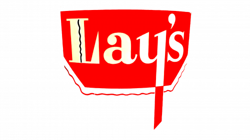
The original logo had the basic elements of Lay’s logo down. It featured a red pot or bowl used for cooking with a wavy red line underneath symbolizing heat. Its name was written in white across the bowl with the letter “Y” going beyond the bottom of the pot. The capitalized letter “L” also had a vertical black line. The serif lettering had sharp, triangular endings.
1955 – 1981
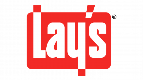
The next version of Lay’s logo still had the same color scheme with white lettering against a red background. This time, though, the red pot turned into a rectangle with rounded corners. The letters now had squared endings and letters “L” and “Y” along with apostrophe went beyond the rectangle border, where its color became white instead of red for contrast. A registered trademark symbol is added outside the rectangle in the top right corner.
1981 – 1984
The emblem showcases a vivid crimson hue that instantly captivates attention. The design is characterized by the intertwining of letters that form the word “Lay’s”. The “L” in the logo stands tall, asserting dominance, while the letters “a”, “y”, and apostrophe seem to nestle comfortably within its embrace. The “s” curves gracefully, adding a dynamic touch to the overall composition. The bold typography exudes confidence, with each character displaying slight variances in thickness, giving the logo depth and dimension. The entire design, with its innovative arrangement of letters and its radiant red palette, encapsulates both modernity and tradition, hinting at the brand’s longstanding history while looking forward to the future.
1984 – 1995, 2021
In 1984, the logo was changed once more. Overall, its concept and colors stayed the same. The first letter in the word Lay’s is still capitalized, but an Italic font is used with more rounded lettering. There is no more rectangular shape background. Instead, the word has a thick red outline with all the empty spaces in the center being filled.
In a nod to nostalgia, 2021 witnessed the momentary resurgence of this emblem, specifically for a special edition of Lay’s products that harkened back to bygone eras. This vintage-inspired move was a strategic blend of heritage and modernity, merging past memories with present-day consumers. Lay’s decision to reintroduce the old emblem not only paid homage to its iconic history but also aimed to evoke a sense of familiarity and sentimentality among its loyal fan base. Through such limited-edition releases, the brand successfully connected multiple generations, evoking feelings of reminiscence while capitalizing on the prevailing retro trend that has captivated audiences worldwide.
1995 – 2003
The new logo introduced in 1995 looked very different as it now had a yellow potato chip with white peeking through around the edges as if painted with a brush in the background. The word is now written on a red ribbon that is wrapped around the chip. The letters acquired a 3D effect thanks to thin blue shadows.
2003 – 2007
The logo underwent some changes at the end of 2003 and was slightly turned counterclockwise. The ribbon became more three-dimensional thanks to the dark red gradient around the edges and where it curved around the chip. The edges of the potato chip also look different and now have sharp flame-like swirls. The shadowing around the letters also changed from blue to dark red.
2007 – Today
In 2007, the design was updated once more. A 3D yellow ball with golden with even edges replaced the chip that was used for the past 10 years. A golden line was added to the shadow and underneath the ribbon. Letters “A” and “Y” are interconnected and the ends of letters “L” and “Y” almost touch. There is a white word “brand” under “S” in small capitalized letters.
2020 – Today
The logo introduced back in 1996 proved to be very effective, so the company simply made some adjustments. The logo was simplified and shadows around the letters became barely noticeable. The golden outlines were also gone. The “brand” inscription was replaced by the registered trademark symbol.
Font and Color
The brand’s unique font was for a long time an artistic sort of sans-serif with a cursive, signature-like style. They were smooth and soft, with mostly rounded and gradual turns. The letter ‘L’ is capitalized, whereas all the rest are lowercase. Similar fonts have been in use since the late 90s.
As for the colors, the main color palette was of yellow, red and white. The red is the brand’s chief color, used in the first ever logotype. Unchangingly, the white was used for letters throughout the historic emblems. The yellow has only entered the palette relatively late – in the 90s during the big rebranding.
