League of Legends Logo
“League of Legends” (LoL) is a fast-paced online game blending elements of strategy and competitive action. Developed by Riot Games, it pits players in intense battles, where they assume the role of “Champions,” each possessing unique abilities and skills. Two teams strive to destroy the opposing side’s nexus, located within their base, while navigating a variety of terrains and confronting diverse challenges. LoL has garnered a vast global player base, captivating audiences with its intricate gameplay, multitude of Champions, and the strategic depth required, establishing it as a seminal title in the eSports scene.
Meaning and history
“League of Legends” (LoL), a renowned online battle arena game, was conceived by Riot Games, founded by Brandon Beck and Marc Merrill in 2006. They aimed to innovate in the gaming landscape by focusing on a game-as-a-service model. LoL’s inception was inspired by “Defense of the Ancients,” a “Warcraft III” mod, mixing strategic and real-time elements. Riot sought to create a standalone game enriching this genre, emphasizing character diversity and balanced gameplay.
Launched in 2009, LoL was met with immense acclaim, quickly escalating to one of the world’s premier eSports titles. Its free-to-play model with in-game purchases fueled its rapid ascension, captivating a global audience. Riot continuously enhanced LoL, introducing new champions and gameplay modifications, maintaining a dynamic gaming experience and sustaining its extensive player base. The game’s compelling design, strategic depth, and competitive essence have ensured its enduring appeal, with millions relishing its exhilarating battles and the ever-evolving gaming environment. LoL’s success has spurred Riot Games to expand the League of Legends universe with new games and media, solidifying its monumental impact on the gaming industry.
2009 – 2019
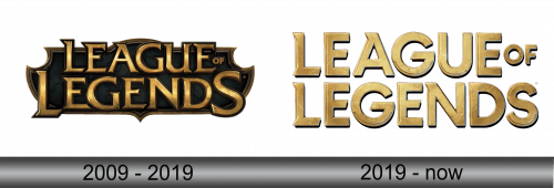
The inaugural graphical emblem for League of Legends manifested concurrently with the game’s debut. Its aesthetics illuminate the reason for its profound appeal to aficionados: this rendition of the “LEAGUE OF LEGENDS” emblem serves as a portal into the game’s expansive realm. It beckons entrants into a dimension of mystical terrains, valorous confrontations, immeasurable riches, and courageous champions.
The creators opted for a stylized serif font featuring elaborate tails, reminiscent of the Friz Quadrata design, conceptualized by Victor Caruso and Ernst Friz in 1965 for the International Typeface Corporation. The characters, imbued with a sense of antiquity by a dark gradient, project depth, appearing as though forged from lustrous metal that has experienced weathering at its extremities, invoking a feeling of aged elegance.
The moniker of the game is bifurcated into dual tiers; “LEAGUE OF” situated above and “LEGENDS” below. Interestingly, the conjunction “OF” is minimized to near invisibility. The inscription is superimposed on an elongated, shield-like polygon, adorned with a marble-like texture and golden accents, reinforcing the emblem’s heraldic resonance. The amalgamation of these elements breathes life into the emblem, enhancing its connection to the mystical and adventurous essence inherent in the game, mirroring the myriad of experiences awaiting players in the enchanting worlds within.
2019 – Today
In 2019, commemorating the game’s milestone, the creative team elected to revitalize the logo, supplanting the fantastical emblem with a version stripped of its antique resonance, opting for minimalism. The alteration was met with disillusionment by millions of gamers who had fostered a decade-long attachment to the traditional visual representation, dubbing the new design as lacking in conceptual depth and spirit. The shift away from the vintage ambiance and the perceived over-simplification of the typography particularly irked them.
Regardless of the unfavorable reception, the spokespersons for Riot Games resolved to maintain the newly introduced logo, anticipating a phase of acclimation for the users to the contemporized symbol. It doesn’t markedly deviate from its predecessor, the differences primarily residing in the typography and the omission of the heraldic backdrop. The aesthetic embellishments persist, utilizing color dynamics like shadows, luminosity, and gradient to enhance the lettering, retaining some visual appeal while navigating through the waters of modern simplicity and evolving gamer expectations, balancing tradition and contemporary design principles.


