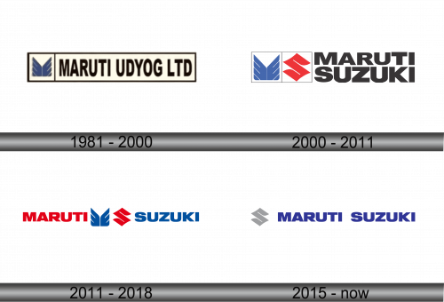
Maruti Suzuki Logo
Maruti Suzuki India Limited, primarily engaged in the manufacture and sale of motor vehicles and related parts, is a leader in the Indian automotive industry. Owned by Suzuki Motor Corporation of Japan, holding a majority stake, it stands as a testament to successful international collaboration. Founded in 1981, Maruti Suzuki revolutionized the Indian car market with its affordable and reliable models. The company’s operational footprint extends across India, with a significant market presence and a vast network of dealerships and service centers, catering to a broad customer base.
Meaning and history
Maruti Suzuki India Limited was founded in 1981 through a joint venture between the Government of India and Suzuki Motor Corporation. This collaboration marked a pivotal moment in the Indian automotive sector. Initially known as Maruti Udyog Limited, the company launched its first car, the Maruti 800, in 1983, which became an instant hit and a symbol of modernity in India. Over the years, Maruti Suzuki has achieved numerous milestones, including becoming the largest car manufacturer in India, with models like Swift, Alto, and Baleno leading the market.
In the contemporary landscape, Maruti Suzuki continues to dominate the Indian automotive industry, holding a substantial market share. The company has expanded its product line to include electric vehicles and advanced hybrid models, adapting to the global shift towards sustainable transportation. With a focus on innovation, customer satisfaction, and environmental sustainability, Maruti Suzuki is poised to maintain its leadership position in the evolving automotive sector, further solidifying its status as a key player in both the national and international markets.
1981 – 2000
The emblem is a distinctive insignia of Maruti Udyog Limited, the precursor to the contemporary Maruti Suzuki India Limited. This logo encapsulates a bygone era of the company’s storied lineage. It is ensconced within a slender rectangular boundary, partitioned into two distinct horizontal bands. The upper echelon of this emblem is bathed in a paler hue, suggesting an open sky or a broad horizon, and is adorned with an abstract duo of wings. These wings, steeped in a deep, likely azure shade, are emblematic of ambition and soaring aspirations, perhaps a nod to the company’s lofty ambitions in the automotive sphere.
Beneath this emblem of flight, the company’s moniker is inscribed in a robust, unembellished typeface that occupies the lower segment of the rectangle, which is saturated with a more pronounced intensity of color, possibly to provide a grounding contrast to the ethereal wings above. The name “MARUTI UDYOG LTD.” is presented in capital letters, manifesting the brand’s emphasis on solidity and presence in the market. The logo’s overall aesthetic conveys a sense of enduring progress and industrious legacy, a testament to the company’s foundational ethos and its journey towards becoming a titan of industry.
2000 – 2011
The logo is a composite emblem representing Maruti Suzuki’s brand identity. On the left, two stylistically abstracted wings are encased within a square, exuding a sense of freedom and uplift. This element is rendered in a serene blue, indicative of reliability. Adjacent to it is a dynamic, red rhombus containing a stylized “S,” symbolizing Suzuki’s influence and energy. The merger of these two symbols signifies the alliance between Maruti and Suzuki.
Contrasting with the previous Maruti Udyog Ltd logo, which was solely typographic and monochromatic, this logo introduces graphical elements and color to convey the brand’s evolution and partnership. The text “MARUTI SUZUKI,” in bold, black font, is assertive and modern, denoting the company’s forward momentum. The transition from the earlier logo to this presents a visual journey from a singular national entity to a globally recognized joint venture.
2011 – 2018
This rendition of the Maruti Suzuki logo is a harmonious blend of color and typography, showcasing the synergy between Maruti and its partner Suzuki. The name ‘MARUTI’ is in a bold red font, connoting energy and passion, while ‘SUZUKI’ is in a calming blue, representing innovation and reliability. The centerpiece of the logo is the two stylized wings in blue, symbolizing freedom and growth, flanked by a red ‘S’ for Suzuki. Compared to the previous logo, this one has a more balanced and integrated design, reflecting a seamless partnership and a unified corporate identity. The use of distinct colors for each brand emphasizes their individual strengths while also illustrating their combined force in the automotive industry.
2015 – Today
The logo showcases a minimalist approach, with the company’s name “MARUTI SUZUKI” displayed in a bold, blue sans-serif font, symbolizing professionalism and reliability. Preceding the text is a stylized, abstract emblem rendered in a light grey tone that suggests sophistication and modernity. This logo, when compared to its predecessor, strips away color distinctions and graphic details to favor a more unified and contemporary look, emphasizing the brand’s evolution towards a sleeker and more integrated identity.


