MG Logo
MG is a British brand notable for designing, producing, and selling of sports cars across the world. It was founded in 1924 as a small factory producing vehicles for racing as well as tuning these cars. They also offer services for their cars modification and fixing, as well as changing of parts. They produce cars for various types of audience. Their automobiles are popular in cities, racings, showcases, competitions, and others.
Meaning and history
The name of the brand, Morris Garage, is a nod to – William Morris, an industrialist, and businessman, who established the company and make the basis for its development in the further years to come. The iconic ‘MG’ badge never changed its core image – the brand designers only refreshed the coloring of letters and the frame, as well as changed the style. But the familiar ‘MG’ inscription was always visible on the vehicles made by the company.
What is MG?
Morris Garages Motors is a car producer, which appeared in Great Britain in the middle of the 1920s. Throughout its history, the company was always focused on designing, producing, and distributing of high-quality sports cars, passenger cars, commercial cars, et cetera. The company also offers a set of modification and repairing services, as well as changing vehicle parts. Now they’re owned by SAIC, a Chinese state-owned automobile corporation.
1924 – 1927
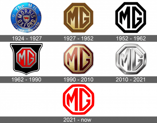
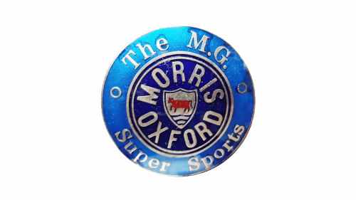
The very first logotype was rather a test of what logotype would be the best, so it stayed with the brand for a short period. It was a circular badge with an outer part and an inner part. On the external side of the circle, the brand designers wrote ‘The M.G.’ nameplate at the top, and the ‘Super Sports’ inscription at the bottom. On the inner side of the logo, there was a ‘Morris Oxford’ inscription, written in a circular position. At the very center of the badge, there was a silver shield with engraving on it.
1927 – 1952
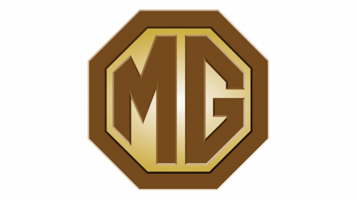
The renovation of the MG brand identity brought a new concept of the logotype, which would stay with the company for years to come. It was a brown octagon with the same brown MG monogram, depicting letters of the same thickness as the framing of the badge. The font used for the characters had extra bold and sharp bars and a very thin gray outline. The inner part of the badge, where the monogram was located, was painted gradient golden and had a lightened area close to the center.
1952 – 1962
Another major redesign happened only decades later. They had changed the color palette of the badge to black for the lines and white for the inner part and the background.
1962 – 1990
Then, the brand designers put the badge inside the black shield contoured two white and black lines. The badge itself got a red inner side coloring and gradient gray and silver shades for the letter and the framing.
1990 – 2010
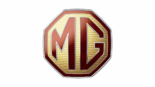
Then, they renovated the brand logotype once again in the 90s. The new design brought us a striped gradient golden pattern of the inner part and gradient red coloring of the letters and framing of the octagon. The characters and framing also got a metallic silver contour. The shield, by the way, was removed from the whole composition.
2010 – 2021
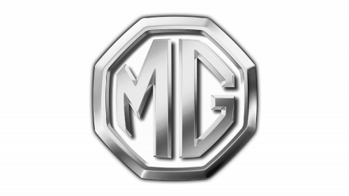
They brought a new design of the logotype in 2010. The shape and font remained unchanged, but the color palette and the whole style of the badge endured major renovations. Now there were a gradient silver frame and letters, placed on the white background. The special feature of the badge was that they added a 3D effect to the whole image. Now the logo had a serious and glossy appearance.
2021 – today
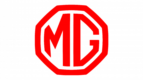
The 2021 version of the Morris Garage logo design depicts the monogram placed inside an octagon frame. The logotype is colored red and white. There aren’t any outlines or patterns, as it was in the previous version. The 3D effect was also removed, so now there is just a logotype with the simple and clean lines.
Font
The font of the monogram in the MG logotype has a bold, sharp, and angular style of the uppercase sans-serif letters. This font was designed especially for MG logotype by the company brand design team that wanted a heavy and strict font with gothic features, which would allow the designers to play with the coloring with no extra risks.
Color
The 2021 logo has a monochrome red design, but the previous logotypes used a variety of color schemes. For example, the 1990 version used royal red for framing and letters, silver for the outline, and golden shades for the inner part.

