Microsoft Logo
Being the world-wide transnational corporation, Microsoft produces a lot of informational technology such as computer software and electronics, game consoles and other related stuff. The products of Microsoft have been sold in more than 80 countries of the world and translated on 45 different languages.
Meaning and History
The company has a long history starting with a small business founded by two friends Bill Gates and Paul Allen all the way to the giant corporation with a lot of subsidiaries all over the world as well as a variety of logos and symbols which represent the goals and principles of the company.
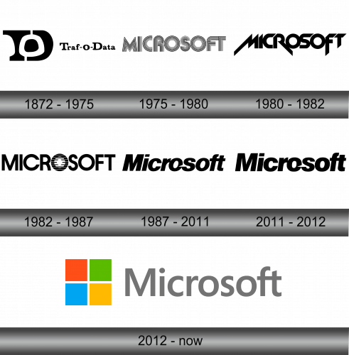
The Microsoft logo has had several brand reimaginations until the most recognizable logo came up in 1987.
1972 – 1975
The prime logotype of the brand represented the first name of the company – Traf-O-Data. The depiction was featured in three black figures. The black figure was split into the stylized ‘T’ and ‘D’ letters. In the figure, there was a dot that formed ‘O’, so the whole combination looked like the acronym of the name.
The emblem was put right side to the inscription written in the black font with small rounds which looked quite friendly.
1975 – 1980
In 1975, Microsoft was renamed and rebranded, and now it was something close to that one we know now. The name of the brand was described in all cap letters. They were surrounded by a lot of small lines with a white-and-black colour palette.
1980 – 1982
In the year 1980, the company continued experiments with its logo. From now, although it saved the bold black palette, the inscription style turned to a futuristic one, having bright, sharp and aggressive lettering. However, this logo introduced brand for only couple of years, until it was changed to another one.
1982 – 1987
With the redesign of 1982, Microsoft brought us another grand renovation of the logo. Now it is a plain typeface with no serifs, sharps and rounds, which stresses the letter ‘O’ with the bars, so this stripped pattern makes the ‘O’ the centre of the word.
1987 – 2011
In 1987 Scott Baker made a new logo for the corporation which stayed with Microsoft for almost 25 years. The emblem, depicted in a sans-serif black font had an interesting feature: a triangular slice in the letter ‘O’ that divided the word in two.
2011 – 2012
In 2011, the logo got a little modification: the letters were lessened and the ‘M’ became a bit got a space between its lines.
2012 – Today
In 2012, the company’s brand identity endured major changes: with the Windows 8 release the company has changed its emblem design. From now, it symbolized the multitasking of the brand. On the right of the grey name of the company written in simple and soft font with there were four small multicolored squares.
Emblem and Symbol
For a lot of time, the company follows to the traditions of the minimalism. It is represented in all the logotypes of the brand since 1987. Much of the Microsoft’s own brand inspired the branding of Windows – the corporation’s primary product of the century.

