Most Famous Logos With a Crocodile
The crocodile, often synonymous with power and agility, has become a favorite symbol in the branding world, spanning various industries. Known for its fierce aura and unique look, this reptile is ideal for logos, representing resilience, persistence, and a robust competitive edge. In sports, its image embodies athleticism and tactical expertise, while fashion brands use it to represent luxury, elegance, and timeless appeal. The crocodile’s ability to thrive in both aquatic and terrestrial environments reflects the adaptability that many brands strive to showcase.
This adaptability is evident in the diverse design aspects of crocodile logos. Color schemes vary from naturalistic greens and yellows to more vibrant, brand-specific hues. The typography accompanying these logos also differs, ranging from bold and commanding to sleek and sophisticated, enhancing the crocodile’s symbolic message for the brand.
Exploring these logos offers insight into their narrative, the values they represent, and their artistic significance. These are not mere static images; they’re vibrant symbols capturing a brand’s vision and its path in the competitive realms of business and culture.
Crocodile
![]()
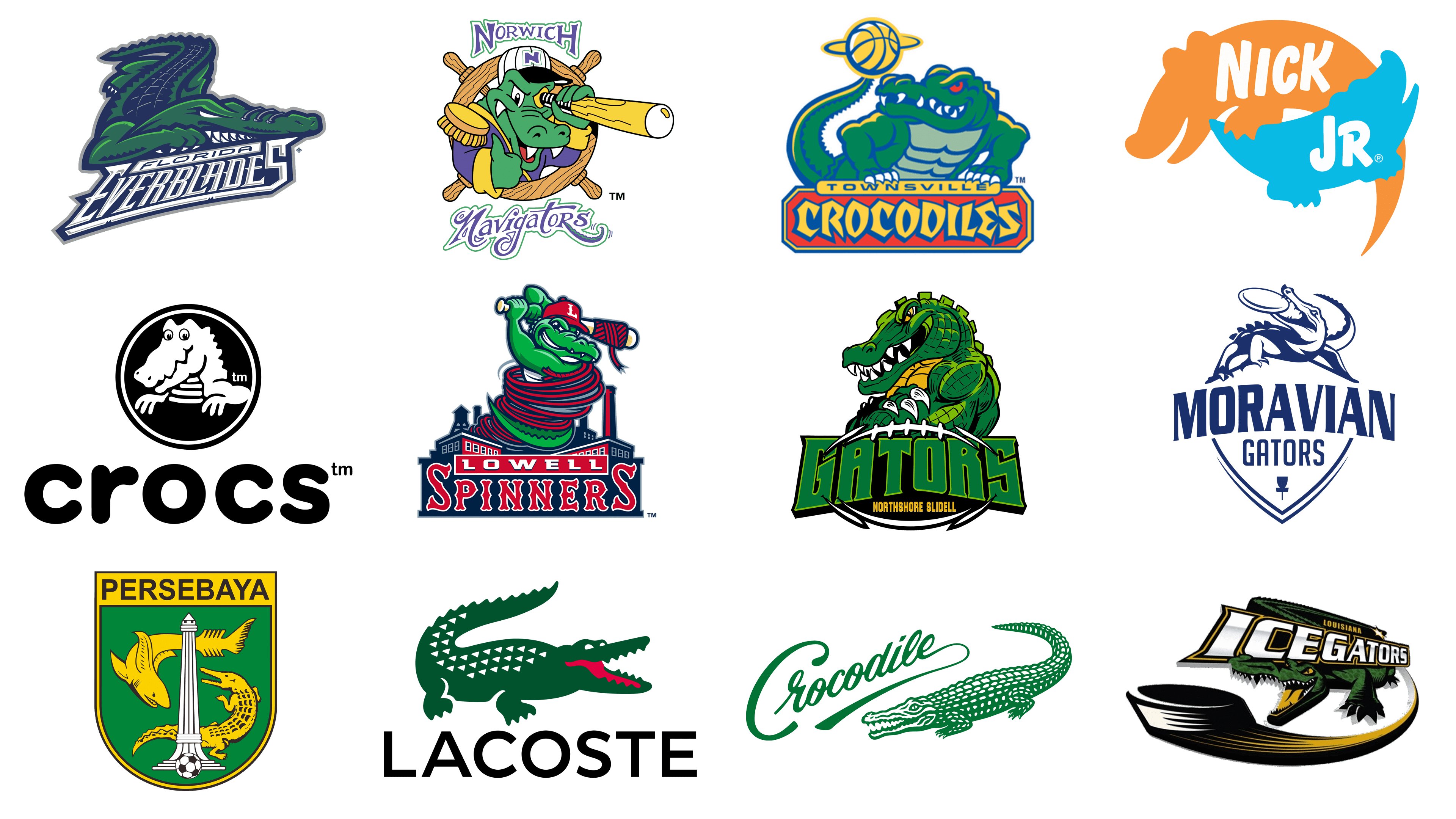
Regarding “Crocodile,” an esteemed global fashion brand known for its premium menswear and iconic logo. The logo features a sleek, elongated crocodile in a vivid green, with a gradient effect for a three-dimensional look. Its scale pattern adds texture, underscoring its reptilian essence. The logo’s focal point is the crocodile’s eye, marked by a simple dot, adding a touch of liveliness. The brand name “Crocodile” is scripted in a fluid, cursive style above the creature, in a matching green shade. The font’s dynamic elegance, with extended strokes reminiscent of the crocodile’s form, creates a cohesive and distinct design.
Crocs
![]()
Renowned globally, Crocs, Inc. stands out for its innovative casual footwear. Since 2002, they’ve been known for their signature, airy, and cozy clog design. Their logo is a cheerful, simplistic cartoon crocodile, encircled by a black and white border. This grinning crocodile in profile adds a playful character, with its large, welcoming eyes enhancing its friendly appeal. Beneath this round design, “crocs” appears in a chunky, curvy font, mirroring the crocodile’s shape and reinforcing the brand’s laid-back vibe. The lowercase style of the letters further accentuates its relaxed nature. The logo’s registered trademark symbol is subtly integrated, affirming its authenticity. This design encapsulates the brand’s ethos of fun, comfort, and informality.
Florida Everblades
![]()
Since 1998, the Florida Everblades have been a key ice hockey team from Estero, Florida, participating actively in the ECHL. Their logo, a fusion of wildlife and athleticism, showcases a vivid green alligator, poised to pounce. Its sharp angles and defined lines convey dynamism and aggression. The alligator’s detailed scales add texture, and its bared teeth reflect fierceness. “Florida Everblades” is scripted below in a slanted, impactful font, implying swiftness and force. The white letters outlined in dark blue stand out against the lighter blue highlights, simulating a rapid slicing motion. The logo’s design reflects the team’s vigorous spirit.
Lacoste
![]()
Since 1933, Lacoste, founded by tennis legend René Lacoste and André Gillier, has been a paragon in the fashion world, renowned for its polo shirts featuring a striking green crocodile emblem. This logo displays a dynamic, green crocodile in profile, poised as if in motion. Its geometrically patterned scales give a textured look, and the red tongue adds a vivid contrast. The brand name “LACOSTE” is boldly printed in a clear, sans-serif font, exuding elegance and a timeless quality. The green crocodile against a pure white backdrop, alongside the bold text, renders the logo instantly recognizable, embodying the brand’s luxurious sports apparel identity.
Louisiana IceGators
![]()
Active in the ECHL from 1995 to 2005, the Louisiana IceGators were known for their energetic presence in professional ice hockey. Their logo is a lively mix of fierceness and fun, centering around a detailed, menacing-eyed alligator set against a stylized hockey puck. The alligator’s green contrasts with its belly and the puck’s yellow and white hues. “ICEGATORS” is written in a bold, slanted, metallic font, capturing the essence of a competitive sports team. Above, “LOUISIANA” arches in a smaller but bold font, adding a sense of location and identity. This logo exudes a feeling of vigorous activity, fitting for an engaging sports team.
Lowell Spinners
![]()
Since 1996, the Lowell Spinners, a Boston Red Sox affiliate, have been a renowned minor league baseball team celebrated for their lively games and community involvement. Their logo, a playful and spirited illustration, combines classic American baseball with a local twist. It features a green alligator, animatedly holding a baseball bat, wrapped in a red and white striped scarf. This alligator, smiling and donning a red cap with an ‘L’ emblem, symbolizes the team’s Lowell roots. Beneath, “LOWELL SPINNERS” is written in a bold, red font with a navy blue outline, echoing classic baseball typography and exuding a sense of Americana. The background showcases industrial motifs like smokestacks and mills, nodding to Lowell’s rich industrial history. This design thoughtfully marries the team’s identity with the community’s heritage.
Moravian College
![]()
Representing Moravian College in various sports, the Moravian Gators embody a robust competitive spirit and teamwork. Their logo presents a navy blue alligator gripping a frisbee, positioned atop a shield. This shield, a symbol of unity and strength, is inscribed with “MORAVIAN” above and “GATORS” below, conforming to its shape. This monochromatic design, with the shield and frisbee-holding alligator, suggests both ferocity and finesse, aptly representing collegiate athleticism.
Nick Jr.
![]()
As a pioneer in preschool programming since 1988, Nick Jr. under Nickelodeon specializes in both educational and entertaining content for young audiences. Their logo uniquely intertwines two alligator silhouettes, one orange and the other blue, in a yin-yang arrangement, embodying Nick Jr.’s playful and balanced ethos. The larger, orange alligator sports “NICK” in white, bold letters, while the smaller, blue one bears “JR.” This design, with its circular flow and clever use of negative space, charmingly captures the channel’s dual focus on fun and learning for children.
Northshore Gators
![]()
Known for their dynamic presence in regional tournaments, the Northshore Gators’ logo radiates energy and strength. It showcases a green alligator in a menacing stance, mouth agape, displaying sharp teeth—a symbol of power and resolve. Overlaid on an American football, it emphasizes the sports theme. Below, “GATORS” appears in large, 3D-styled green letters with a black outline, adding impact. “NORTHSHORE SLIDELL” is subtly placed underneath, anchoring the logo geographically. This design conveys the team’s aggressive competitiveness while acknowledging their local identity.
Norwich Navigators
![]()
Active from 1995 to 2006 in Norwich, Connecticut, the Norwich Navigators were a Minor League Baseball team celebrated for their engaging gameplay and community activities. Their logo featured a whimsical alligator styled as a captain, using a yellow baseball bat as a makeshift telescope, cleverly tying in with the navigator theme. The alligator wore a purple jacket with yellow accents and a captain’s cap marked with an ‘N,’ emphasizing its role. A steering wheel encircled the alligator, symbolizing guidance, aligning with the team’s moniker, “Navigators.” The name “Norwich” was displayed in bold, block letters above, while “Navigators” was in a flowing, cursive font below, both reinforcing the nautical concept. The vibrant colors captured the team’s lively spirit and the adventurous essence of navigation.
Persebaya
![]()
Established in 1927, Persebaya Surabaya is an Indonesian football club known for its fervent fan base and achievements in Indonesian football. Their logo is a heraldic green shield with a yellow border, showcasing symbols central to the club’s identity and local heritage. The shield’s heart features the white “Heroic Monument,” a key landmark in Surabaya. Flanking the monument are two mythical creatures in gold: a shark and a crocodile, symbolizing Surabaya’s maritime heritage and folklore. A football at the monument’s base highlights the club’s sports focus. “PERSEBAYA” is boldly written in yellow above, standing out against the green background, embodying the club’s deep ties to Surabaya’s rich culture.
Townsville Crocodiles
![]()
Competing in the National Basketball League from 1993 to 2016, the Townsville Crocodiles were a professional basketball team from Townsville, Queensland, Australia. Their logo showcased a dynamic, athletic crocodile in various green hues, radiating strength and competitiveness. The crocodile, with a bold grin and intense eyes, was accented by a spinning basketball on its tail. “TOWNSVILLE” was arched above on a banner, with “CROCODILES” prominently displayed below on an orange, geometrically patterned banner. The bright colors and the crocodile’s lively illustration encapsulated the team’s essence, reflecting their spirited approach to basketball.