Nick Jr. Logo
Nick Jr. is a smaller TV-channel launched under Nickelodeon in 2009. It mainly broadcasts shows for toddlers and preschool viewers, as well as some usual Nickelodeon programs. As of 2021, it was introduced in almost 20 countries all over the world, although it’s often not supported by most providers.
Meaning and History
1988
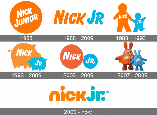
Before it became a separate channel, Nick Junior was simply a TV section on the big Nickelodeon. It appeared in 1988, and the first logo was an orange circle with the white words saying ‘Nick Junior’ written diagonally using the usual Nickelodeon style.
1988 – 2009
The rest of the pre-channel years, the section used its wordmark (‘Nick Jr.’) written in the same Nickelodeon style. The coloring was mostly pale orange, but the second word was colored turquoise instead.
1988 – 1993
There was also a cute little emblem for a few years. Here, the text parts were put onto the chest of two silhouettes: a parent and a child. Both had the colors from the previous design – orange & blue – while the text became white.
1993 – 2009
After that, they used a similar logo. Except, instead of the human silhouettes, they adopted two pig shapes of the same colors and with the same text on them.
2003 – 2009
They continued updating these sweet emblems. In 2003, they introduced two circles: a bigger orange one with the word ‘Nick on it, and a smaller blue one with ‘Jr.’ inscribed in the middle.
2007 – 2009
The 2007 emblem is the last of the pre-independent bunch. This time, there were two rabbits made from Play-Doh. Like before, one of them was big and orange, while the other – small and blue. The text bits were written on their chests like before.
2009 – today
Nick Jr. entered its independent phase in 2009. They adopted just the wordmark as their main emblem. By 2009, Nickelodeon started using round lowercase letters as their brand typeface. That’s also what they did here. The colors were still pale orange and blue. By comparison, there were now virtually no intervals between the letters.
