Noggin Original Logo
Noggin Original is a children’s educational app. Nickelodeon created it to offer entertaining and educational content for kids. The app was developed in the United States. It provides interactive videos, games, and activities. The goal is to help children learn while having fun. Noggin Original focuses on early childhood education. It covers topics like math, reading, and problem-solving. Parents can use it to supplement their children’s learning. The app features popular Nickelodeon characters. It ensures a safe and ad-free environment for kids.
Meaning and history
Noggin Original launched in 1999 as a joint venture between Nickelodeon and Sesame Workshop. The network targeted preschool-aged children. In 2002, Noggin shifted focus to educational content. Nickelodeon fully acquired Noggin in 2009. They rebranded it as a streaming service in 2015. The service provided interactive learning for children. In 2020, Noggin introduced personalized learning paths. These tailored content to individual children’s progress. Noggin continued expanding its content library. The platform added new features regularly. Parents appreciated the safe, ad-free environment.
What is Noggin Original?
Noggin Original is an educational app for children. Nickelodeon created it to provide fun and interactive learning content. It features videos, games, and activities focusing on early childhood education.
1999 – 2000
The Noggin logo features a playful design. A green character sits atop a large, stylized face. The character appears to smile. The face has a simple, rounded shape with a wide grin. “NOGGIN” is written in bold, black letters. The letters are centered on a white rectangular background. The logo uses bright, vibrant colors. This design aims to attract a young audience. The logo combines fun and educational elements. It represents the brand’s focus on children’s programming.
2000 – 2002
The new Noggin logo shows significant changes. The green character is replaced by a lightbulb-shaped head. “NOGGIN” is now written in a blue band across the lightbulb. The lightbulb design suggests bright ideas and learning. Radiating lines around the lightbulb indicate illumination. The background uses vibrant yellow and orange colors. The word “ORIGINAL” appears below the lightbulb. This new logo emphasizes creativity and education.
2002 – 2007
The new Noggin logo shows further evolution. The lightbulb is replaced by a tree design. “ORIGINAL” is written on a banner across the tree. “NOGGIN” appears below in a green box. Two cartoon birds perch on branches. The background features a sky-blue color. The logo emphasizes growth and nature. It reflects a playful and educational theme.
2003 – 2007
The new Noggin logo shows a fresh approach. The tree design is replaced by a whimsical, mechanical theme. “NOGGIN” appears in a green band with a smiling face below. “ORIGINAL” is written in playful, varied fonts to the right. The background features a green pattern with circular designs. The logo includes gears and a megaphone, emphasizing creativity and imagination. This design reflects a more modern, dynamic brand identity.
2005 – 2007
The new Noggin logo introduces another redesign. The mechanical elements are replaced by a large phonograph horn. “NOGGIN” is written in colorful, playful letters within a red box. The smiling face remains below “NOGGIN”. “ORIGINAL” appears on a banner carried by birds. The background has yellow stripes with decorative dots. The design combines vintage and whimsical elements. It emphasizes creativity and fun, appealing to children.
2006 – 2008
The latest Noggin logo shows a simplified design. The phonograph horn and birds are removed. “NOGGIN” appears in a red box with a smiling face below. Three blue gears are placed above the box. The background is now plain white. This design emphasizes clarity and modernity. It retains the playful, educational focus with a clean, minimalistic look.
2021 – Today
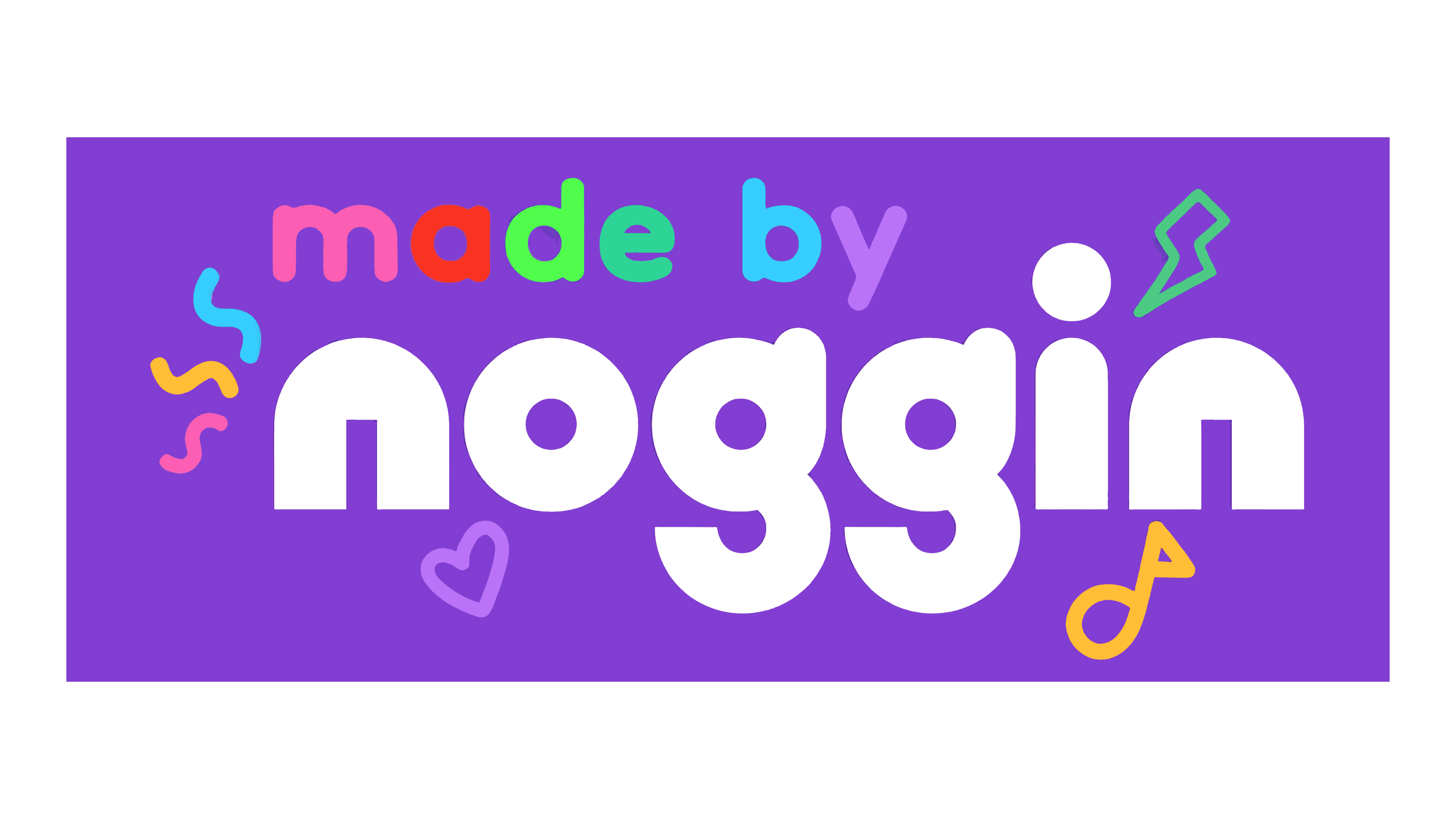
The latest Noggin logo features a vibrant, modern design. The gears and face are replaced with bold, playful text. “made by” appears in colorful, rounded letters above “noggin”. The background is a bright purple. Decorative elements like squiggles, hearts, and musical notes surround the text. This design emphasizes creativity and fun, targeting a young audience with its colorful and engaging look.
