Oreo Logo
A favorite sweet for kids and adults, Oreo cookies are recognized as the best-selling cookie brand of the 21st century. In memory of those old days, the street where the cookie shop was located at that time was called “Oreo Way”. Another interesting fact is that half of the consumers split the cookie into two halves before eating. The “Twist, Lick, Dunk” marketing campaign was surely successful.
Meaning and History
A world-famous sweet product appeared at the beginning of the last century. The first Oreo rolled off the production line at the Chelsea Market bakery in Manhattan in 1912 and was sold in Hoboken, New Jersey. It was packaged in large tin cans and sold for 30 cents a pound. The recipe was developed by the National Biscuit Company (Nabisco). The Oreo brand is registered as a trademark of Nabisco in 1913. The history of Nabisco began in 1898 with the merger of several baking companies. Since then, cookie production has long gone beyond the USA. Today, it is not only exported all over the world but also produced in many countries. Oreo Nabisco is now owned by Kraft Foods. Where did the name Oreo come from? Even the oldest employees of Nabisco are not sure, but the most popular version is the combination of the syllable “re” from the word “crème” with two letters “O” symbolizing cookies on both sides.
What is Oreo?
Oreo is the most loved and best-selling cookie brand of the 21st century. Even after numerous modern variations and experiments with flavors, fillings, and sizes, Oreo cookies remain as incredibly tasty and tender as they were many years ago.
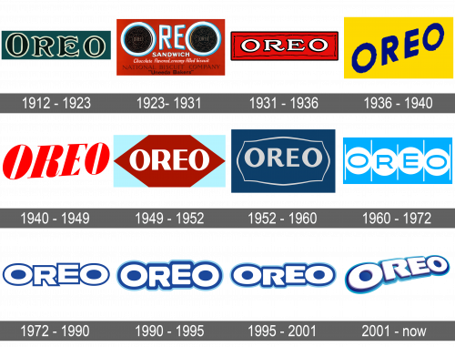
1912 – 1923
The first Oreo logo looked luxurious thanks to a rich green and white color palette and elegant font with beautiful serifs. Although all the letters looked uppercase, the first “O” was slightly higher than the rest. The company used for over ten years.
1923 – 1931
This logo has a completely different feel. The color palette was changed to light blue, white, and brown with red for the background. The brand name featured a sans-serif font. The letters were off-white and had a light blue shadow that created a 3D appearance. The most memorable part of this logo was the two “O”s, which were enlarged and had an Oreo cookie in the center. Besides drawing a link between the brand name and its product, this created a very symmetrical and balanced image. Underneath, the emblem had inscriptions printed in several lines using different font styles.
1931 – 1936
The company preserved the white, red, and black colors from the previous version, but this time, the logo was much simpler. A red banner with a thin black frame featured the name of the company printed using a stylish serif font. The white letters had a thick black outline that made them stand out on a bright background.
1936 – 1940
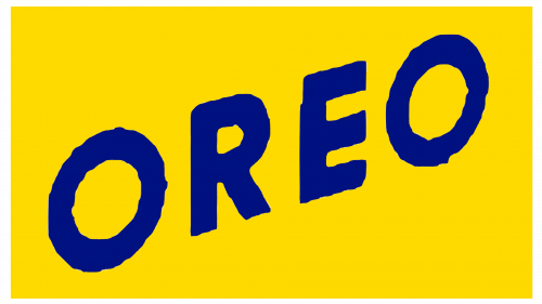
The company was not afraid to experiment with a new brand image. This time it came up with a bright yellow background for its brand name. The latter was placed on a diagonal and used a basic, sans-serif font of a dark blue color. The image was playful and surely attracted the attention of kids and adults to the product it was decorating.
1940 – 1949
The red color was brought back and used for the brand name, making it stand out on the white background. “Oreo” wordmark had a bold, geometric font, clean lines, and delicate serifs. It was placed on a diagonal with the letters getting smaller towards the right. There were no other details.
1949 – 1952
The new design of the Oreo brand logo had a burgundy rhombus background with a relatively simple, sans-serif typeface for the lettering. A light blue background behind the rhombus was an interesting choice.
1952 – 1960
Along with the change in the design of the cookie pattern, which consisted of elements of the Nabisco Biscuit Co logo being added to the cookie design, the logo underwent some changes as well. The curved leg of the letter “R” along with an ornate frame around the name added a sophisticated and luxurious touch. The dark blue background further strengthens an association with the original logo.
1960 – 1972
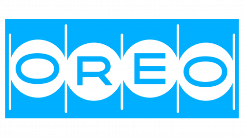
A very minimalistic logo was introduced in 1960. It had a light blue color that created a calm feel. Although the typeface was basic, oblong “O”s and letters that were placed at different heights added dynamics and interest.
1972 – 1990
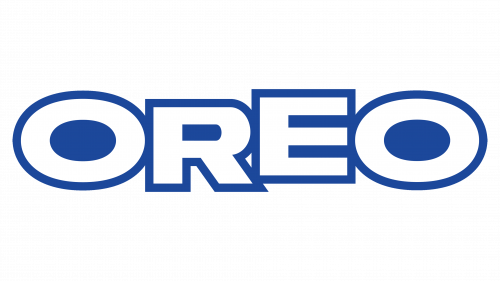
The previous logo was given an update. The letters got much bolder, so they were touching in some places. In addition, they acquired a thin, dark blue outline, while the light blue was replaced by white. This created a more cohesive and confident feel and was a good representation of a brand that was on the market for 60 years at the time. This logo served as the basis for the brand image we know today.
1990 – 1995
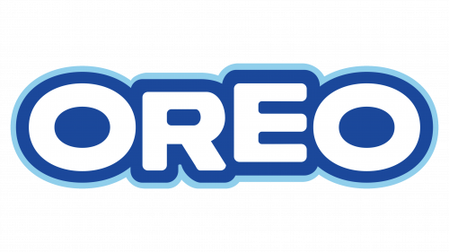
This emblem had a lot in common with the previous one. However, it looked softer thanks to rounded corners and in line with all the good feelings Oreo cookies can be associated with. The dark blue outline got thicker, while the addition of a lighter outline on the outside of it made it seem that it was glowing.
1995 – 2001
Not long after the last modification, the company updated the font to make it look sharper. Otherwise, the brand image underwent minimal changes.
2001 – Today
The brand image was modernized after it changed owners. The letters and background acquired some volume. They were placed on a diagonal and similar to the 1940 version, the letters go smaller towards the right, which created an interesting perspective.
Font and Color
The brand’s color palette changed several times, but there are several prominent ones worth mentioning. The period from 1923 until 1952 was marked by red, white, and black colors. After that, it was blue and white with a bit of black for an accent. It is a good color choice for a company that wants to show its loyalty to the consumers. When it comes to fonts, the company went back and forth between more elegant and stylish serif typefaces and less fancy, sans-serif options.
