PAW Patrol Logo
PAW Patrol is a cartoon series, made by a Canadian filmmaker Keith Chapman in 2013. Its production was held by Spin Master Entertainment, while Guru Studio was in charge of animation process. The story, serialized in 9 seasons and 216 episodes, follows the adventures of a ten year old boy, rescuing his friends – dogs, often finding themselves in trouble. Every episode has a common structure and touches on a certain list of topics for children and parents in a catchy and funny format.
Meaning and history
The show development began when Spin Master’s co-founder, Ronnen Harary, made a toy of a truck able to change its form in 2010. Shortly after this, the company issued for proposals of a cartoon TV show based on this toy. Keith Chapman, the Bob the Builder creator, suggested his original idea of a show where six dogs are saved by a series’ protagonist, a boy named Ryder. However, this idea was initially declined by the production team.
This idea has later evolved in short episodes always beginning with a display of several dogs that play with their toys at the local playing zone in Adventure Bay. During their activities, dogs always get into various troubles, and a ten-year-old boy Ryder helps them. Every episode in the show involves new characters and themes, but always follows the common structure.
Ryder is alerted about the trouble by his crewmates: Mayor Goodbay or a soldier-biologist Cap’n Turbot, aware much about the Bay’s nature. The team goes into the headquarters named the Lookout, and stand in a line. Ryder, as the leader, selects several fellows to get through the problems. After the discussion, the friends get into their transports and complete the task. At the end of every episode, Ryder always tells the dogs: ‘Whenever you’re in trouble, just yelp for help!’
Since the start of the show production, its animation was carried by Guru Studio, while its rock-influenced soundtrack was made by Ontario-based band Voodoo Highway Music & Post.
What is PAW Patrol?
PAW Patrol is a Canadian TV show started in 2013 by Keith Chapman. The show consists of 9 seasons and 216 episodes that describe the adventures of a ten-year-old boy named Ryder, who helps the dogs always getting into some trouble. The show is primarily targeted toward children, which describes the cartoon style of the show’s animation.
2012 – 2013
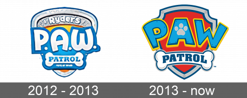
The show’s original logotype depicted a triangular shield with rounded edges. It had been drawn in three layers: a frame, a central part depicting the ‘Ryders’ inscription, and an orange zone deep inside the shield. There was the name caption over the shield, where the word ‘PAW’ was an acronym with each letter was separated by dots, while the word ‘patrol’ was placed on a white bone. The whole text caption was bold-contoured.
2013 – today
Then, they’ve changed the shield’s form, making it less triangular, and repainted it. The name was renovated as well. The brand designers changed the font of the acronym and tilted the characters ‘a’ and ‘w’. The word ‘patrol’ has also received a new design, while the bone was redrawn.
Font
The two portions of the name caption have been written in two scripts featuring different letterforms.
The acronym ‘PAW’ is drawn using sans-serif capitals with small gaps between them. Each of the three letters has unique features: the ‘p’ character is tilted and made bolder at the top than at the bottom; ‘a’ has a paw trace in the empty place at its center; finally, the left bar of the symbol ‘w’ is way slimmer than the right one.
The word ‘patrol’ at the bottom of the shield is executed in all heavy capitals with prominent gaps.
Color
The artists used multiple colors to depict the 2013 shield. Its frame is gray, but it’s contoured blue from the outer and inner sides. The center is red. As for the nameplate, the acronym consists of bright blue letters contoured with double dark blue and bright yellow outlines. The dark blue word ‘patrol’ is based on the white bone, outlined blue and gray.
