Perodua Logo
Perodua, formally known as Perusahaan Otomobil Kedua, is a Malaysian automaker primarily engaged in designing, manufacturing, and selling compact cars. It’s renowned for being the second-largest automotive company in Malaysia. Perodua specializes in affordable and fuel-efficient vehicles, catering mostly to the domestic Malaysian market and some Asian countries. The company operates under a significant influence of Daihatsu Motor Co., Ltd., a Japanese car manufacturer, which holds a substantial stake.
Meaning and history
Perodua, short for Perusahaan Otomobil Kedua Berhad, embarked on its automotive journey in Malaysia in 1993. This venture represented a strategic collaboration between Malaysian interests and Japanese technology, with UMW Corporation Sdn Bhd and Daihatsu Motor Co., Ltd. being prominent stakeholders. This partnership was pivotal in Malaysia’s venture into automotive manufacturing, complementing the established Proton.
From its inception, Perodua focused on producing compact vehicles, addressing the needs of Malaysia’s burgeoning middle class. The launch of its first vehicle, the Kancil, in 1994, marked a milestone. This car, a localized version of the Daihatsu Mira, quickly became synonymous with affordable mobility.
Daihatsu’s role in Perodua’s growth cannot be overstated. This alliance brought in critical technology and design expertise, shaping Perodua’s offerings to suit the Malaysian market. The company expanded its lineup with models like the Myvi in 2005, which resonated well with consumers and became a top seller.
In the early 2000s, Perodua began to look beyond Malaysia, targeting markets in the UK, Singapore, Brunei, Sri Lanka, and Mauritius. The company’s success in these markets varied, but the effort marked its aspiration to be more than a domestic player.
Domestically, Perodua continued to dominate the market, often leading in sales. Its collaboration with Daihatsu evolved, with the latter playing a larger role in design and technology, ensuring Perodua’s offerings remained modern and competitive.
The 2010s were characterized by Perodua’s portfolio diversification, with a focus on introducing models with advanced features while still emphasizing affordability. This era also saw the company enhance its production capabilities and integrate more sophisticated technologies.
Perodua stands strong in the Malaysian automotive landscape, adeptly balancing its role as a producer of budget-friendly vehicles with the market’s shift towards eco-friendlier solutions.
What is Perodua?
Perodua, formally known as Perusahaan Otomobil Kedua, is a leading Malaysian automobile manufacturer renowned for compact and affordable vehicles. Established in 1993, it has grown to be a significant player in the Southeast Asian automotive industry, with a strong reputation for producing small, efficient cars tailored to meet the needs of a growing urban population. Perodua’s collaboration with Japanese automaker Daihatsu has been instrumental in its success, blending local insights with global technological expertise.
1993 – 1998
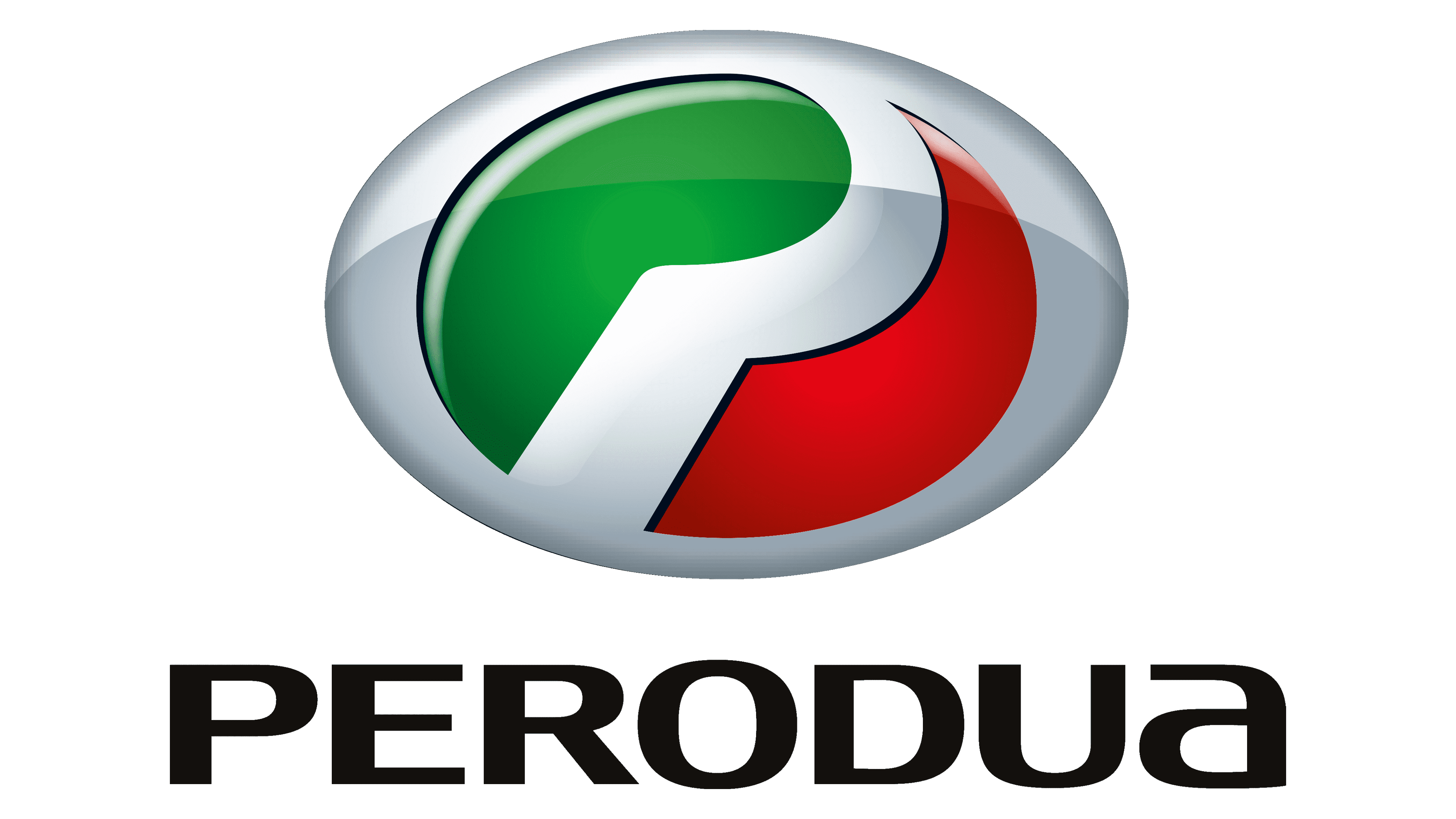
The emblem is a vibrant fusion of color and form. The dominant green curve conveys growth, contrasted by the energizing red sweep. The red appears to embrace the green, suggesting care or endorsement. The use of primary colors and basic shapes speaks to fundamental values and simplicity. The logo’s curves imply modernity and dynamism. Its contrasting hues and crisp contours forge a distinctive and impactful visual signature.
1998 – 2008
The logo is sleeker, with a silver elliptical border enhancing its modern appeal. Green and red shapes suggest unity and eco-awareness in a seamless flow. ‘PERODUA’ is in bold black letters, the ‘O’ mimicking a tire tread, hinting at movement and global reach. This logo signifies sophistication, aiming to elevate the brand’s global automotive presence. The design reflects a strategic branding evolution, portraying a forward-thinking and innovative company. The choice of a chrome finish suggests a step towards a more premium market positioning.
2008 – Today
The logo’s green and red hues are now more striking within its oval shape, adding depth. A chrome bezel replaces the silver trim, enhancing its modern, upscale look. The colors flow organically, their sheen implying elegance and premium quality. ‘PERODUA’ is boldly displayed below, its sans-serif font projecting strength. This logo suggests greater refinement, reflecting the brand’s upward trajectory in the auto market. The logo’s 3D elements and metal gloss suggest a tactile, luxurious identity. It illustrates Perodua’s commitment to innovation and premium market positioning. The new design speaks to a company on the rise, ready to challenge global competitors.


