SBI Logo
The State Bank of India (SBI) is the largest bank that serves the public in the country for over two centuries. SBI can be considered the banker of the average Indian. The bank provides a wide range of services in various business areas, it also provides services to individuals. It also provides cheap loans to businesses in various sectors, supporting the growth process initiated by the RBI.
Meaning and History
The roots of the State Bank of India go all the way back to when the Bank of Calcutta was established in 1806. It was later renamed and in 1921, the bank merged with a couple of other banks to form the Imperial Bank of India. During mid-1955, the latter became the State Bank of India. By early 2017, the State Bank of India had almost 200 foreign offices in 36 countries around the world. The number of customers the bank is serving exceeds 250 million.
What is SBI?
State Bank of India (SBI) is a bank in India that provides financial services to the country’s public sector companies. Millions of ordinary citizens and businesses across India entrust their funds to this bank.
1955 – 1970
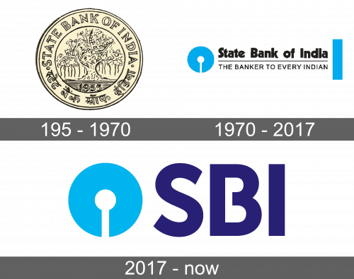
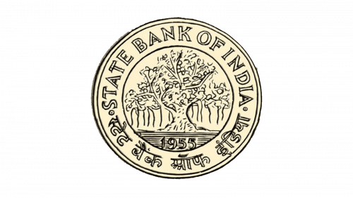
The first logo of the newly formed bank looked like a coin done in light beige color with black details. The outer border had two thin lines. Inside the circle, there was the name of the bank written around the perimeter, with the English name in the upper half and Indian in the bottom half. The letters had an outer and inner outline and were the same color as the whole emblem. In the center, there was another circle with a blooming tree and the establishment date written at the bottom of it.
1970 – 2017
For almost half a century, the bank used a logo that looked more like a stylized wordmark. It spelled out the name of the bank in a bold, classic typeface with the first letters being uppercase and plenty of space between the words. The name was underlined and underneath it said the bank’s motto – The banker to every Indian. The letters were all capitalized and significantly thinner than the name. In contrast to the black words, there was a blue circle with a slit at the bottom and a smaller white circle in the center. A balancing element was done in the form of a vertical thick line on the other end of the wordmark.
2017 – Today
The bank took the blue round element from the previous logo and added the abbreviation of the name. The name was done in dark blue using a bold, simple typeface. The letters were the same height as the circle element on the left. This update gave the logo a modern feel while maintaining the trustworthiness and reliability that is often symbolized by the blue colors.
