Skype Logo
Most users have long associated Skype with the first video calls over the internet. This platform was created to use the internet infrastructure to reduce the cost of international calls. Perhaps the main advantages that gave it a strong start were ease of use and excellent sound quality, and later, the ability to use it on multiple platforms. The cellular telephony industry was hit hard because now communication between users anywhere in the world was completely free.
Meaning and History
The real story of Skype began in 2000 when the basis of the Global Index P2P technology was created under the leadership of the Swede Niklas Zennström and the Dane Janus Friis. Soon, they came up with the idea of creating an application capable of providing voice communication between any computer connected to the internet. Instead of files, the partners configured the technology to transmit digitized voice data. In 2005, Skype was sold to eBay for $2.6 billion. After the acquisition of Skype Limited by Microsoft in 2011, the company became a division of Microsoft. What does the word Skype mean? Initially, the application program was called Sky Peer-to-Peer. The name described how the service worked, but it turned out to be too long. They decided to shorten it to Skyper, but the domain of the same name turned out to be busy. Thus, Skype was born.
What is Skype?
This is a free program thanks to which users can make calls to other subscribers and exchange messages and files with them. Skype is the only calling and video calling platform that is available on a large number of devices.
2003 – 2004
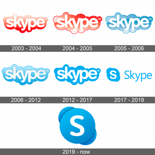
Not many remember that originally the Skype emblem was red. The name of the service was printed in white using a smooth, rounded, sans-serif typeface and all lowercase letters. Their white color created a nice contrast against a deep red. The base had a form of a cloud, which was in line with the word “Sky”, and partially repeated the outline of the inscription.
2004 – 2005
The logo was given an update soon after its creation. The red became much brighter and the cloud not only had a gradient, but also a darker outline with a very thin highlight. This gave it a three-dimensional appearance. The name was no longer pure white but acquired a reddish tint.
2005 – 2006
The new logo kept everything the same except for one thing. It was the color, which was now a pleasant sky blue with the gradient and highlights preserved.
2006 – 2012
There was less grayish tint in the blue. Along with a brighter blue, the white color of the letters made the logo look lighter and more welcoming. The gradient was also modified with a darker shade at the bottom and a lighter one at the top. The letters seemed to be pressed into the background.
2012 – 2017
This version looks completely flat. The color hue was also altered and appeared more saturated. There was also no more dark outline around the emblem. It was given a modern spin.
2017 – 2019
It was decided to bring the Skype logo in line with other Microsoft products, where the name was accompanied by a symbol on the left. The letter “S” from the previous version was set on a blue circle with two “ears” placed on a diagonal. It was accompanied by the full name in a lighter blue. The latter was printed using a new fine sans-serif font.
2019 – Today
The logo was updated again to stay in line with the other products and services of Microsoft. Only the emblem seen on the left of the previous logo was used. Of course, it was not presented as is. First of all, the letter “S” was printed using a different font so it was not as curvy. In addition, there was a shadow behind the round background. This added dynamics and created a three-dimensional appearance. The blue and white color palette insured that the logo was still easily recognizable.
Font and Color
The designers used Arial Rounded MT Bold font to print the name of the service. It is a rounded, bold, sans-serif typeface that makes the service appear more approachable and friendlier. Although the company used a red and white color palette during the first two years, its sky blue and white color palette is more recognizable. The sky blue is associated with freedom and trustworthiness, which is what this service is all about. It is a color that is frequently used in the communication industry.
