Adobe InDesign Logo
Adobe InDesign is a professional desktop publishing software developed by Adobe Systems. It’s used for designing, preflighting, and publishing documents for print, digital media, and online distribution. With its advanced layout capabilities, InDesign helps users create stunning and sophisticated page designs for magazines, newspapers, books, brochures, and more. It integrates seamlessly with other Adobe applications like Photoshop and Illustrator, enabling a smooth workflow for graphics and text. InDesign’s versatility also extends to interactive PDFs, ebooks, and digital magazines, making it a go-to tool for publishers and designers.
Meaning and history
Adobe InDesign, crafted by Adobe Systems, emerged in 1999, revolutionizing the realm of desktop publishing. It was conceptualized as an advanced alternative to Adobe PageMaker, targeting the burgeoning digital publishing sector. Initially available for Mac OS, InDesign quickly gained traction among professional designers and publishers, thanks to its sophisticated layout and typesetting capabilities.
The early 2000s marked a pivotal era for InDesign, as it began to challenge QuarkXPress’s stronghold in the market. Adobe’s strategic decision to include InDesign in its Creative Suite cemented its significance. This integration with Adobe’s Photoshop and Illustrator streamlined cross-media design workflows, enhancing its appeal in the creative community.
InDesign’s adaptability was further boosted by the introduction of XML and scripting functionalities, broadening its use beyond traditional print media. Its prowess in creating digital formats, like eBooks and interactive PDFs, underscored its versatility in an increasingly digital-focused world.
The advent of Adobe Creative Cloud in 2013 marked a new chapter for InDesign, transitioning it to a subscription model. This shift ensured that users always had access to the latest features, with the added benefits of cloud collaboration and regular updates, keeping the software at the industry’s cutting edge.
In its current iteration, Adobe InDesign stands as a fundamental tool in the design and publishing sectors, renowned for its reliability, adaptability, and continuous innovation. Its evolution mirrors Adobe’s commitment to staying aligned with the dynamic trends in digital design and publishing.
What is Adobe InDesign?
Adobe InDesign is a leading desktop publishing software, renowned for its powerful layout and design capabilities. It enables designers and publishers to craft stunning, professional documents for both print and digital media, integrating seamlessly with Adobe’s suite of creative tools. This software is a cornerstone in the industry for creating everything from intricate books and magazines to interactive digital publications.
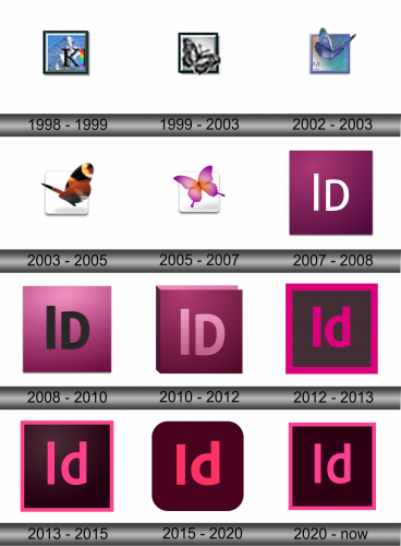
1998 – 1999
The logo in the image features a bold, capitalized ‘K’ centered within a square frame. The character is set against a patterned blue background that suggests a digital motif. A vertical stripe on the right side displays a gradient with spectral colors, reminiscent of a printing color test strip, hinting at the logo’s association with design and publishing. The ‘K’ itself, with its prominent serifs and heavy font weight, conveys a sense of solidity and professionalism, while the frame’s simplicity suggests a window to creativity and precision. This design encapsulates the essence of a tool geared towards meticulous layout and design tasks.
1999 – 2003
The 1999 logo of Adobe InDesign features a striking monochromatic butterfly, elegantly poised within a square frame. This butterfly, rendered in shades of grey, conveys a sense of artistic flair and digital sophistication, mirroring the creative essence of the InDesign software. The square frame, simple yet bold, encapsulates the butterfly, symbolizing the structured environment of design within which creativity takes flight. Interestingly, the butterfly’s wings gently extend beyond the confines of the frame, a subtle nod to the boundless possibilities and creative freedom that InDesign offers to its users. This interplay between the restrained geometry of the square and the organic, free-flowing form of the butterfly creates a visually compelling contrast. The butterfly itself, a universal emblem of transformation and beauty, aptly represents the transformative power of design. Its monochrome palette suggests a blank canvas, inviting designers to infuse color and life into their creations. Overall, the logo is a masterful blend of simplicity and depth, embodying the essence of Adobe InDesign as a tool for creative exploration and professional design.
2002 – 2003
The logo is a graphic representation for Adobe InDesign. It showcases a vibrant blue butterfly, its wings unfurled and overlapping the boundaries of a square frame. The frame, with rounded edges, carries a gradient of green and blue, suggesting a creative canvas. At the bottom left corner, the iconic “A” of Adobe grounds the image with corporate identity.
This logo introduces color and a sense of dynamism. The wings are detailed and lively, exuding a realistic texture that evokes the tactile feel of printed media. The butterfly is not just a silhouette but a colorful, three-dimensional being, bringing depth and a splash of creativity, which is at the heart of InDesign’s capabilities.
The overlapping of the wings beyond the frame could be seen as a metaphor for thinking outside the box—a fitting tribute to the software’s aim to empower creativity beyond traditional confines. The gradient background softens the geometric rigidity of the square, offering a more modern and approachable aesthetic.
This logo represents a shift from simplicity to complexity, from monochrome to color, and from the abstract to the more literal. It speaks to the evolution of design tools and the increasingly rich features offered by software like Adobe InDesign.
2003 – 2005
The logo is a further evolution of Adobe InDesign’s visual identity, marking another step in its design journey. A butterfly, rendered with photographic realism, dominates the emblem. Its wings are a warm palette of oranges and browns, with distinctive markings that suggest a peacock butterfly. This creature does not just breach the frame’s boundary; it appears almost entirely unconfined by the light grey square that fades into the white background, symbolizing the software’s growing liberation from constraints and the expansion of creative possibilities.
Transitioning from the previous logo, there are notable changes. The vibrancy of colors has shifted from cool blues to warm, earthy tones, perhaps signaling a more organic and naturalistic approach to design. The butterfly now has a direction, seemingly in motion, which could be interpreted as the forward momentum of InDesign as a tool for dynamic and evolving creative work.
The soft shadow beneath the butterfly adds a sense of depth, hinting at the software’s ability to create designs that leap off the page. Unlike the prior logo’s clear, defined edges, the boundaries here are blurred, further emphasizing the theme of boundless creativity.
2005 – 2007
The butterfly, once depicted with realistic detail, is now stylized and abstracted. Its wings boast a gradient of purple to pink, blending smoothly to create a sense of depth and dimension. This butterfly is centered within a square that has a drop shadow, giving the impression of the icon floating above a surface.
The changes from the previous logo are significant. The move from a realistic butterfly to a more abstract one suggests a pivot from traditional design elements to a modern, digital-first approach. The color palette is cooler, with purples and pinks replacing the warm earth tones, perhaps indicating a shift towards a more imaginative and innovative approach in the software’s capabilities.
The silhouette of the butterfly is smoother and more simplified, emphasizing ease and fluidity in design, a principle likely reflective of the user experience InDesign aims to provide. The square frame remains, but it’s softened with rounded corners, reinforcing the modernity and user-friendliness of the software.
This iteration of the logo embodies the essence of Adobe InDesign as a tool for creating sleek, contemporary designs with an intuitive and accessible interface. The progression from detailed imagery to a minimalist representation aligns with design trends favoring simplicity and symbolizes the software’s evolution to meet the changing needs of designers.
2007 – 2008
The logo represents a significant departure from the previous iterations of the Adobe InDesign identity. It features a starkly minimalist design, with the letters “Id” prominently displayed in a clean, sans-serif font against a deep purple gradient background. The gradient itself is subtle, creating an almost tactile sense that the viewer is looking into a dimensional space.
This logo abandons the butterfly motif entirely, a bold move that suggests a pivot towards a more streamlined and modern brand identity. The use of the letters “Id” alone is a direct nod to the software’s name and a reflection of its industry standard status. The choice of purple communicates creativity and originality, which are key attributes of the InDesign software.
The removal of graphical elements in favor of typographic simplicity aligns with trends in digital design, which favor clean, scalable logos that are easily recognizable across various media. This transformation mirrors the evolution of the software itself, focusing on the essential tools and features that empower users to create sophisticated designs.
The new logo’s emphasis on text over imagery could also represent the software’s focus on layout and typesetting, core functionalities of Adobe InDesign. It’s a mature, confident identity that aligns with the professional nature of the software and its user base.
2008 – 2010
The logo in the image retains the minimalist approach of the previous design but introduces subtle yet impactful changes. The “Id” of InDesign is now set against a gradient that shifts from a deep magenta at the top to a brighter pink at the bottom. This gradient is more pronounced, adding a sense of vitality and energy.
The font remains sans-serif, maintaining the clean and modern aesthetic, but it appears bolder, conveying strength and reliability. The color change from a uniform purple to a vivid gradient could symbolize the software’s versatility and its potential to bring a spectrum of design ideas to life.
These design choices reflect an evolution toward a more engaging and visually dynamic identity, one that resonates with the progressive nature of Adobe InDesign as a tool for professional designers who demand functionality as well as aesthetic flexibility in their work.
2010 – 2012
The logo continues the theme of minimalism but adds a new layer of sophistication. The “Id” for InDesign is now rendered with a beveled effect, giving the letters a three-dimensional appearance. This depth is enhanced by a light source from above, casting subtle shadows and highlights on the letters, suggesting a polished, high-quality finish.
The background maintains the gradient theme but now incorporates a vertical transition from a light pink at the top to a darker magenta at the base. This creates a backdrop that resembles a sunrise or the gradient of a precious gem, adding a luxurious feel to the logo.
This iteration moves away from the flat design of the previous logo, embracing a trend towards skeuomorphism, where design elements mimic their real-world counterparts. The embossed look of the “Id” suggests a tangible, touchable object, which could be seen as a nod to the tactile nature of print design, InDesign’s primary domain.
In this evolution, the logo becomes more assertive and prominent. The change reflects confidence and stands as a metaphor for the software’s robust capabilities and its solid position in the design world. The new design elements serve to convey the depth and richness of the user experience in InDesign, a tool that shapes how professionals bring their creative visions to life.
2012 – 2013
The logo abandons the previous three-dimensional and beveled text effects in favor of a flat design. “Id” is now featured in bold, flat magenta letters on a dark brown background. The letters are encased in a magenta border that matches the text color, creating a frame within the frame.
This design aligns with the flat design trend that became popular in the early 2010s, emphasizing simplicity and clarity. The magenta and brown color scheme is a stark contrast to the earlier gradients, providing a bold and modern look. The flat design eschews any semblance of skeuomorphism, indicating a shift towards digital-first thinking, where simplicity and ease of recognition are paramount.
The choice of a darker background with a vibrant color for the text and border suggests a focus on the starkness and readability that modern design software and interfaces favor. It reflects a move away from the embellishments of the past to a more straightforward, user-friendly approach that values functionality and efficiency.
The changes in the logo are reflective of Adobe InDesign’s progression and its commitment to staying at the forefront of design technology trends, catering to the needs of contemporary designers who value clean, impactful, and easily navigable interfaces.
2013 – 2015
The logo reflects a subtle yet impactful evolution from its predecessor. The “Id” text is now set against a deeper, more uniform background, enhancing the magenta text’s vibrancy. The border framing the logo maintains the magenta hue, establishing a cohesive color scheme.
The logo’s text remains flat, consistent with the previous design’s modern aesthetic, but its color seems more saturated, possibly to stand out more effectively against the new background.
The overall effect is one of depth and focus, with the text and border now becoming the sole bearers of color, drawing the eye directly to the brand’s initials. This change could be indicative of a refined focus on the brand identity, emphasizing clarity and the power of simplicity in design.
2015 – 2020
The logo retains its original background but features a notable change in the hue of its elements. The border and the “Id” letters, previously magenta, have shifted to a different shade of purple. This adjustment in color brings a fresh perspective to the design, while maintaining the overall structure and identity of the logo. The consistency of the background ensures familiarity, with the altered purple tone injecting a new dimension to the visual appeal of the logo.
2020 – Today
The logo signifies a notable departure from the previous design. It presents a more rounded, app-like icon shape, aligning with modern mobile and desktop interface aesthetics. This rounded rectangle shape is a departure from the traditional square or rectangular logos used previously, suggesting adaptability and a user-friendly approach in line with current software and app trends.
The color palette has been retained, with the magenta “Id” prominently set against a deep, almost black background. However, the magenta appears more luminous, providing a striking contrast that ensures the “Id” is the focal point. The border has been removed, which simplifies the design further and could imply a move towards a cleaner, more scalable logo that maintains its integrity across various sizes and applications.
The shift to a rounded icon shape reflects the ever-increasing importance of mobile platforms in design work, indicating Adobe InDesign’s commitment to staying relevant in a multi-device world. This design change underscores the software’s capability to integrate seamlessly into the workflow of designers, who are increasingly operating in a digital environment that values accessibility and consistency across platforms.

