Subway Logo
Subway is a popular fast-food chain celebrated for their variety of sandwiches. Famously, you can waltz into one of them and monitor the creation process of your own order by telling employees what you want in your sandwich and in what proportion. This endearing process is almost unique to Subway.
Meaning and History
It’s an American firm, the first restaurant of which opened in 1965. Back then, it was known as ‘Pete’s Super Submarines’ – ‘submarine’ being a popular type of long sandwich. That’s also where the contemporary name comes from – they basically took the usual word for underground and changed the meaning.
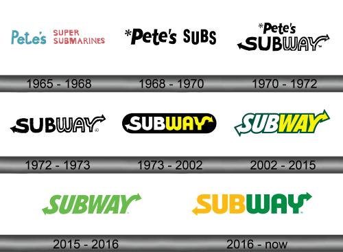
1965 – 1968
The first restaurant was called ‘Pete’s Super Submarines’ – after Peter Buck, one of the founders. The first logo was just two pieces of text: on the left was the word ‘Pete’s’ in light blue; and on the right were words ‘Super Submarines’ in red and written in two levels.
These two were also different stylistically, which wasn’t very efficient, most likely.
1968 – 1970
In 1968, the first Subway restaurant was opened. It was a yellow word ‘Subway’ written completely in uppercase. They used a very soft, uneven font this time. On the tips of both the first and the last letters were two now-iconic arrows. These are an attempt to play off the ‘way’ part in the name.
1970 – 1972

The 1970 logo first saw the word ‘Subway’ used by this brand. They put the word ‘Pete’s’ from the previous logo on top, and the word ‘Subway’ right below it.
The second part was the word ‘Subway’ written completely in uppercase. They used a very soft, uneven font this time. On the tips of both the first and the last letters were two now-iconic arrows. These are an attempt to play off the ‘way’ part in the name.
1972 – 1973

This time, they scrapped the ‘Pete’s’ part and focused on ‘Subway’. That second part was now the sole element on the logo, but no particular change was made.
The colors were usually yellow, but depending on the situation they could make the logos black-and-white in different combinations.
1973 – 2002
In 1973, they decided to put the name onto a black rounded rectangle, but it wasn’t the only change. They made the letters bolder, as well as changed the coloring. The first three letters were white now, while the ‘sub’ part remained yellow (although a brighter hue now).
2002 – 2015
The 2002 change was the removal of the black background in favor of a green outline around the letters. The letters themselves changed little, apart from being tilted to the right side slightly.
2015 – 2016
In 2015, Subway decided to commit fully to the green look and repainted an otherwise unchanged logo completely green.
2016 – today
In 2016, they removed the tilt and made the letters a bit wider than before. Additionally, the ‘Sub’ part was again repainted yellow with no other alterations.
Emblem and Symbol
Subway also has a symbol used very frequently to either identify the brand where the full logo wouldn’t fit or on the exterior of building just as a final touch. The symbol is to identical arrows of green and yellow which originate from vaguely the same place but don’t connect. It’s meant to resemble the letter ‘S’.


