Tata Logo
Tata, the esteemed transnational conglomerate based in Mumbai, India, boasts a rich history dating back to 1868 when Jamsetji Tata laid its foundation. Today, this prominent group stands as one of the world’s largest and most diverse business entities, with a vast presence across automotive, steel, information technology, hospitality, consumer goods, and various other sectors.
Meaning and History
![]()
The history of the Tata Group traces back to 1868 when visionary Jamsetji Tata established a weaving business in India. Over the years, the group expanded its horizons, incorporating a research organization in 1945 and venturing into passenger car production through Tata Motors in 1986, further diversifying from locomotives and commercial vehicles.
The Tata Group boasts several pioneering milestones in India, including the introduction of the first airlines, luxury hotel, and steel mill. As an influential entity, the group remains under the stewardship of the Tata family, witnessing substantial growth under J.R.D. Tata’s leadership, diversifying into an array of products from automobiles to tea.
In 1991, Ratan Naval Tata took the reins and embarked on a mission to restructure the conglomerate, narrowing its focus to seven core sectors.
During the overall transformation, the Tata Group initiated a brand identity renewal. The result was the iconic “T” logo enclosed within an oval, becoming synonymous with Tata. This emblem adorned all products and services, while individual companies within the group maintained their distinct designs.
What is Tata?
Tata stands as a remarkable international business group, with a diverse portfolio encompassing automobiles, steel, energy, beverages, telecom, hospitality, and more. Founded in 1868, it has grown into one of the world’s largest and most influential conglomerates, leaving an indelible mark on various industries.
1945 – 1988
![]()
The initial emblem resembled a seal, featuring a central and outer part in a classic rondel shape with accentuated middle and multiple rings. The prominent letter “T” represented Tata, with red and white lines symbolizing roadways and a T-junction. “Tata” appeared in bold capital letters atop a wide ribbon, while “Engineering” appeared below in a lean, slender font, separated by laurel branches.
1988 – 2003
![]()
The emblem in this era integrated a road with a capital “T” standing out distinctly against a cobalt background. Negative space formed a gap between the umbrella and two side triangles, enclosed within an oval. The car company’s name appeared below in bold, massive letters, featuring an “A” without an internal crossbar, adding originality to the logo.
2003 – today
![]()
The main mark, designed by UK agency Wolff Olins, shared its structure with the previous logo of the Indica passenger car brand, owned by Tata Motors. The updated version featured an author’s stylization, depicting “T” as two white lines bent at an acute angle and aligned inside a blue oval. The word “TATA” appeared at the bottom in an individual font.
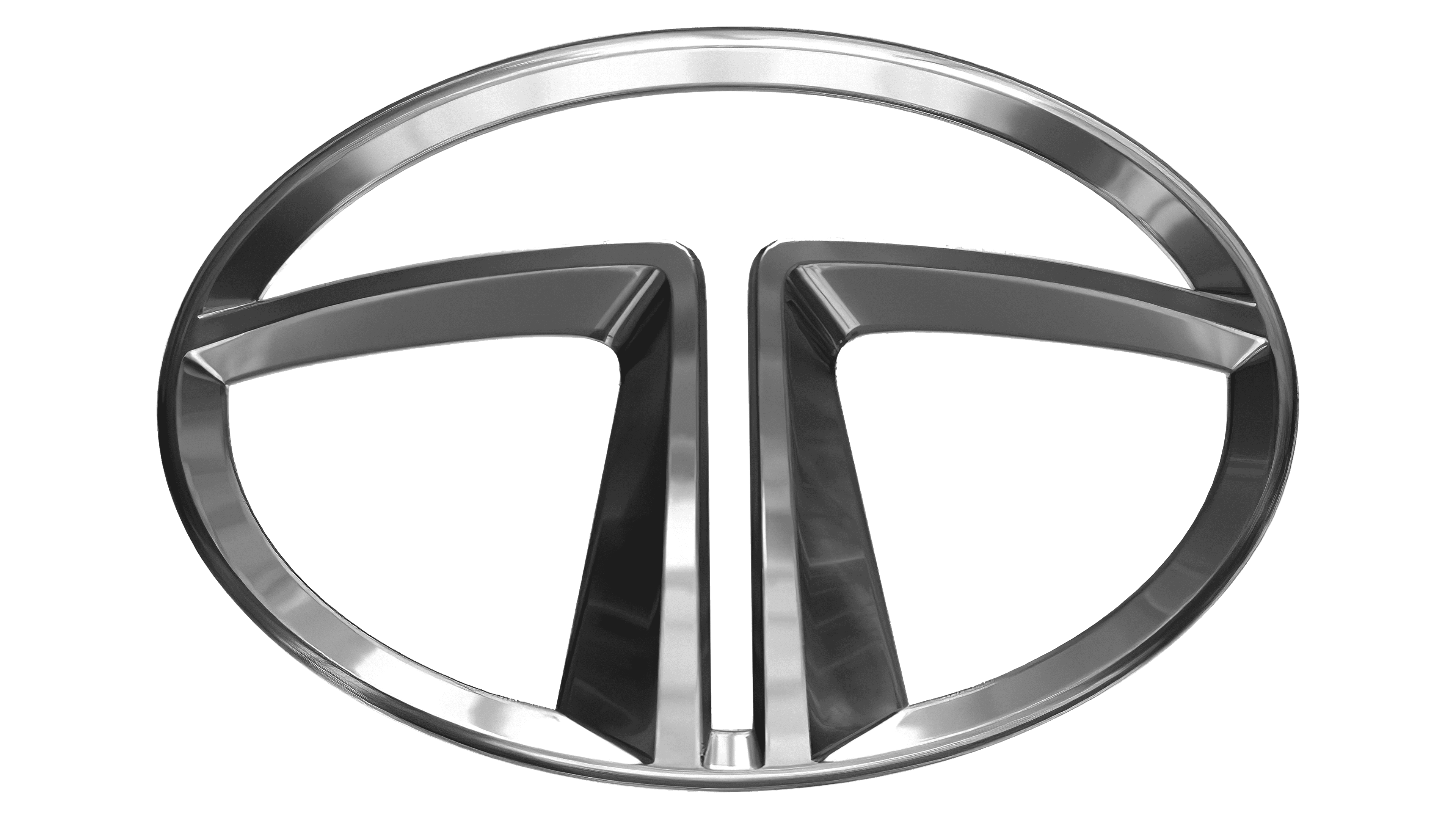
2023 (tentative)
![]()
The concept for the Tata logo, which is about to be used by the company starting 2025, is based on a very minimalistic and sharp element, the stylized capital letter “T”, drawn in two parts. The parts look completely the same — a short thick vertical bar and a thin long horizontal one — and are placed mirroring each other, on a slight distance. The new emblem of the brand is executed in a classy and timeless black and white color palette.
Font

Typography plays a significant role in the Tata Group logo, with a unique twist on the neo-grotesque style of Helvetica – the absence of horizontal strokes on both “A” letters. The inscription is presented in a title case inscription of bold style.
Color
For most of its history, the conglomerate has been using a light blue backdrop that reflects confidence and professionalism. It’s best balanced by the transparent or white backdrops of the organization’s logotypes.


