Tekken Logo
Tekken emerges as a pinnacle of fighting video games. Bandai Namco, a Japanese titan in the gaming industry, birthed this phenomenon. They developed Tekken with a vision to redefine combat experiences in gaming. Crafted within the heart of Japan, this series has garnered a global following. It stands not just as a game but as a bridge between different cultures, bringing them together in virtual combat.
Meaning and history
Since its inception in 1994, Tekken has evolved significantly. This game transformed the fighting genre with its introduction. Its journey saw a notable milestone in 1997 with Tekken 3, revolutionizing 3D combat gameplay. By 2015, Tekken 7 unleashed innovations with Unreal Engine 4, pushing boundaries further. Each installment not only enhanced the gaming experience but also expanded its lore, making it a cultural icon.
What is Tekken?
Tekken is a testament to the evolution of fighting games. At its core, it offers an arena for players to engage in epic battles. With a rich narrative and advanced gameplay mechanics, it transcends mere entertainment. Tekken symbolizes the thrilling essence of virtual combat, making every match a memorable adventure.
1994
The Tekken logo exudes boldness with its striking red kanji, capturing the essence of battle. Below, the name “TEKKEN” anchors the design in solid black, providing a stark contrast. This visual amalgamation symbolizes the fusion of traditional martial arts with contemporary gaming culture. The kanji characters seem to slice through the air, suggesting motion and impact, much like the swift moves of the game’s fighters. The red and black color scheme evokes intensity and passion, mirroring the game’s high-energy playstyle. Overall, the logo stands as a powerful representation of the game’s spirit.
1995
The logo for Tekken 2 presents a gritty evolution from its predecessor. The red kanji, now more fragmented, echoes destruction, hinting at the game’s heightened intensity. “TEKKEN 2”, in monochrome, looms beneath, its metallic sheen giving a nod to technological advancements in gameplay and graphics. The number “2” stands out, signifying this sequel’s new chapter. The overall design, with its weathered textures and rough edges, suggests a deeper dive into the game’s combative world. This emblem serves not only as a title but as a harbinger of the evolved challenges that await within Tekken 2.
1997
The Tekken 3 logo bursts with an edgier aura, showcasing a more pronounced 3D effect. Its fiery red backdrop, mottled with darker shades, conjures images of a battlefield. The letters “TEKKEN” are now encased in a metallic border, suggesting a fusion of steel and strength. The “3”, prominently displayed, is chiseled with bevels and shadows, exuding depth and solidity. This design speaks to the game’s leap forward in graphical finesse and its ever-expanding universe. It reflects a saga that continues to push the envelope in interactive entertainment and storytelling.
2001
The Tekken 4 logo marks a dramatic shift with its sleek, metallic sheen, reflecting a modernized aesthetic. Silver tones dominate the “TEKKEN” part, symbolizing a leap into a futuristic era of gaming. The fiery “4”, ablaze with orange and yellow gradients, ignites a sense of energy and evolution. This stark contrast from the previous design emphasizes the franchise’s continuous innovation. The use of gradients and metal textures gives the logo a tangible quality, almost as if it could be forged in reality. This emblem represents the series stepping into a new age with confidence and vigor.
2004
In the Tekken 5 logo, a fusion of fiery reds returns, now enveloping the kanji to symbolize intensity. The “TEKKEN” portion retains its metallic luster but with increased three-dimensionality and a chrome-like finish. The “5” boldly asserts itself with a similar silver chrome effect, standing in sharp relief against the fiery backdrop. This iteration of the logo combines the heat of battle with a sleek, modern polish, showcasing the series’ growth and its fiery spirit. It reflects the game’s commitment to visual spectacle and its blazing path forward in the gaming world.
2007
The Tekken 6 logo presents a departure with its raw, brush-stroke style kanji, embodying a return to a more traditional aesthetic. The “TEKKEN” script below is sleek, edged with metallic trims, suggesting a merger of the classic and the modern. The number “6” introduces a new graphic element, a deep red with a hint of shadow, providing a sense of depth and dimension. This logo marries the ferocity of hand-painted art with the precision of digital design, capturing the spirit of a game that honors its roots while forging ahead. It’s a visual testament to the game’s enduring legacy and its constant reinvention.
2015
The Tekken 7 logo intensifies its artistic flair with kanji swathed in deep, fiery tones, reminiscent of smoldering embers. The “TEKKEN” text sharpens into an even more futuristic font, with metallic gradients that convey motion and cutting-edge technology. The “7” extends from the text, its sleek design a combination of sharp angles and a silver to gold gradient, suggesting a new dawn in the series. Black splatter elements around the kanji add a raw, uncontained energy to the design. This logo captures the series’ essence—explosive and unbridled, ready to unleash the next saga in its storied legacy.
2024
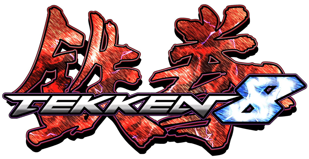
The logo for Tekken 8 electrifies with its kanji cloaked in a dynamic mix of deep red and sharp, electric blue accents. Below, the “TEKKEN” text shifts to a futuristic purple hue, bridging the old and new. The “8” bursts forth in a crystalized blue, embodying a cool, digital evolution. This logo suggests a fusion of fire and ice, a duality reflecting the game’s narrative depth and cutting-edge gameplay. It’s a bold step into a new era, capturing the series’ essence of continuous innovation and fierce competition.


