Electronic Arts Logo
Electronic Arts is a respected distributor of video games from the United States. Its games are loved, though far beyond its home country. Although the idea was born much earlier, the company officially exists since 1982. EA is known for such games or series of games as Need for Speed, Dragon Age, Medal of Honor, and others. Trip Hawkins steered the company in the right direction as it has demonstrated remarkable flexibility and the ability to adapt to market conditions.
Meaning and History
The company’s headquarters are set in California. Founded by Trip Hawkins, who was an employee of Apple Inc. since 1978, it was one of the pioneer businesses in the gaming industry. EA, which exists since 1982, was distinguished by the fact that it made the people who were directly involved in the creation of the games, designers and programmers, more valued. Initially, this company was just a game publisher. However, several years after its foundation, the console games were being rolled out by EA.
What is Electronic Arts?
Electronic Arts is the publisher of famous video games, such as FIFA and The Sims. This business also produces hero figures based on its games. Each character has a different height according to the scale relative to other heroes.
1982 – 2000
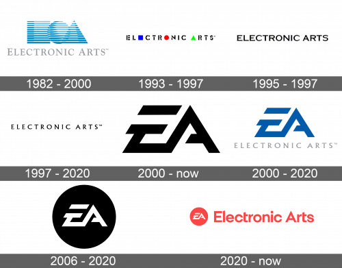
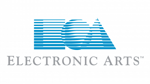
When the company was founded, Barry Deutsch designed a logo that had the name of the company written in classical capital letters using a very light gray color. It was accompanied by a bright element that had three geometric figures done in light blue and white horizontal strips that created a three-dimensional effect. The first figure was a square and meant to stand for “E”. It was followed by a circle, which can be looked at as a globe, while the final figure was a triangle that represented “A”. The figures slightly overlapped.
1993 – 1997
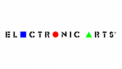
The next logo was more graphical. This time, it was simply a name of the company typed using a stenciled font with spaces in the letters. All the letters were uppercase, just like in the original. There was another element that traced the logo to the original idea. It was the three figures. A blue square replaced the second “E”, a red circle stood for “O”, while “A” was done as a bright green triangle.
1995 – 1997
The company decided to use a more minimalistic logo on its Creative Wonders products. It was a wordmark written using a black Copperplate Gothic Bold font. The original emblem, which had blue geometrical figures, was sometimes used along with this wordmark.
1997 – 2020
The font used to write the company’s name has been updated once more. It was changed to Albertus Nova Regular, so it was no longer bold and the letters were spaced further apart. Despite a redesign that happened in 2000, this version remained as a wordmark for 20 more years.
2000 – Today
Electronic Arts decided to introduce a new version of its logo in 2000. It was a redesigned version of the logo it already had for its Sports division. This move created a more wholistic company image. The logo itself was an abbreviation of the name. They had an abstract graphic design with bold, straight lines, and pointy ends. The letters were interconnected, but at the same time the top horizontal line of the “E” was disconnected from the letter and “A” had a slit.
2000 – 2020
An alternate version of the logo introduced in 2000 was used until 2020. It was the same abbreviation of the name, but the color was changed to blue and it was accompanied by a wordmark from the original logo, which was placed right below the two letters.
2006 – 2020
It was not long before a new modification was done. This time, a large black circle was used as a background for the two letters. They were exactly the same as in the previous logo, but a white color was used for a crisp-looking emblem.
2020 – Today
The emblem introduced in 2006 was complemented by a name of the company. The color palette was changed to red and white. Unlike in previous versions, the name was not written below the emblem. Instead, the circle was set on the left, and “Electronic Arts” was written in line with it. It had only the first letters capitalized and used a custom font, which had simple, clear-cut lines.
