Tottenham Hotspur Logo
Tottenham Football Club is one of the most important clubs in the world. He has repeatedly achieved success at home, fought for the highest achievements in European competitions. The club was founded in 1882, it was founded by schoolchildren. Tottenham is the name of the street, Hotspur is the nickname of one of the heroes of Shakespeare’s plays.
Meaning and history
Tottenham Hotspurs is one of the top professional football clubs in England. It was founded in 1882 in the Tottenham area of London. Originally under a different name, they switched to the current moniker in 1884. They are also colloquially known as Spurs, which refers to the rooster on their logo.
Their first major win was the FA Cup of 1901, and they went on to win it 8 more times. Besides that, they claimed 2 League Cups and 2 UEFA Cups. On the home front, they are currently ranked as the 4th best club of the Premier League. That makes them one of the best in the country.
What is Tottenham Hotspur?
Tottenham Hotspur, aka Spurs or Tottenham, are one of the best football clubs in England. Founded in 1882 in London, they are amongst the oldest such teams in the country. Their strongest following is concentrated in North London (their home area) and parts of East England.
1921 – 1951
The team’s first permanent logo appeared in 1921. It was a blue shield, inside which was a blue rooster on a white background.
1951 – 1967
In 1951, the image of a rooster was changed, now it is in a state of takeoff. The rest remained unchanged.
1967 – 1971
In 1967, it was decided to abandon the shield in the club’s logo. The image of the rooster remained the same, but now the bird stood on a soccer ball, without which it is impossible to imagine this game.
1972 – 1981
In 1972 the logo began to be used, where the rooster (the symbol of the team) stood on the ball. At the same time, he himself was in the background of a large ball. The logo became round, the name of the club was inscribed in the circle.
1973 – 1981
In 1973, a logo was created that was simplified compared to the previous one. On it there was only a rooster standing on a ball.
1983 – 1984
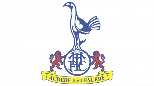
The 1983 logo is more colorful and uses lighter shades of blue. The rooster now stands not on the ball, but on a circle, inside which the letters F, C, T, H intersect with each other. Red lions are located on both sides of the circle. At the bottom of the coat of arms there is a yellow banner on which the Latin phrase “AUDERE EST FACERE” is written in blue letters, it means “To decide is to do”.
1985 – 1986
In the 1985 – 1986 season, a logo similar to the previous one was used, but all elements in it were painted in brighter colors.
1987 – 1988
The emblem of the 1987-1988 season is characterized by the use of light shades, the set of elements has not changed.
1988 – 1989
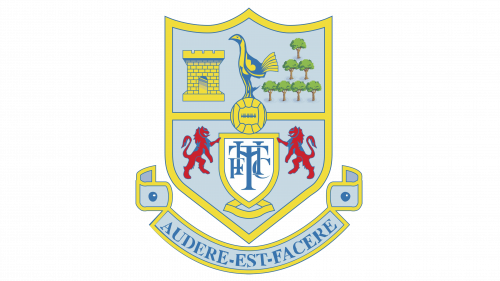
The next season the team played again with an updated logo. This time a combination of blue and light yellow was used.
1989 – 1995
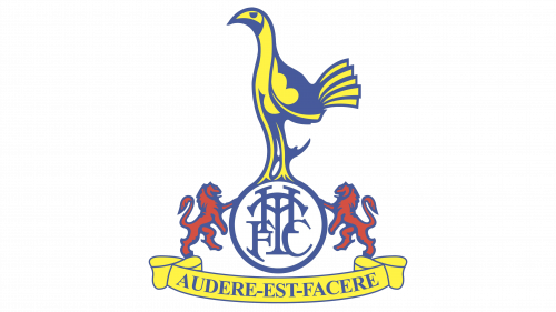
In 1989, a number of elements in the logo were removed. There is a rooster standing on a circle in which the abbreviation of the club is inscribed. Lions hold a circle on the sides. At the bottom there is a banner on which the slogan of the club is written.
1995 – 1997
In 1995, the logo again became two-color, in which the rooster stands on the same ball with letters, and there is a shield around it.
1997 – 1999
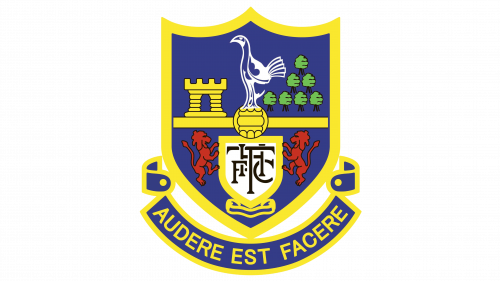
After 2 years, the owners of the club again decided to make the logo more varied in terms of visual content. The yellow shield contains already familiar elements from the previous emblem, as well as a gray tower, green trees, red lions. The ball has returned under the cock, the letters (F, C, T, H) are now located inside another shield.
1999 – 2006
In 1999, they again decided to change the logo, returned to the 1983 version, making minor adjustments to it.
2006 – 2013
In 2006, it was decided to abandon the motto “AUDERE EST FACERE”. The logo became similar to the 1967 model, but in a more schematic and modern style, without unnecessary details.
2013 – 2024
In the previous logo, the previous rooster sported additional white and blue contours. In 2013, these were gotten rid of.
2024 – Today
In 2024 the Tottenham Hotspur visual identity got a refreshed version. Now the graphical part is the only hero of the composition, as the arched wordmark was removed from the badge. Another visible modification is the color palette. The logo is still set in blue and white, but the blue is darker and more intense, which makes the whole emblem look stronger and more confident.
Color and font
Tottenham’s logos are traditionally dominated by dark blue, which goes well with white. The inscription in the logo is usually absent, but there is a variant of its writing under the ball in a special font.
