UCLA Logo
The University of California at Los Angeles is considered to be the education dream of young people from all over the world. UCLA is known for its high-level academic programs, as well as its solid contribution to the culture, sports, and health of the country. It is also worth mentioning the successful research activities of the university aimed at improving the quality of life and protecting the environment.
Meaning and History
The date of foundation is considered to be 1919. UCLA was founded as a division of the General University of California on the south coast. The achievements of this branch are impressive. They include over ten Nobel Prize winners. The strongest sports teams: players and coaches in the history of the university have won more than 250 Olympic medals. It has more than 300 specialties and funding of more than 1 billion dollars.
What is UCLA?
The University of California, Los Angeles is a public research university in LA and one of 10 branches of the University of California. This educational institution has been consistently ranked among the top two dozen universities in the world for many years. The university boasts a special center for gifted children and geeks, numerous research centers, and its own crime laboratory.
1964 – 1978
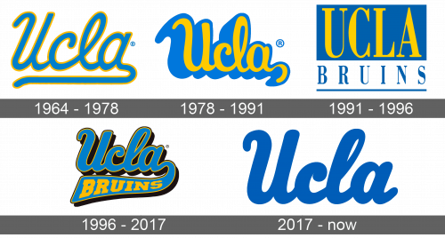
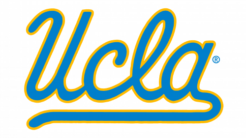
For most of its history, the university used logos that were based on this 1964 version. It was an abbreviation of the university name with only the first letters being capitalized. The sky blue color was the main color, while a golden yellow was used for the outline of all the letters. It features cursive writing with all the letters connected. The letter “A” curved and underlined the whole inscription, creating an appearance of a signature.
1978 – 1991
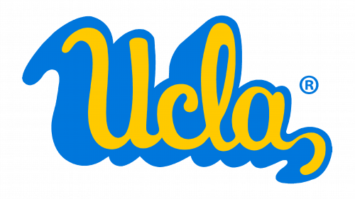
The new logo was based on a previous one, but it now had a three-dimensional appearance. The color palette was inverted with yellow being used as the main color. The logo looked bolder and curvier with the “A” having a shorter tail.
1991 – 1996
The updated logo acquired a stronger and more sophisticated thanks to bold, uppercase letters that featured slab serifs. The same typeface was used for both the “UCLA” inscription, which was placed on a rectangular dark blue background, and the “Bruins” underneath. The latter was done in smaller font, so the length of both inscriptions was the same. It used the same blue as the background above and had a blue line gong underneath, not only creating a complete picture but also referencing the original emblem.
1996 – 2017
A classic appearance of the logo was soon brought back as the new emblem featured a font similar to the original one, only bolder, and with a thin yellow outline just like in the original. The designers introduced a black color for the shadow, which added a touch of boldness and power. They also kept the “Bruins” part but added it to the tail of the “A”. A different font was used for the “Bruins”. It was a bold, serif typeface done in a familiar yellow.
2017 – Today
Although the color palette was changed in favor of just a deep blue, the logo still looks very recognizable. It was achieved thanks to the use of a cursive typeface that looked very much like the ones seen in other versions. The font looked more like the one seen in a logo introduced in 1996 and had thick, elegant strokes. The “Bruins” part was removed and the tail of the letter “A” was no longer curving down.
Font and Color
Blue is the color of wisdom, which makes it more than appropriate for an educational institution. The yellow color used in logos until 2017 adds a touch of creativity, energy, excitement, and friendliness. It is also used to symbolize intellect. The educational institution used one font with slight modifications almost for all of its logos. It was a cursive font that typically looked bold and had some type of outline or shadow. The typeface looks most like sans-serif Helvetica/Arial.
