Unilever Logo
Unilever is a major producer of food, hygiene and general use products. It’s based in the Great Britain, although the brand has long gone international – with operational centers in many countries of the world, even outside of Europe. Thus, they’ve been a successful brand since the 1920s.
Meaning and History
The company was created in 1929. It was created as a sort of merger between the two enterprises – one led by the Lever brothers, and the other – by one Margarine Urie. They first produced hygiene products, and the company was very soon famous for this part of their line of work.
1969 – 2004
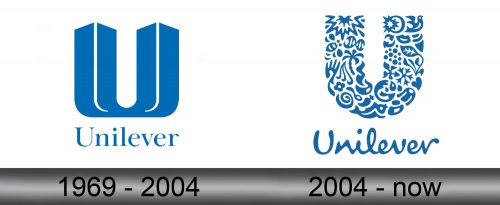
The first logo appeared in 1969 – it was the company name written in thin serif and colored in light blue. Above it was a primary emblem – a blue ‘U’ shape with white lines on the ribs to promote the volume. The bottom part was cut to a very thin remnant.
2004 – today
In 2004, both parts were redesigned, but the idea stayed pretty much unchanged.
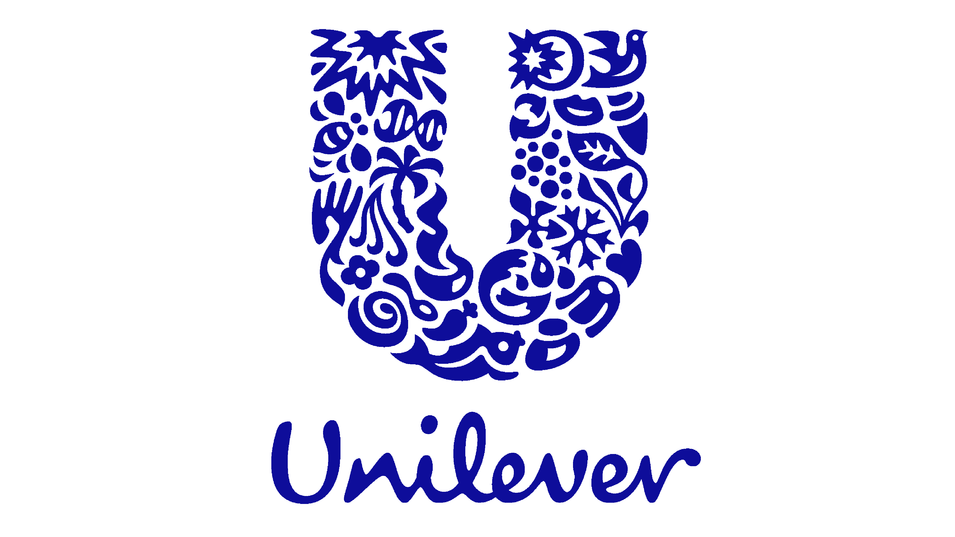
The writing was now thin and spindly. It was handwritten, and had lots of inconsistencies and small nuances. The upper part – the letter ‘U’ – was now just a usual plain ‘U’. However, instead of being simply written, it consisted of many images, such as snowflakes, cinnamon buns, plants, and so forth.
The whole thing was also repainted to a darker hue of blue.
Emblem and Symbol
The images on the 2004 emblem were basically chosen to look pleasant and desirable, because there is no special connection between the objects. A lot of it is nature, but some also feature food. A good chunk of these icons, on another hand, are pretty obscure, such as the sparkle or the lips.
